Preview image. Unlock full-res
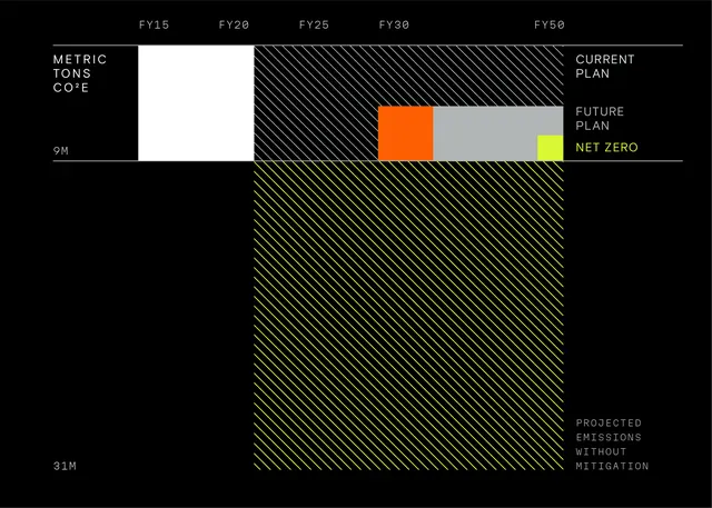
Dark infographic comparing current plan, future plan, and unmitigated emissions from FY15 to FY50.
Styleminimal, technical, data-dense
Colordark, vibrant, high-contrast
Typemonospace, sans-serif, all-caps
Moodprofessional, technical, bold
Palette
#080805
#DECEBA
#5D6146
#7D855A
Summary
A black sustainability chart layers hatched areas and solid bars to compare emission plans through 2050.
Visual description
FY15-FY50 runs along the top with METRIC TONS CO2E on the left. White and hatched white zones mark CURRENT PLAN above 9M. Yellow hatching fills PROJECTED EMISSIONS WITHOUT MITIGATION below. An orange-to-gray FUTURE PLAN bar ends at a yellow NET ZERO marker.
Key takeaway
Diagonal hatching plus one neon fill distinguishes scenarios without relying on many colors.
Reuse notes
ESG reports, climate dashboards, or editorial data stories needing dark-mode clarity.