Preview image. Unlock full-res
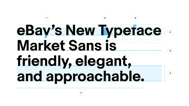
A type specimen for eBay's Market Sans typeface, with a bold headline annotated by numbered alignment and measurement guides.
Summary
A type specimen for eBay's Market Sans typeface, with a bold headline annotated by numbered alignment and measurement guides.
Visual description
On a plain white background, a four-line bold sans-serif headline reads "eBay's New Typeface Market Sans is friendly, elegant, and approachable." Thin light-blue horizontal guide lines run across the type at cap-height and baseline, with the first and last lines highlighted in a pale blue band. Seven small numbered circles (1-7) sit along the right edge and above the first line, marking specific letterform and spacing details (an apostrophe, a T crossbar, an f terminal) and line-height/width measurements, including a horizontal measurement bracket beneath the final line.
Key takeaway
The numbered callouts turn a plain headline into a legible teaching tool: viewers can see exactly which measurements and letterform details the guides point to rather than being told about them.
Reuse notes
Strong reference for brand typography specifications, typeface launch posts, or type-design case studies. The white background and light-blue guide color are what make the technical overlay readable; keep good contrast if adapting to a darker background.
More like this



Keep what you find
A free account saves references to boards and can send you a weekly email of picks based on what you save.
To see every result, go Pro.