Preview image. Unlock full-res
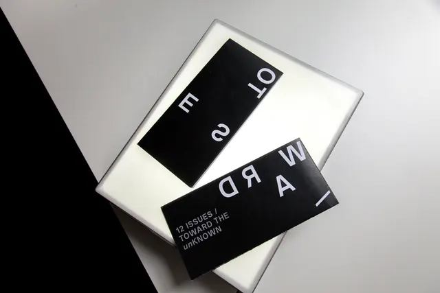
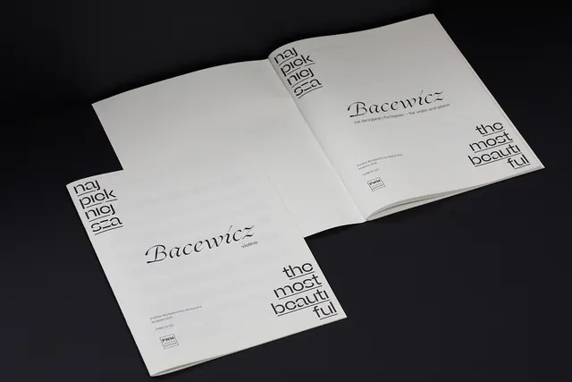
Multiple magazine covers featuring minimalist typography stacked at angles on a white background with dramatic lighting.
Summary
Magazine covers stacked and overlapped at dynamic angles, printed with black and white color schemes and clean sans-serif typography.
Visual description
Two or more magazine covers are arranged at contrasting angles on a light gray background with strong shadow work. The top cover shows numbers or text on a black rectangle against white. A lower cover in the stack displays text reading Toward The Unknown and smaller copy about 12 issues. The typography is crisp, modern sans-serif in white against black backgrounds. The arrangement creates depth through angled overlaps and cast shadows. The composition emphasizes minimalism and typographic hierarchy through stark contrast and clean geometry.
Key takeaway
The angled, stacked arrangement adds visual interest to a minimalist design system. The restraint in color and form draws all attention to the typography, making the text message maximally clear.
Reuse notes
Excellent for magazine promotions, publication identity, or editorial case studies. The technique works well for displaying a series of related covers or issues. The high-contrast palette works for print and digital applications. Adapt by changing text content or the number of covers in the stack.
More like this



Keep what you find
A free account saves references to boards and can send you a weekly email of picks based on what you save.
To see every result, go Pro.