Preview image. Unlock full-res
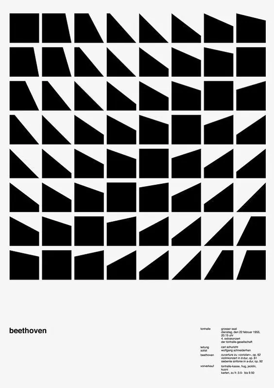
A black-and-white poster built from an 8-by-8 grid of abstract black geometric blocks with small text at the bottom.
Summary
A black-and-white poster built from an 8-by-8 grid of abstract black geometric blocks with small text at the bottom.
Visual description
The image shows a large matrix of black geometric tiles arranged in a strict grid on a white background, with each tile varying in diagonal cuts and slanted edges. Near the bottom left is the lowercase word "beethoven," and a compact block of small right-aligned text sits in the lower right corner.
Key takeaway
Use a rigid grid to turn simple geometric variations into a strong visual system. Pair the large abstract field with tiny, quiet typography to create a sharp hierarchy.
Reuse notes
This approach works well for posters, music-related prints, and identity pieces that need a stark, disciplined look. It is especially effective when the goal is to make a modular system feel editorial rather than decorative.