Preview image. Unlock full-res
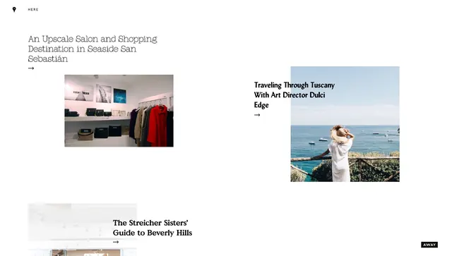
A minimal white editorial layout featuring three article previews with headlines, photography, and navigation arrows in a clean grid composition.
Summary
A minimalist magazine layout presenting three curated lifestyle articles in a grid format with photography, sans-serif headlines, and subtle navigation elements on a clean white field.
Visual description
The page is dominated by white space with minimal graphic elements. Three article previews are arranged in a loose grid. The top-left features an indoor salon or boutique photograph with a headline in serif type. The top-right shows a Tuscan coastal landscape with a woman, accompanied by the headline Traveling Through Tuscany With Art Director Dulci Edge in bold sans-serif. The bottom-left hints at a Beverly Hills guide with serif typography. Each article has a small arrow icon for navigation. Small text reading HERE appears at the top with a location pin icon. The AWAY logo sits in the bottom-right. The palette is dominated by off-white and dark charcoal with subtle gray accents.
Key takeaway
The restrained use of imagery and typography creates an editorial hierarchy that guides the viewer naturally through the content. The white space and minimal borders frame content without visual clutter.
Reuse notes
Excellent for magazine websites, travel guides, lifestyle publications, or curated content platforms. The grid approach scales well for multiple articles. Works for desktop and adapts to mobile. Adapt by changing photography, headlines, or adding more article blocks. Pairs well with elegant serif headers or modern sans-serif.
More like this

Keep what you find
A free account saves references to boards and can send you a weekly email of picks based on what you save.
To see every result, go Pro.