Preview image. Unlock full-res
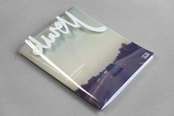
A minimalist magazine or publication cover with the word "dwell" in bold white letterforms, a soft gradient transition, and a dark architectural or landscape photograph in the lower portion set against neutral tones.
Summary
A minimalist publication cover balancing large typographic hierarchy with a subtle gradient and photographic element. The design prioritizes clarity and elegance through strategic whitespace and restrained color use.
Visual description
Neutral beige-gray background dominating the upper two-thirds. The word "dwell" appears in bold white sans-serif letterforms positioned in the upper-left quadrant. A soft gradient transitions from warm neutral tones to cooler slate blue-gray moving downward. In the lower third, a dark architectural or landscape photograph (appears to be an interior or outdoor scene) is partially visible, creating visual contrast and contextual anchor. The composition uses strong horizontal divisions: type-heavy upper section and image-heavy lower section. Overall palette remains muted and sophisticated with strategic use of whitespace.
Key takeaway
Large typographic statements benefit from substantial whitespace and neutral backgrounds to remain readable and elegant. Gradients can create subtle visual interest without competing with type. Anchoring editorial covers with imagery in the lower portion grounds the composition.
Reuse notes
Works well for design-forward publications, architecture and lifestyle magazines, or premium brands prioritizing sophistication. The minimal approach suits high-end positioning. The white-on-neutral type treatment is accessible and reads well at small sizes. Consider for book covers, digital publication headers, or campaign covers where clear messaging matters.
More like this

Keep what you find
A free account saves references to boards and can send you a weekly email of picks based on what you save.
To see every result, go Pro.