Preview image. Unlock full-res
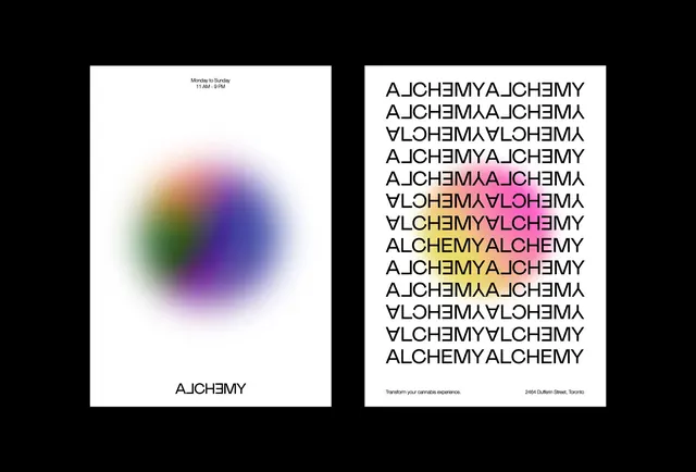
A bifold design layout showing a soft-focus gradient sphere on one side and repeated typography pattern on the other, set on high-contrast dark and light halves.
Summary
A split-screen graphic design study using a blurred multicolor gradient sphere paired with a pattern of repeated mirrored typography, divided evenly between light and dark fields.
Visual description
Left half: a soft-focus radial gradient (blue, purple, pink, green, yellow hues) blurred into a sphere against a white background, with small "Alchemy" text centered below. Right half: black background with white sans-serif letters arranged in a repeating diagonal pattern, the word "ALCHEMY" reversible and mirrored throughout. A thin beige divider separates the two halves. Bottom-right corner credits the source.
Key takeaway
Color-to-typography translation: converting the gradient's hue range into letter-form repetition. The symmetry of the layout creates a visual echo between the rounded gradient and the angular, repeating type patterns.
Reuse notes
Strong for visual-identity systems, especially tech or experimental brands. The bifold structure works as a cover, poster, or page spread. Good reference for gradient color generation and for exploring how continuous color can be translated into discrete typographic forms.
More like this


Keep what you find
A free account saves references to boards and can send you a weekly email of picks based on what you save.
To see every result, go Pro.