Preview image. Unlock full-res
A 31-page dark-mode brand and product guideline deck for Opera One, built on oversized all-caps Be Vietnam Pro headlines, a Space Mono utility layer, and iridescent fluid gradients against pure black.
Summary
The external v1 design guide for the Opera One browser: a 31-page guideline deck that pairs oversized all-caps Be Vietnam Pro headlines with a Space Mono utility layer, set almost entirely on pure black and punctuated by Opera's iridescent fluid gradients and the cropped Opera "O" mark.
Visual description
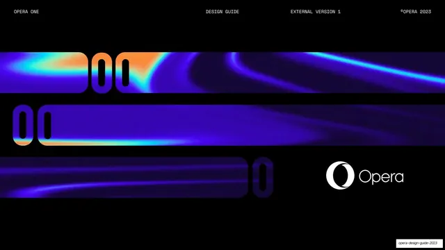
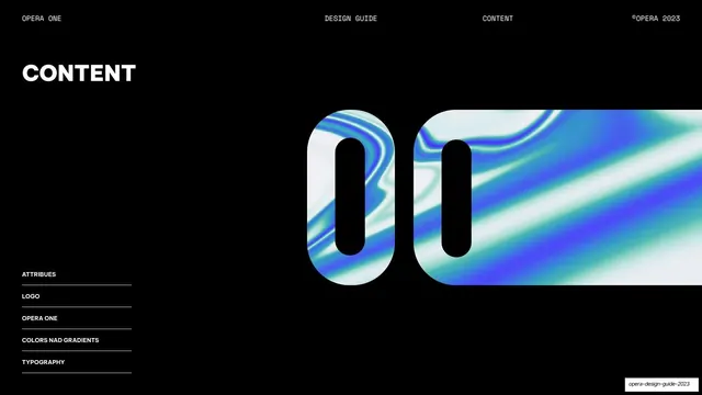
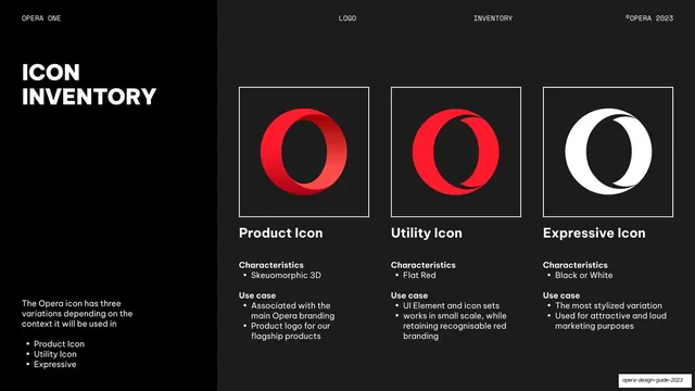
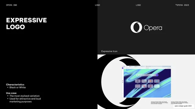
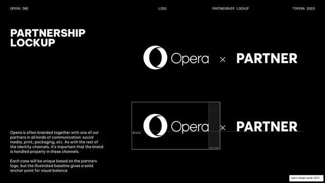
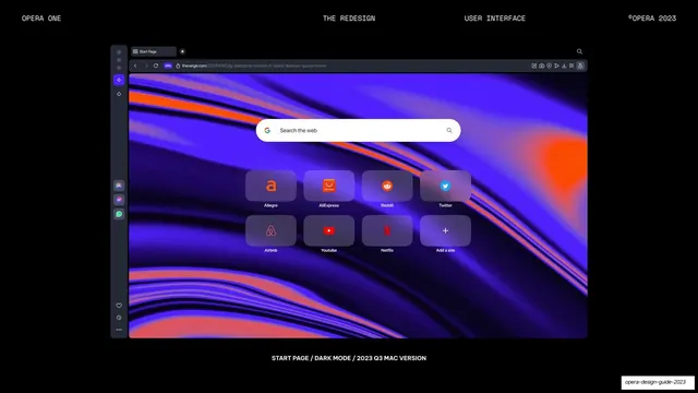
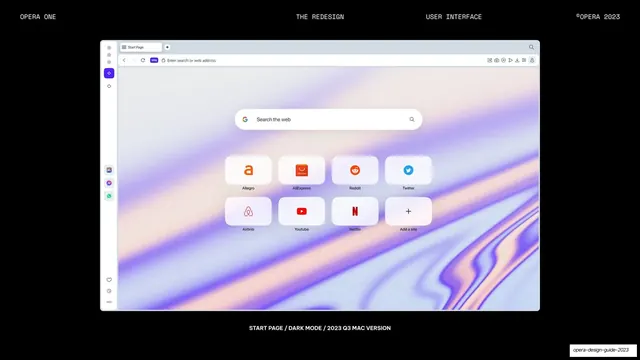
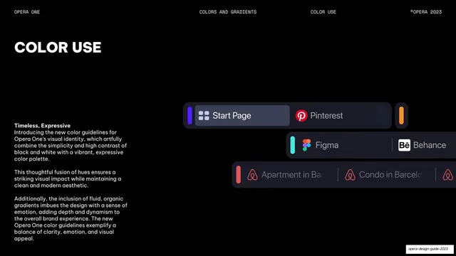
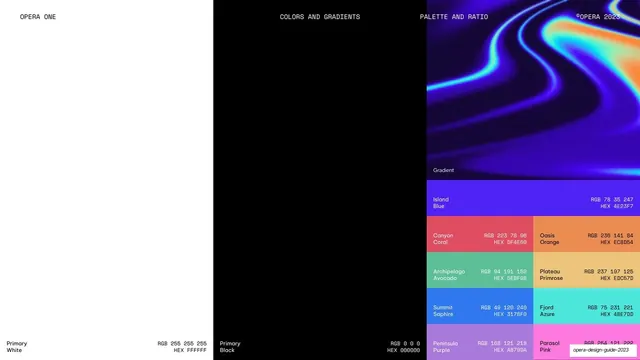
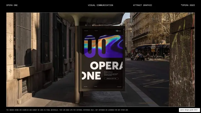
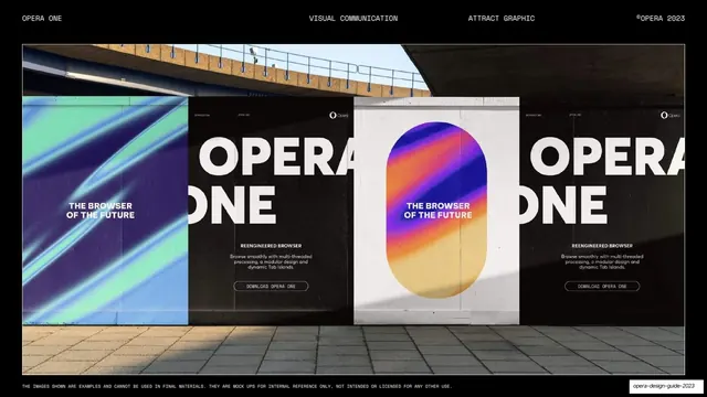
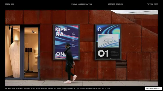
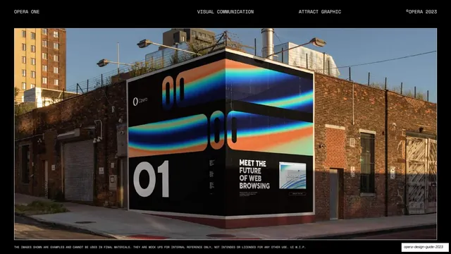
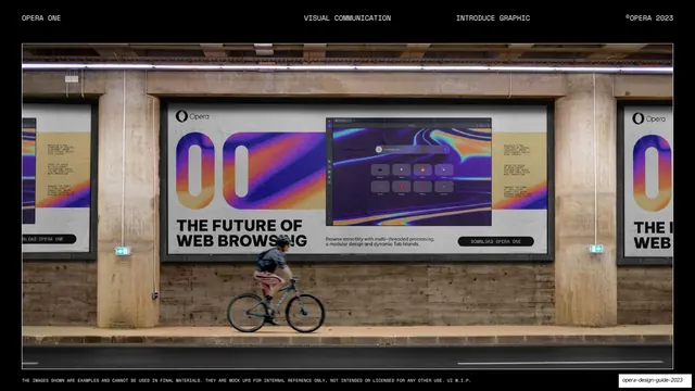
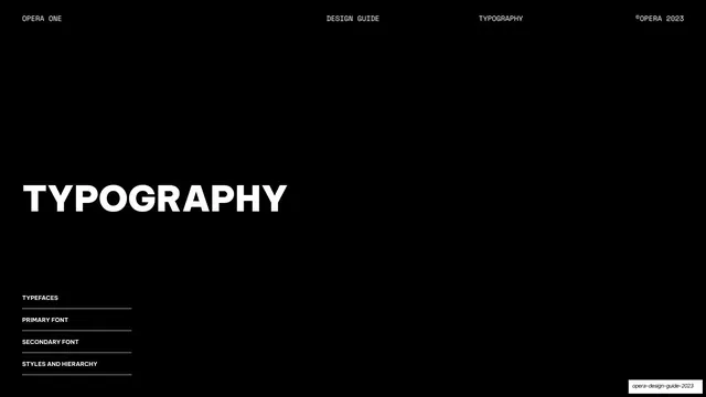
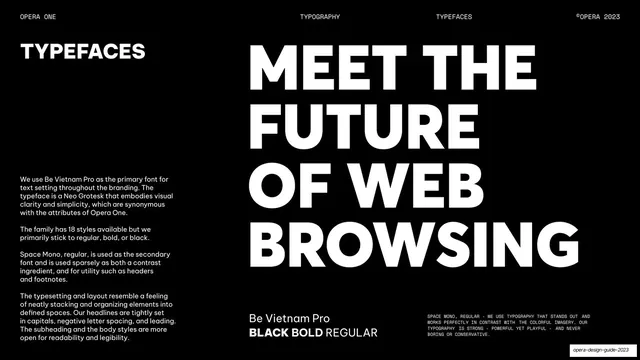
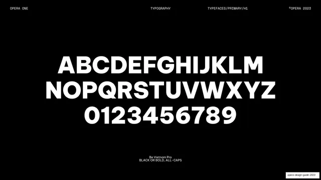
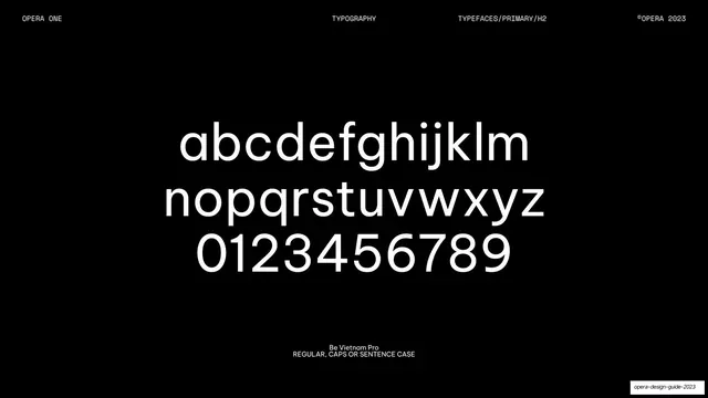
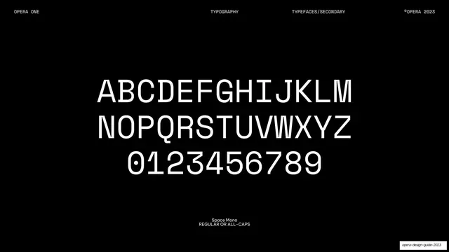
Pages run 16:9 and lean overwhelmingly dark, with pure-black (#000000) backgrounds; a handful break to near-white or full-bleed gradient (the color-palette split, the light start-page mockup) and several use real-world photographic poster mockups. Every page carries the same monospace running header on a hairline rule: "OPERA ONE" left, a centered section label, a sub-section label, and "©OPERA 2023" right. Section-divider pages share one grammar: a large left-aligned all-caps headline ("LOGO", "COLORS AND GRADIENTS", "TYPOGRAPHY", "IN SITU EXAMPLES") with a small bottom-left contents list separated by hairline rules. The type system is explicit and used as content: Be Vietnam Pro (a Neo Grotesk) is the primary face, set tightly in all-caps black for headlines and regular for body, while Space Mono is the secondary face for headers, footnotes, and disclaimers. The color system is a black/white base plus a named expressive palette (Island Blue #4E23F7, Canyon Coral #DF4E60, Oasis Orange #EC8D54, Archipelago Avocado #5EBF98, Plateau Primrose #EDC57D, Summit Saphire #3178F0, Fjord Azure #4BE7DD, Peninsula Purple #A879DA, Parasol Pink #FE79DE) and fluid iridescent gradients. Recurring devices: the Opera "O" used huge and cropped as a window onto gradient artwork or product UI; three-up icon and characteristic/use-case cards; tick-and-cross do/don't grids; clear-space and lockup diagrams with X/Y measurement units; browser start-page screenshots in dark and light; transit-poster and mural mockups carrying the "Meet the future of web browsing" campaign; and full-bleed type specimens.
Key takeaway
The discipline of a single monospace running header that locates every page (product / section / sub-section / copyright) and turns navigation into ornament. The two-typeface contract stated plainly: one Neo Grotesk doing all the loud all-caps headline work, one monospace doing all the quiet utility work. And the strongest move: keeping the entire system black-and-white and then letting one named, expressive palette plus fluid gradients carry all the color and emotion, used sparingly through the Opera "O" as a cropping mask.
Reuse notes
A strong reference for product and brand guideline decks, developer-tool and consumer-app identities, and any dark-mode system that needs to feel both technical and expressive. The divider-with-contents-list, three-up characteristic cards, do/don't tick grids, clear-space diagrams, and type-specimen pages are directly reusable as a guideline template. Depends on genuinely good gradient artwork and real photographic mockups to carry its emptier black pages; the all-caps oversized headline only works with a strong grotesque.