Preview image. Unlock full-res
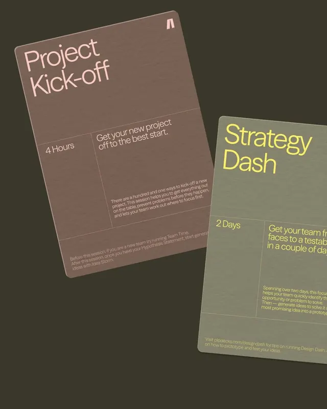
Two minimalist printed poster-style cards with oversized sans-serif headings and small grid-based explanatory copy on a dark olive background.

Summary
Two minimalist printed poster-style cards with oversized sans-serif headings and small grid-based explanatory copy on a dark olive background.
Visual description
The image shows two large rounded-rectangle cards tilted at different angles on a dark olive background. The left card is brown with pale pink text reading "Project Kick-off" and the right card is sage gray with bright yellow text reading "Strategy Dash," both divided into thin-lined grid sections with smaller explanatory copy.
Key takeaway
Use oversized, lightweight sans-serif titles paired with a restrained grid to make informational content feel premium and structured. The overlap and rotation add energy without breaking the minimal system.
Reuse notes
This approach works well for workshop decks, service offerings, or editorial promo pieces where the headline needs to dominate but supporting details still matter. It is especially effective when you want a tactile printed feel with a calm, modern tone.
More like this






Keep what you find
A free account saves references to boards and can send you a weekly email of picks based on what you save.
To see every result, go Pro.