Preview image. Unlock full-res
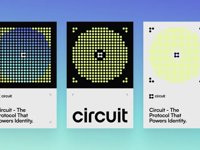
Three framed poster designs are displayed on a textured wall, using bold typography, a neon yellow panel, a portrait-centered middle panel, and a dark text-heavy panel.
Summary
Three framed poster designs are displayed on a textured wall, using bold typography, a neon yellow panel, a portrait-centered middle panel, and a dark text-heavy panel.
Visual description
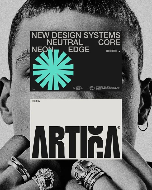
The image shows three vertical framed posters mounted side by side on a rough beige wall. The left poster is a bright yellow typographic block, the center poster features a close-up portrait overlaid with a logo, and the right poster is a black poster with stacked white copy.
Key takeaway
Use a triptych system to vary one concept across three distinct treatments: bold type, image-led center, and dense copy. The high-contrast yellow-on-black visual language makes the set feel cohesive while still giving each panel a separate function.
Reuse notes
This approach works well for brand campaigns, portfolio displays, and poster series where you want one idea to feel expanded rather than repeated. It is especially effective when the environment is part of the presentation, because the framed mockup adds realism and perceived polish.