Preview image. Unlock full-res
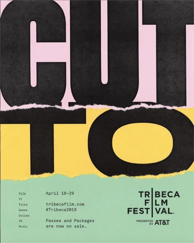
A bold festival poster design with layered typography in pink, black, and yellow, showing torn paper edge effects.

Summary
A layered festival poster for Tribeca Film Festival featuring bold display typography split across three color zones: soft pink, charcoal, and yellow, with raw torn-paper edges between sections.
Visual description
Vertical poster composition split into three visual layers. Upper section shows HUT in oversized sans-serif on a soft pink background. Middle section separates with a torn white paper edge effect, showing TRO in charcoal on a textured dark background. Lower section continues with yellow-green background holding lowercase text in black and event details. Torn paper effects at layer boundaries create visual dynamism and rawness. Bottom includes information lines: File, TV, Talks, Games, Online, VR, Music categories and dates (April 18-29), along with tribecafilm.com and Tribeca Film Festival branding. The typography emphasizes geometric sans-serif letterforms scaled to dominate the composition.
Key takeaway
Festival posters using layered color-blocking and torn-paper effects for visual interest and tactile appeal. The torn-paper transitions suggest deconstructed, contemporary design thinking. The bold color choices (pink-charcoal-yellow) are unexpected but cohesive, and the broken layout invites closer inspection of details.
Reuse notes
Excellent for film, art, music, or cultural event promotions seeking a creative, contemporary aesthetic. The torn-paper effect is memorable and print-friendly. The color blocking works at various scales. Best reproduced in print where the torn edges can show texture. Pairs well with experimental or avant-garde event positioning. The type hierarchy is clear despite the fragmented layout, making it suitable for posters, social media, and promotional materials.