Preview image. Unlock full-res
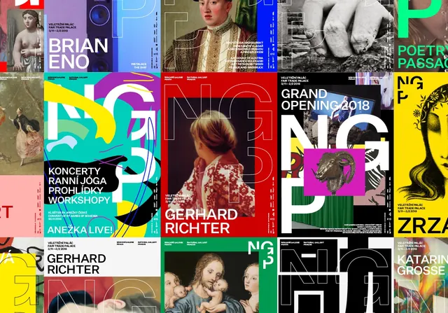
A vibrant identity system for the National Gallery Prague featuring bold typography, cultural imagery, and a warm earth-tone palette centered on deep teal, terracotta, and beige.
Summary
A cultural identity system for the National Gallery Prague that uses bold typography, layered photography, and a sophisticated warm-toned palette to convey institutional prestige and creative energy.
Visual description
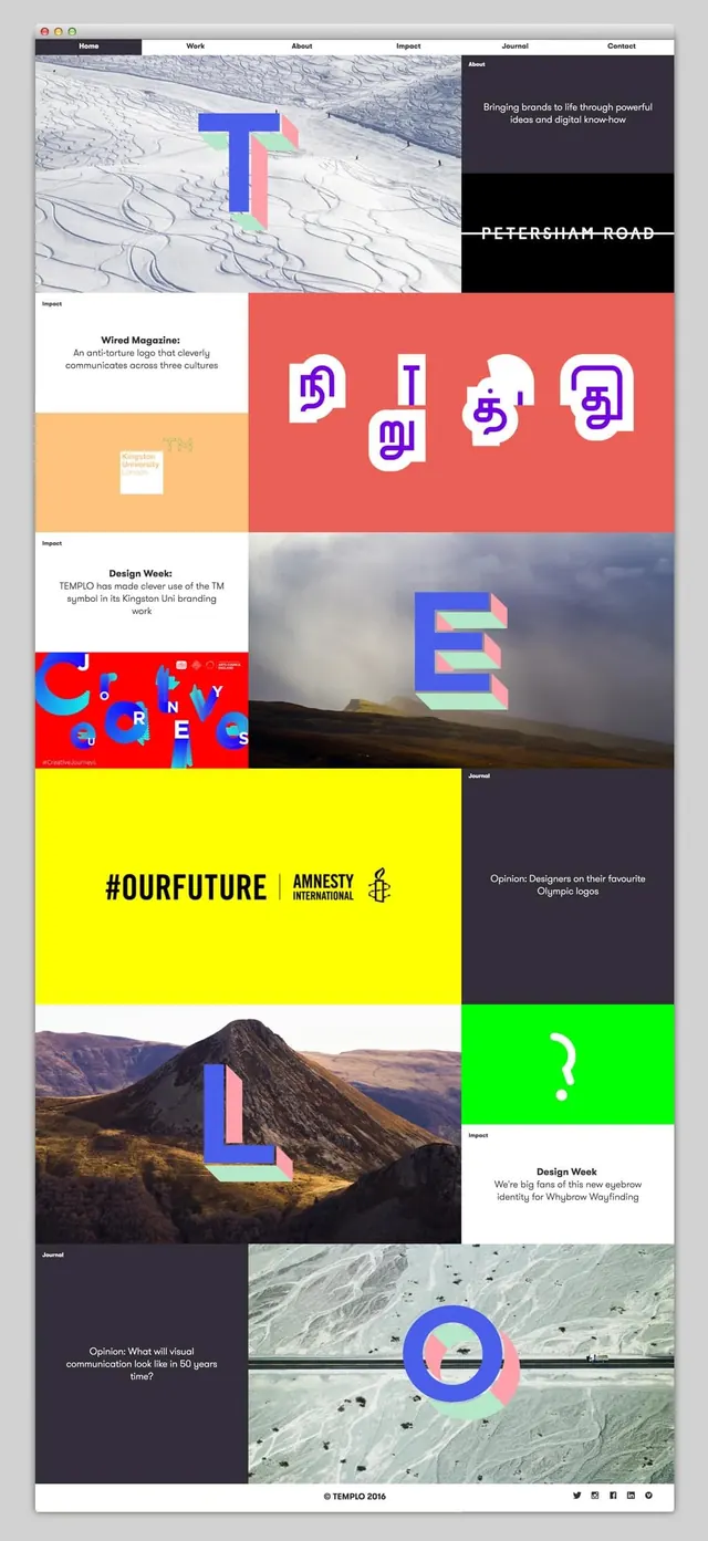
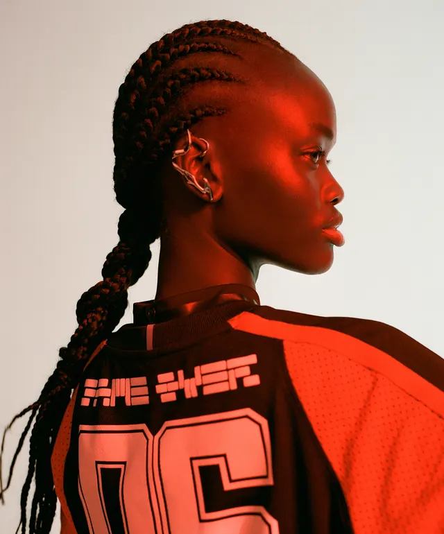
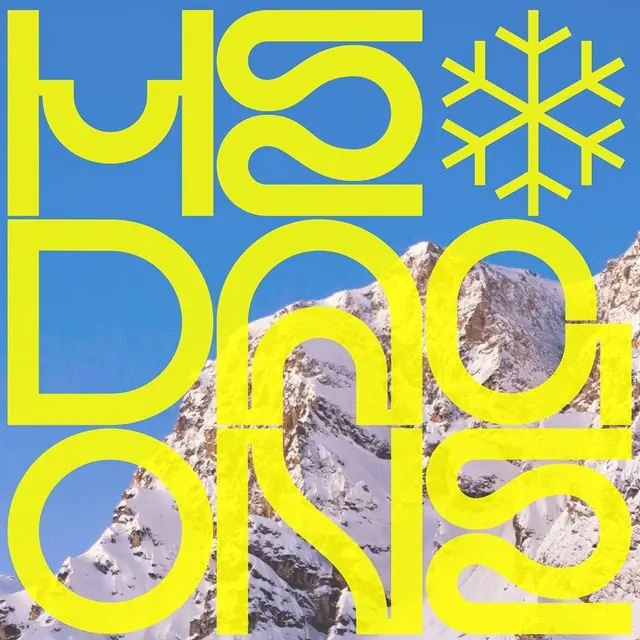
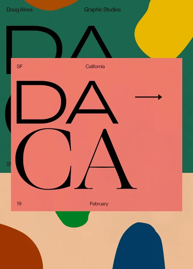
The composition showcases a poster grid featuring overlapping imagery of performers, musicians, and cultural figures. Large-scale typography is integrated throughout—band names like "GERHARD RICHTER" and event titles compete with imagery in bold sans-serif display faces. Colors shift between deep teals, warm beige, vibrant red-orange accents, and gold highlights. The arrangement is deliberately chaotic and maximalist, creating visual excitement through layered elements and dramatic cropping.
Key takeaway
The identity demonstrates how overlapping imagery and bold display type can coexist without hierarchy chaos—the warm earth palette unifies disparate visual elements. The teal-to-terracotta contrast creates visual punch while maintaining cultural gravitas.
Reuse notes
Ideal for cultural institutions, museums, and festivals seeking a contemporary yet sophisticated brand system. The approach works well for promotional campaigns where imagery variety is an asset rather than a liability. Works best with high-quality photography and display typefaces that can command space. May overwhelm in smaller contexts; requires sufficient real estate to shine.