Preview image. Unlock full-res
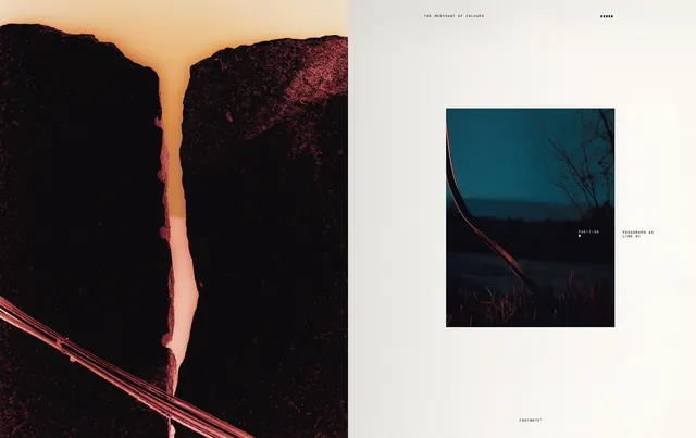
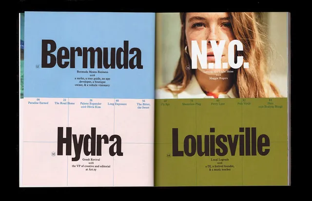
An editorial publication spread featuring a dramatic landscape photograph on the left page paired with a smaller image and minimalist typography on the right, exemplifying contemporary magazine design.
Summary
An editorial publication spread from Footnote No.2 pairing a dramatic landscape photograph with minimalist typography and supporting imagery, demonstrating contemporary magazine layout principles.
Visual description
An open publication spread shows a two-page layout. The left page features a large dramatic landscape photograph capturing a canyon or gorge with a thin light-colored river or crevice illuminated against dark rock walls, shot at golden hour. The right page has a light background with a smaller landscape photograph positioned in the center-right, accompanied by minimal text and page numbers. The typography is clean, contemporary sans-serif in black. Subtle color accents and fine lines provide structure without visual clutter. The overall approach emphasizes photography and whitespace, following a modern editorial aesthetic.
Key takeaway
Generous use of whitespace and carefully proportioned imagery create sophistication and allow photography to be the primary communication. Minimal typography supports rather than competes.
Reuse notes
Strong reference for magazine and publication design, art direction, and editorial layout. The asymmetrical balance and photography-focused approach work well for arts publications, design magazines, and lifestyle content. The technique is effective for portfolios, lookbooks, and branded publications.
More like this


Keep what you find
A free account saves references to boards and can send you a weekly email of picks based on what you save.
To see every result, go Pro.