Preview image. Unlock full-res
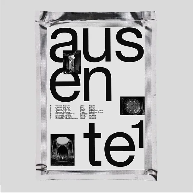
Asymmetric magazine layout featuring oversized serif type reading "AUSTEN" paired with architectural photographs of interior spaces and details.
Summary
An editorial magazine spread displaying oversized serif typography paired with architectural photography, using asymmetric layout to balance large type with detailed interior and structural images.
Visual description
Vertical magazine spread photographed as a mounted or printed page. Large serif typography reading "AUSTEN" dominates the upper half and left side in dark gray or black. Below and to the right: black and white architectural photographs showing interior corridor spaces with dramatic perspective and structural details. Smaller text appears beneath the photographs containing location and descriptive information. Additional line sketches or architectural diagrams appear integrated with the photographs. Layout uses generous white space and asymmetric balance to allow the large type to coexist with detailed imagery. Overall aesthetic emphasizes architectural sophistication, editorial refinement, and careful typographic hierarchy.
Key takeaway
Using oversized serif typography as a design element equal to photography, creating visual hierarchy through scale and asymmetric placement. The architectural subject matter and refined palette convey institutional credibility.
Reuse notes
Excellent template for architecture publications, design magazines, and art-focused media. The asymmetric layout technique works for editorial design across various industries. The serif-forward approach conveys institutional authority and editorial prestige. Adapt the typography, imagery, and layout direction for different subjects while maintaining the balance of type and imagery.
More like this



Keep what you find
A free account saves references to boards and can send you a weekly email of picks based on what you save.
To see every result, go Pro.