Preview image. Unlock full-res
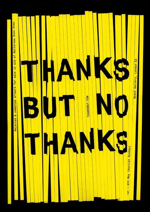
High-contrast black and yellow book or poster cover with bold sans-serif text reading "thanks but no thanks".
Summary
High-contrast book or poster design with bold black sans-serif text stacked vertically centered on a bright yellow background with repeating vertical line pattern.
Visual description
Bright yellow background completely filled with repeating thin black vertical lines creating a striped texture. Centered over this pattern, black sans-serif text reading "THANKS BUT NO THANKS" is stacked in three lines, rendered in heavy weight all-caps. Fine print runs along all four edges of the cover in small black type. The overall effect is maximalist and graphic with strong visual contrast between the bright yellow and pure black elements.
Key takeaway
Simple duotone palette creates maximum impact and legibility. The repeating line pattern adds texture without competing with the typography. The playful, witty copy combined with bold sans-serif creates personality on what could be a corporate or serious context, subverting expectations through tone.
Reuse notes
Excellent template for book covers, posters, or branding where bold personality and humor are goals. The vertical-line texture adds visual interest without requiring imagery. Works particularly well for design critique, humor, or counterculture contexts. The 2-color constraint means it prints/reproduces cleanly and cheaply. May feel dated as gradients and minimalism trend; best used when the bold graphic style is intentional to the brand voice.