Preview image. Unlock full-res
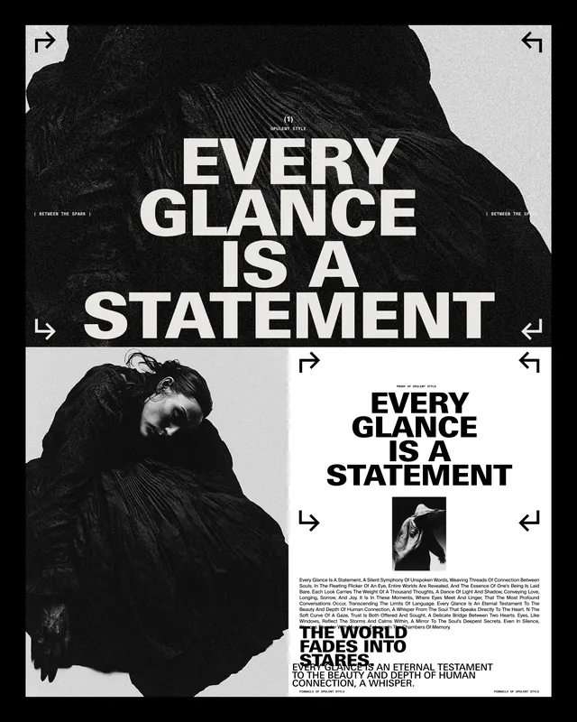
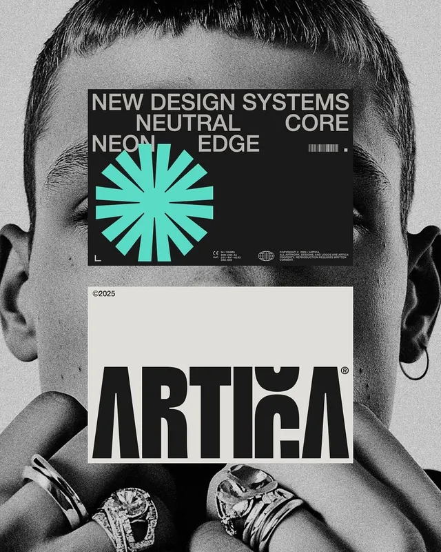
A monochrome poster composition uses a grainy black-and-white portrait background with two centered graphic panels and bold typography.

Summary
A monochrome poster composition uses a grainy black-and-white portrait background with two centered graphic panels and bold typography.
Visual description
A close-cropped black-and-white portrait fills the background, with visible grain and a high-contrast, editorial look. Two centered rectangular panels sit on top: a dark upper block with large pale text and a cyan geometric burst, and a light lower block with oversized black lettering.
Key takeaway
Use stacked overlay panels to create hierarchy over a photographic background, with one bold accent shape to break the grid. Keep typography huge, condensed, and all-caps so the composition reads like a fashion or identity poster immediately.
Reuse notes
This works well when you want a poster, cover, or campaign visual that feels contemporary and art-directed. It is strongest when the background image is already dramatic and you want the layout to feel like a designed object rather than a pure photo.