Preview image. Unlock full-res
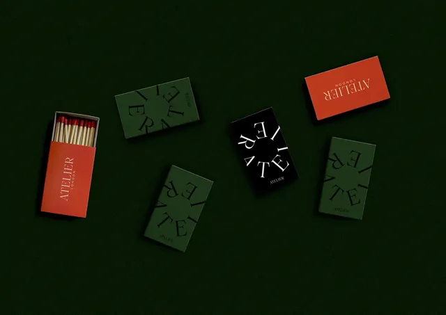
Cohesive brand packaging collection featuring green and red boxes with geometric typography on dark green background.
Summary
A curated packaging collection showing ATELIER brand identity with coordinated green and red boxes, matches, and geometric typography.
Visual description
A styled flat-lay composition on a deep forest green background featuring several packaging items arranged asymmetrically. A bright red matchbox on the left displays white text "ATELIER" with a strike plate. Multiple sage-green rectangular boxes are arranged in the center and right, each featuring geometric line-based typography. A black circular design with white type appears centrally. An orange-red product card or box is visible upper right. A smaller green item appears lower right. The typography appears to be sans-serif and geometric, with letters deconstructed into simple marks. The color palette is minimal: dark forest green, muted sage green, bright red, black, and white.
Key takeaway
How a limited color palette and consistent typographic approach unify diverse packaging into a cohesive brand system. The geometric type treatment creates a distinctive, contemporary identity. Minimalism in execution allows color to carry the design.
Reuse notes
Excellent reference for luxury or contemporary brand identity systems. The minimal approach scales well across product types and formats. Works well for design-forward product lines, artisanal goods, or premium positioning. The geometric type is contemporary but could date quickly; ensure it aligns with brand longevity. The color combination is striking and memorable.