Preview image. Unlock full-res
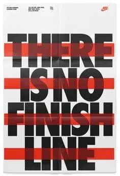
A minimalist black and red typography poster with bold sans-serif text and Nike Swoosh, featuring layered overlapping letterforms in a high-contrast composition.
Summary
A bold typography poster featuring overlapping, layered sans-serif text reading "There is no finish line" in black and red with a Nike Swoosh accent on a light background.
Visual description
All-caps sans-serif text layered and overlapping to create visual depth through color blocking. Black letterforms with red horizontal bars and accent shapes cut through the composition. A small Nike Swoosh appears in the top right corner. Light gray background creates clean contrast. The overlapping composition creates visual rhythm while maintaining strong legibility through bold weight and high contrast.
Key takeaway
Layered, overlapping typography with color blocking and strategic accent shapes creates visual interest while maintaining an athletic, professional tone.
Reuse notes
Strong reference for sports branding, motivational posters, or minimal typography-driven design where overlapping elements build visual hierarchy without illustrations.