Preview image. Unlock full-res
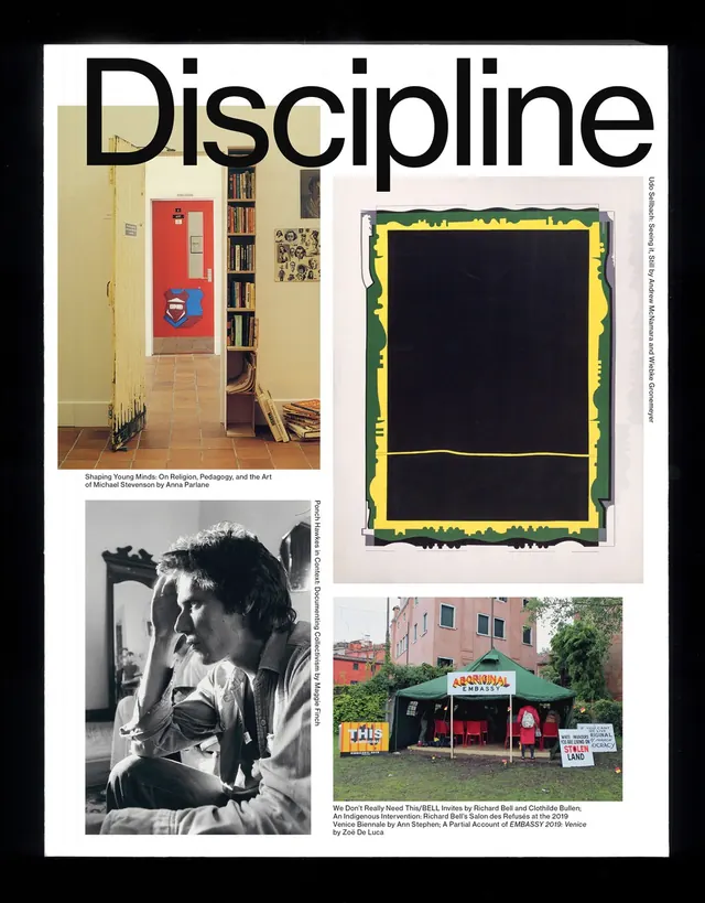
An editorial design layout for a magazine called Discipline featuring a collage of images including interior, portraiture, and street scenes with bold sans-serif headline.
Summary
An editorial layout for Discipline magazine featuring a bold collage of photographs and artwork arranged with overlapping compositional hierarchy and sans-serif typography.
Visual description
A white magazine cover or spread is shown against a black background. A large black sans-serif headline reading "Discipline" spans the top. Below is a collage of four distinct images arranged in an asymmetric grid: an architectural interior with yellow walls and red accents, a black-and-white portrait of a person, a neon yellow and green framed artwork, and a street scene of a storefront. Each image is cropped and sized differently. Small gray text captions appear below some images. The composition balances the hierarchy through size and placement rather than strict alignment. The overall palette is muted earth tones with accents of neon.
Key takeaway
The asymmetric collage layout creates visual interest without chaos through careful proportioning and cropping. The bold sans-serif headline anchors the composition and sets a strong editorial voice. The mix of photography types and artwork suggests editorial depth while maintaining visual cohesion.
Reuse notes
Excellent for editorial design, magazine layouts, and cultural publications. The technique applies to portfolio presentations, exhibition catalogs, and lookbooks. Works well for design-forward publications and cultural institutions. Strong for combining multiple photography styles within a single composition while maintaining clarity.
More like this


Keep what you find
A free account saves references to boards and can send you a weekly email of picks based on what you save.
To see every result, go Pro.