Preview image. Unlock full-res
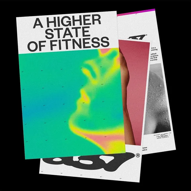
Modern magazine spread layout with vibrant thermal imaging/heatmap alongside brand mark, text, and fitness-focused photography.

Summary
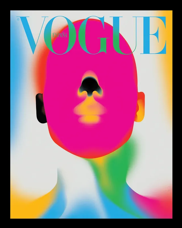
An editorial magazine spread featuring layered design elements: bold headline text, a vibrant thermal/heatmap visualization in cyan-yellow-magenta gradients, a brand mark, and additional typography and photography arranged in an overlapping composition.
Visual description
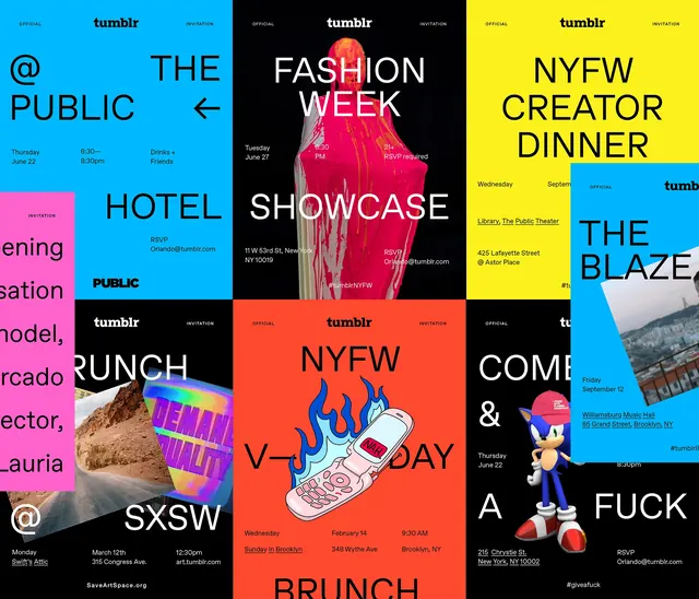
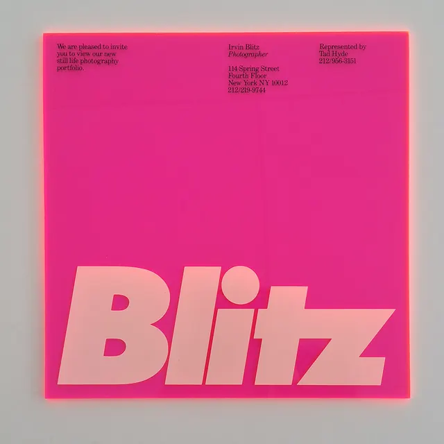
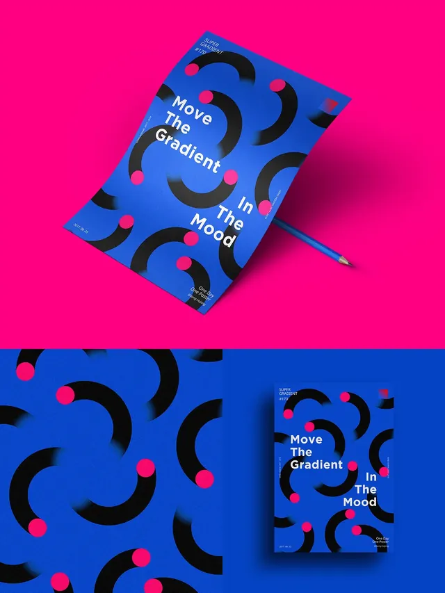
The layout uses a perspective/3D tilt effect, stacking multiple magazine pages or cards at angles against a black background. The dominant visual is a large heatmap-style thermal image rendered in bright cyan, yellow, and magenta—evoking either scientific data visualization or human body heat mapping. A bold sans-serif headline "A HIGHER STATE OF FITNESS" sits prominently in black text. The brand mark (a simple geometric symbol) appears bottom-center. Additional supporting copy and a grayscale photographic element (possibly an athlete or body detail) fills the lower right. Bright cyan and magenta accents frame and separate design zones. The composition has a dynamic, layered depth created by the overlapping page effect.
Key takeaway
Thermal/scientific data visualization as a design accent: the heatmap brings energy, modernity, and technical credibility to a fitness brand without relying on typical athletic photography. Vibrant neon color palette energizes the layout and conveys "science-backed" without being cold. Layered perspective adds visual depth and playfulness.
Reuse notes
Strong approach for tech-forward fitness, health-tech, or sports science brands. The heatmap aesthetic works well for projects touching on performance metrics, biometrics, or data-driven optimization. Gradient color palette is trend-forward but ensure hierarchy remains clear against busy colors. The overlapping card/page perspective is effective for printed materials, digital magazine layouts, or landing pages. Pairs well with bold sans-serif typography. May feel trendy in 2–3 years; use sparingly for brand core, more liberally for seasonal campaigns.