Preview image. Unlock full-res
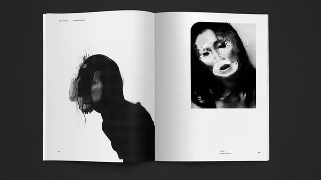
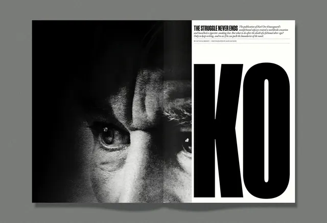
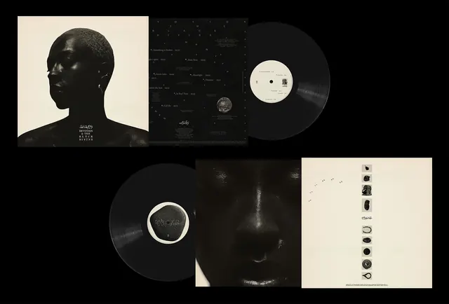
An open book featuring two high-contrast, black and white experimental photographic portraits on a white background.
Summary
An open book featuring two high-contrast, black and white experimental photographic portraits on a white background.
Visual description
The spread features two large-scale, high-contrast black and white photographs. The left image shows a dark silhouette of a person with textured hair, while the right image shows a close-up of a face with distorted, surreal features. Small sans-serif text is placed at the top and bottom margins of the pages.
Key takeaway
Use extreme high-contrast monochrome photography to create a dramatic and artistic editorial impact.
Reuse notes
Ideal for art books, fashion lookbooks, or avant-garde magazine layouts.
More like this
Keep what you find
A free account saves references to boards and can send you a weekly email of picks based on what you save.
To see every result, go Pro.