Preview image. Unlock full-res
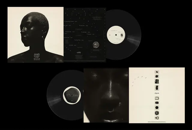
A collection of high-contrast black and white album artwork, vinyl records, and back cover layouts featuring photographic portraits and celestial motifs.
Summary
A collection of high-contrast black and white album artwork, vinyl records, and back cover layouts featuring photographic portraits and celestial motifs.
Visual description
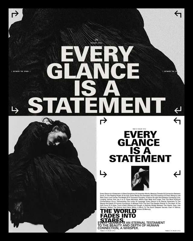
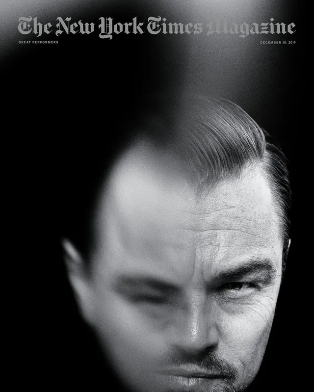
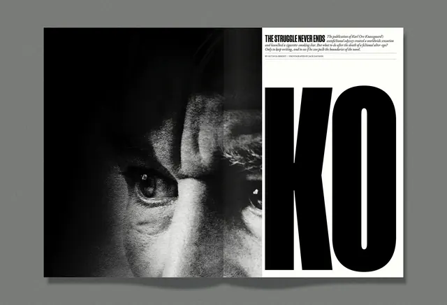
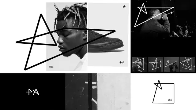
The composition features high-contrast, low-key photographic portraits of a person in profile and close-up. The layouts include a dark back cover with small white text and celestial star-like dots, alongside a light-colored back cover featuring a vertical column of small circular icons. The vinyl discs are black with white center labels.
Key takeaway
Use extreme chiaroscuro lighting and high-contrast monochrome photography to create a dramatic, premium aesthetic.
Reuse notes
Reach for this style when designing high-end physical media packaging or moody editorial photography for music and fashion.