Preview image. Unlock full-res
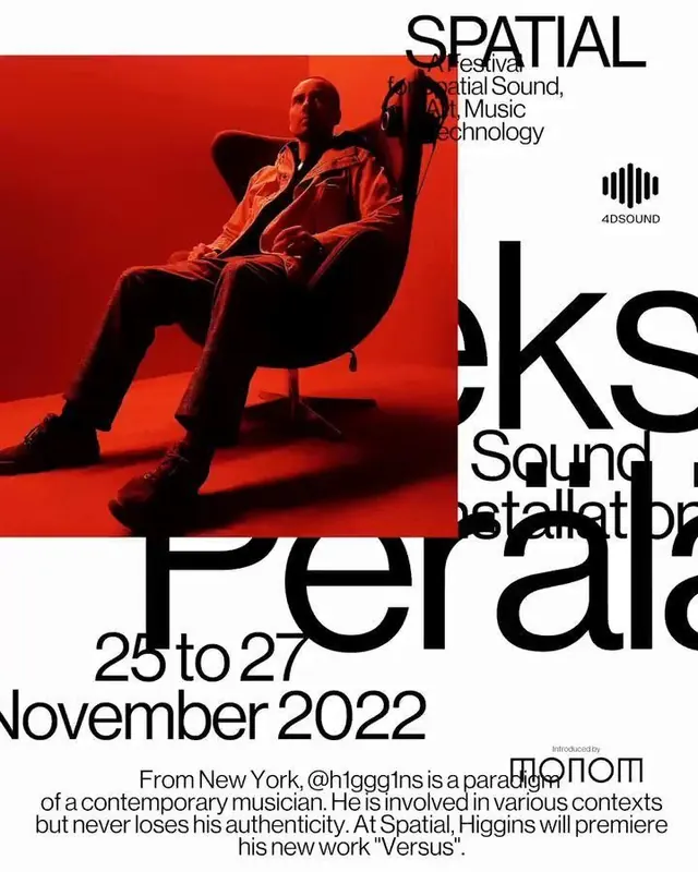
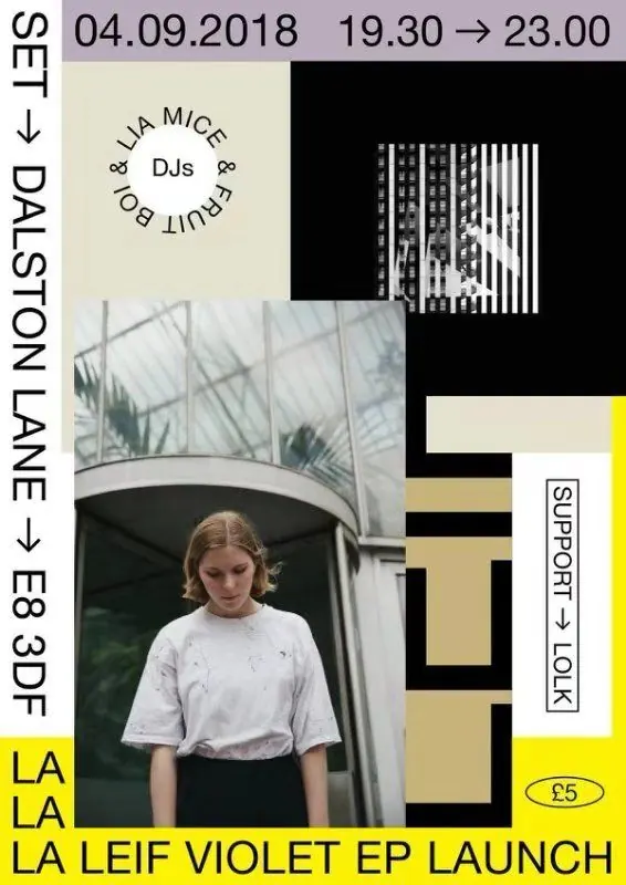
A high-contrast event poster combines a portrait photo with black, cream, yellow, and lilac blocks and bold vertical typography.
Summary
A high-contrast event poster combines a portrait photo with black, cream, yellow, and lilac blocks and bold vertical typography.
Visual description
The piece is a poster-style layout with a lilac top bar, a vertical white strip on the left, and a large black field taking up much of the right side. A portrait photo sits in the lower left center, while a striped black-and-white image, boxed labels, and stacked cream and yellow blocks are layered around it.
Key takeaway
Use a strong modular collage with overlapping rectangular color fields to create hierarchy fast. Pair vertical side text with a photo anchor to make the layout feel more like an object than a flat flyer.
Reuse notes
Reach for this when you want an event or music announcement to feel curated, tactile, and poster-like. It works best when there is one hero image and only a few key facts to emphasize.