Preview image. Unlock full-res
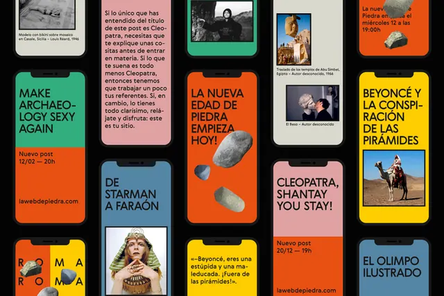
A grid of bold poster-like tiles with Spanish typography and cutout imagery on a black background.
Summary
A grid of bold poster-like tiles with Spanish typography and cutout imagery on a black background.
Visual description
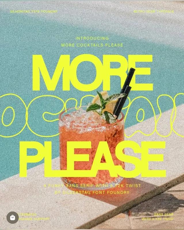
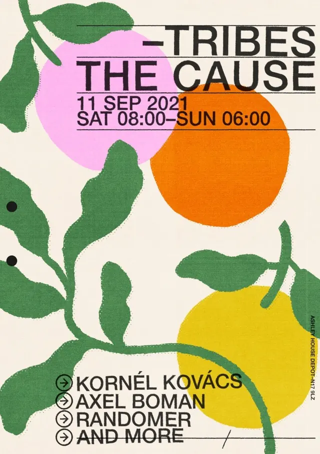
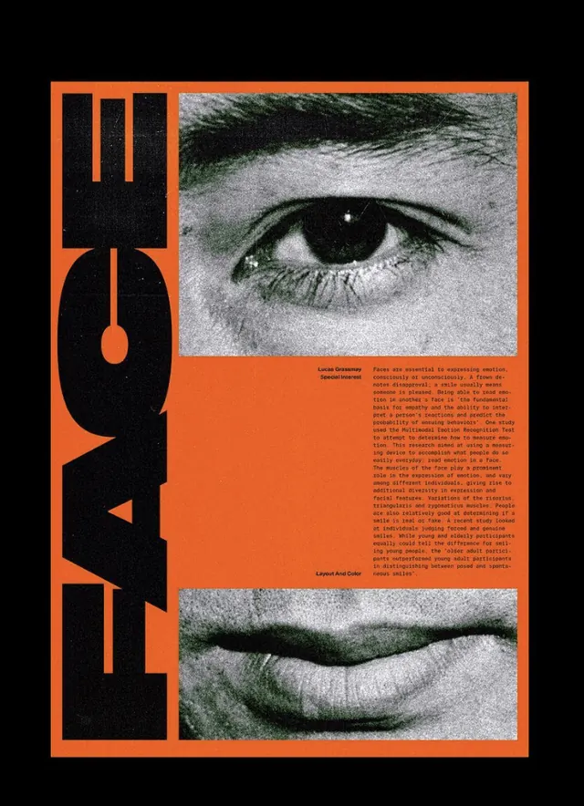
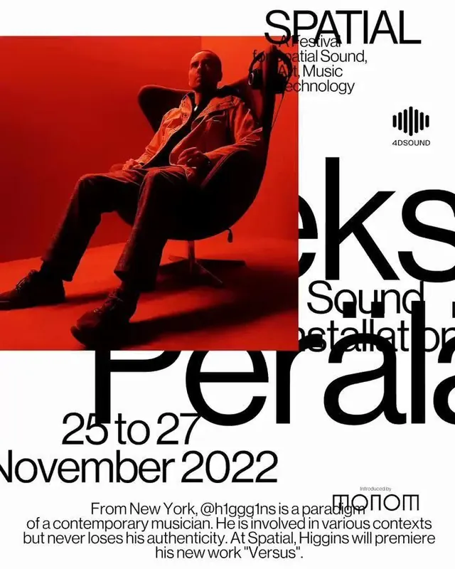
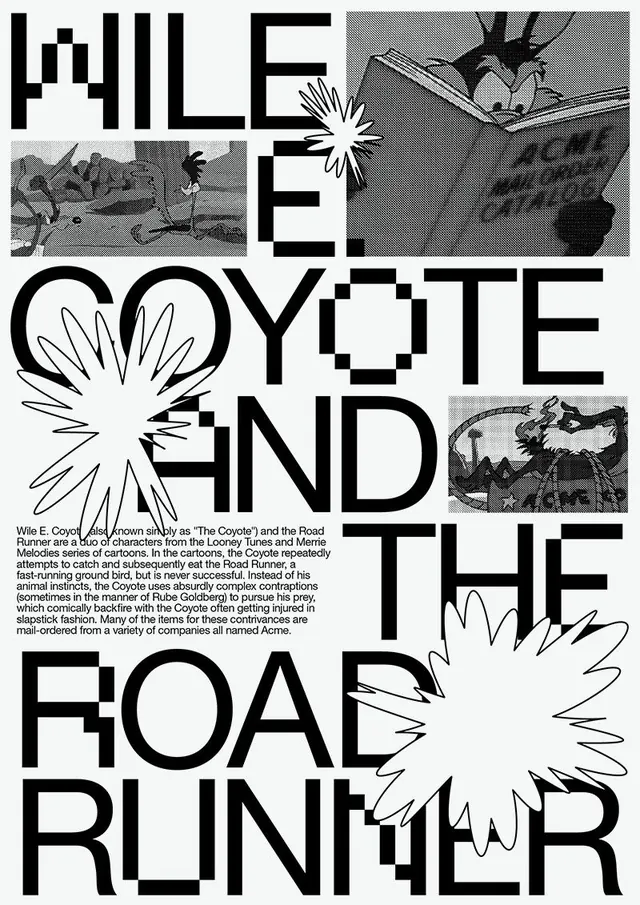
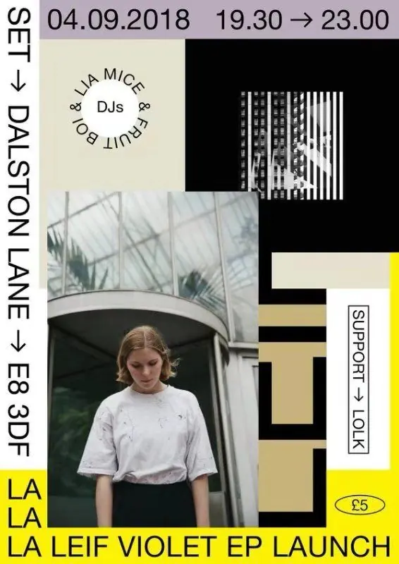
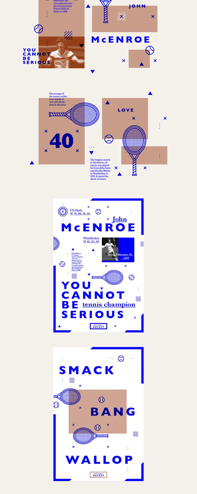
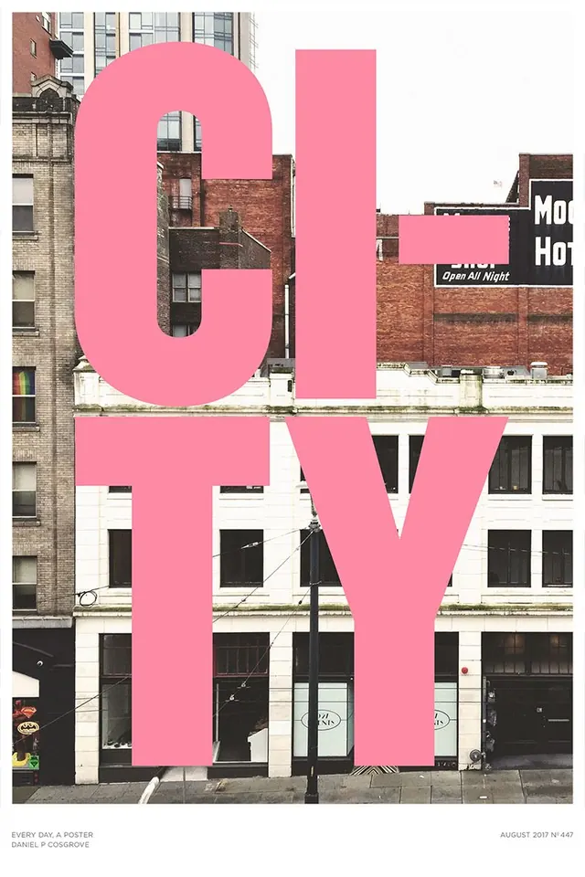
The image shows a black canvas filled with multiple poster designs arranged in a loose three-column grid, many framed inside smartphone-shaped mockups. Most tiles use large sans-serif Spanish headlines, bright flat color blocks, and a few photographic or stone cutout elements.
Key takeaway
Use a strict black background with repeated poster modules to make each message feel like part of a coherent series. Mix oversized typography with one tactile image element per tile for strong contrast and quick visual scanning.
Reuse notes
This works well for social campaign systems, inspiration boards, or editorial promo sets where each panel needs its own message but the whole collection should feel unified. Reach for it when you want bold typographic hierarchy without relying on complex illustration or layout tricks.