Preview image. Unlock full-res
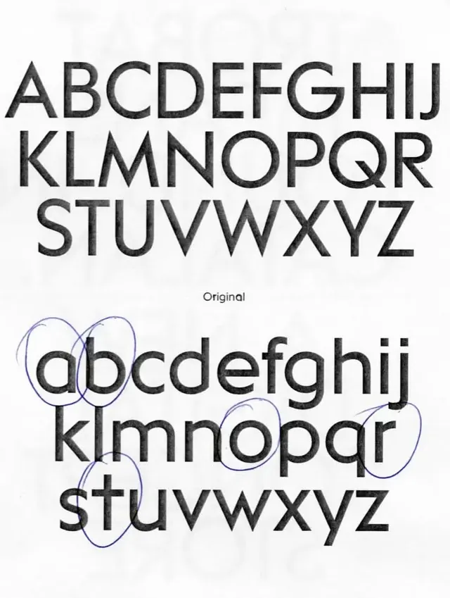
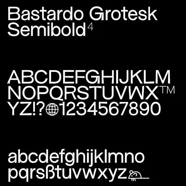
The image presents a stark, high-contrast typographic study contrasting standard uppercase letters with a handwritten or informal lowercase rendition.
Summary
The image presents a stark, high-contrast typographic study contrasting standard uppercase letters with a handwritten or informal lowercase rendition.
Visual description
The image presents a stark, high-contrast typographic study contrasting standard uppercase letters with a handwritten or informal lowercase rendition. The design emphasizes the relationship between formal, structured typography and more fluid, expressive script. The composition is vertically organized, presenting two distinct sets of alphabetical characters stacked one above the other for direct comparison. Two distinct typographic styles are shown: a clean, standard uppercase font and an informal, slightly messy lowercase script.
Key takeaway
A type specimen reference. Worth saving for its typographic, contrast, minimalist treatment.
Reuse notes
Fits general design work.
More like this
Keep what you find
A free account saves references to boards and can send you a weekly email of picks based on what you save.
To see every result, go Pro.