Preview image. Unlock full-res
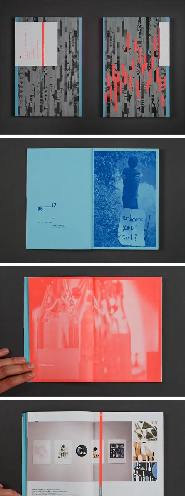
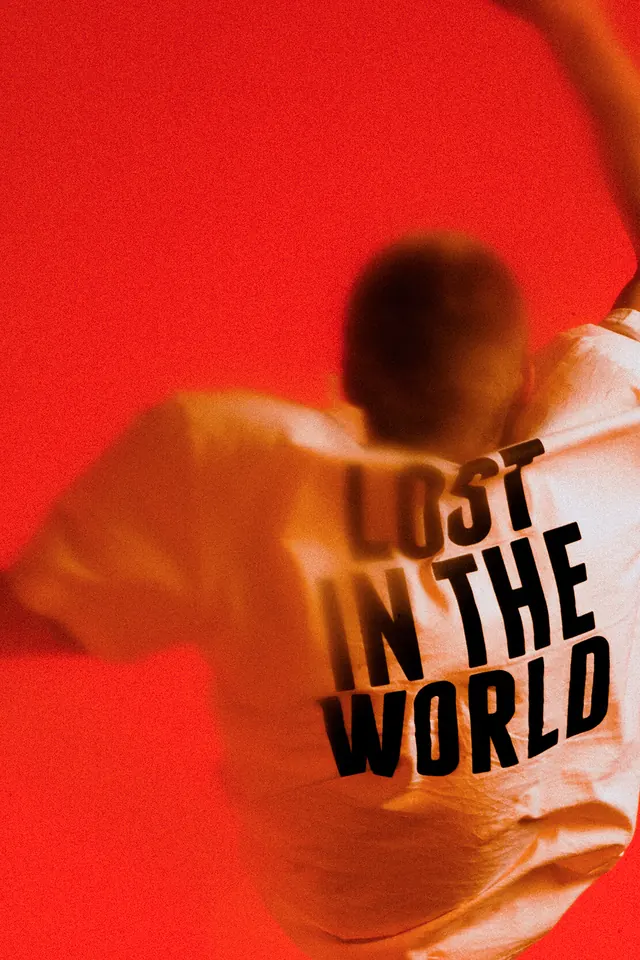
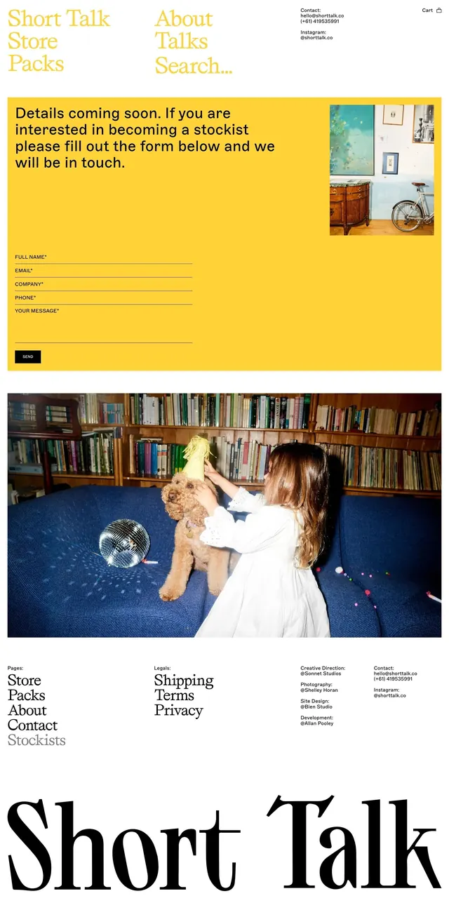
A collection of editorial design spreads featuring duotone color treatments and experimental typographic layouts paired with photography.
Summary
A multi-page editorial layout showcasing duotone photography techniques paired with clean sans-serif typography, demonstrating color separation and experimental photo treatment.
Visual description
Multiple magazine spreads stacked vertically, alternating between duotone-treated photographs in red-cyan and cool blue tones paired with sans-serif body copy and headlines. Photography includes architectural details and figures. Clean grid-based layout with ample white space. Type is flush left, sans-serif in varying weights and sizes.
Key takeaway
Duotone color separation creates visual interest while maintaining legibility; strategic use of white space between photography and type creates rhythm across spreads.
Reuse notes
Strong reference for editorial design using color theory. Works well when consistent duotone treatment is applied across multiple images for visual cohesion.
More like this





Keep what you find
A free account saves references to boards and can send you a weekly email of picks based on what you save.
To see every result, go Pro.