Preview image. Unlock full-res
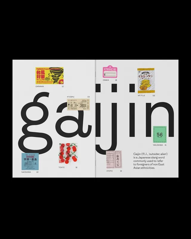
This spread utilizes a stark, high-contrast typographic approach, emphasizing the large, bold rendering of the word 'gajin' against vast amounts of white space.
Summary
This spread utilizes a stark, high-contrast typographic approach, emphasizing the large, bold rendering of the word 'gajin' against vast amounts of white space.
Visual description
This spread utilizes a stark, high-contrast typographic approach, emphasizing the large, bold rendering of the word 'gajin' against vast amounts of white space. The design balances heavy textual weight with subtle graphic elements, creating an impactful and culturally resonant visual experience. The composition is dominated by massive, centered typography that anchors the page, utilizing significant negative space to enhance the visual impact. Heavy, impactful sans-serif for the main title; smaller, legible fonts for supplementary information.
Key takeaway
A type specimen reference. Worth saving for its minimalist, typographic, bold treatment.
Reuse notes
Fits media work.
More like this
Keep what you find
A free account saves references to boards and can send you a weekly email of picks based on what you save.
To see every result, go Pro.