Preview image. Unlock full-res
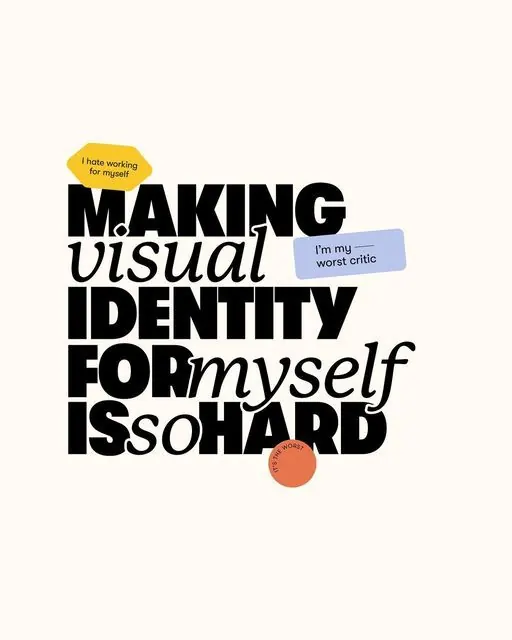
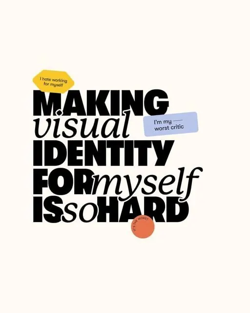
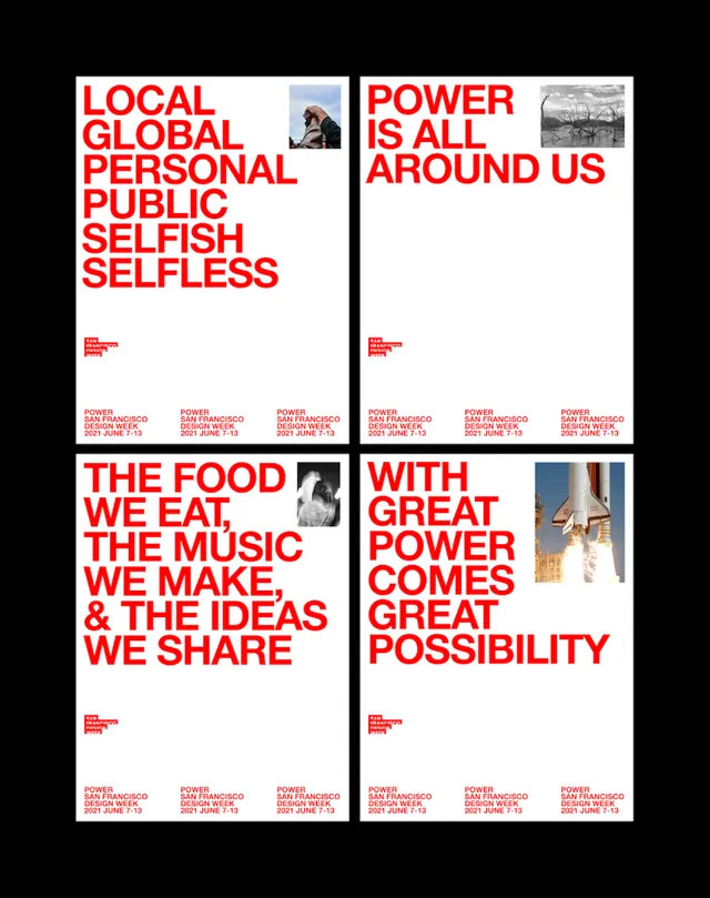
This is a bold, high-contrast typographic design that uses all-caps sans-serif text to convey a strong, assertive message about the difficulty of self-criticism.
Summary
This is a bold, high-contrast typographic design that uses all-caps sans-serif text to convey a strong, assertive message about the difficulty of self-criticism.
Visual description
This is a bold, high-contrast typographic design that uses all-caps sans-serif text to convey a strong, assertive message about the difficulty of self-criticism. The layout is stacked and impactful, relying heavily on negative space around the text blocks for emphasis. The text is centrally aligned and stacked vertically, creating a dense block of information that draws immediate attention. Bold, heavy, all-caps sans-serif typeface is used throughout.
Key takeaway
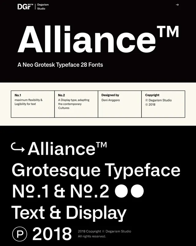
A type specimen reference. Worth saving for its typographic, bold, minimalist treatment.
Reuse notes
Fits general design work.
More like this

Keep what you find
A free account saves references to boards and can send you a weekly email of picks based on what you save.
To see every result, go Pro.