Preview image. Unlock full-res
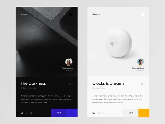
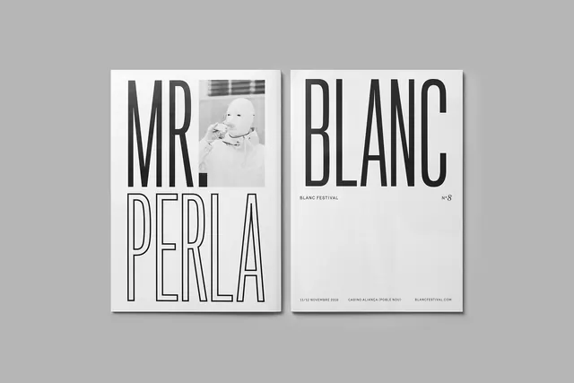
A side-by-side visual comparison of two distinct editorial layouts featuring high-contrast photography and minimalist typography.
Summary
A side-by-side visual comparison of two distinct editorial layouts featuring high-contrast photography and minimalist typography.
Visual description
The left side features a dark, moody photograph of a textured surface with white text and a small circular portrait. The right side features a bright, white minimalist composition with a 3D-like sphere object and clean black typography.
Key takeaway
The design demonstrates how contrasting light and dark themes can maintain a consistent minimalist aesthetic through balanced white space and typography.
Reuse notes
Use this layout structure to showcase contrasting product themes or 'before and after' editorial content.
More like this
Keep what you find
A free account saves references to boards and can send you a weekly email of picks based on what you save.
To see every result, go Pro.