Preview image. Unlock full-res
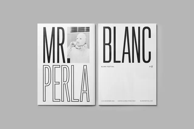
Two-page magazine spread with bold sans-serif headline, archival photography, and minimal layout, high-end art direction.
Summary
Two-page editorial spread for Blanc Festival featuring oversized sans-serif headlines and a sepia-toned archival photograph, stark monochromatic design with commanding typography.
Visual description
Left page displays "MR. PERLA" in large outline sans-serif letters stacked across the page. Right page shows "BLANC" with "BLANC FESTIVAL" subtitle and event details in smaller text at bottom. A faded sepia-toned photograph of a subject appears on the left spread. Light gray background with charcoal type. Clean grid-based layout with substantial white space. Strict two-color palette (gray, black, off-white).
Key takeaway
The elegance of extreme simplicity: bold outline headline, minimal photography, and whitespace do the work. No ornament. The outline lettering adds refinement while maintaining boldness. The restraint in color and composition signals quality.
Reuse notes
Benchmark for cultural event promotion, festival identity, and high-end editorial design. Works best with strong photography and high-impact typography. This approach flatters institutions and arts organizations. Requires confident sizing and spacing to avoid feeling sparse.
More like this
Keep what you find
A free account saves references to boards and can send you a weekly email of picks based on what you save.
To see every result, go Pro.