Preview image. Unlock full-res
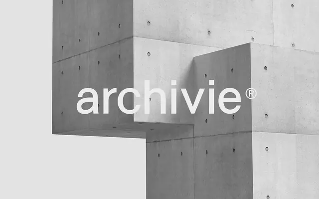
A minimalist branding composition featuring the word 'archivie' in clean white sans-serif type overlaying a geometric arrangement of concrete and white architectural panels.
Summary
A sophisticated branding presentation overlaying the word "archivie" in bold white sans-serif type on a geometric composition of raw concrete and white architectural panels with evenly spaced circular fasteners.
Visual description
The composition features large white sans-serif letterforms spelling "archivie" (with a registered trademark symbol) centered across a carefully arranged architectural background. The background combines light gray and darker gray concrete panels arranged at angles, creating a dynamic asymmetric composition. Small circular fasteners or details dot the surface, adding texture and scale reference. The overall palette is strictly monochromatic in grays and whites, creating high contrast between the typography and the structural background.
Key takeaway
Using architectural photography as a backdrop for typography establishes sophisticated, technical brand identity through environmental context rather than decorative elements.
Reuse notes
Ideal for architecture firms, design studios, or tech brands seeking a modern, minimalist aesthetic. Works particularly well when the subject matter aligns with structure, precision, or construction industries.