Preview image. Unlock full-res
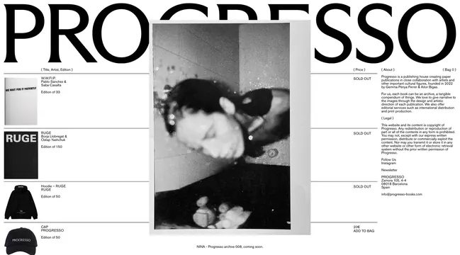
A black and white editorial layout for a book publisher featuring typography, product imagery, and minimalist design with negative space.
Summary
A two-page spread for Progresso publishing featuring bold oversized typography alongside a central black and white product photograph, with a clean grid layout and generous negative space.
Visual description
Large sans-serif caps spelling "PROGRESSO" anchor the left and right pages. The center features a grayscale photograph of what appears to be clothing or fashion items. Text is arranged in a strict grid: product information, pricing ("SOLD OUT"), and editorial copy sit in small type blocks alongside larger typography. The layout is strictly black, white, and gray with no color. Wide margins and white space separate elements into a clear visual hierarchy.
Key takeaway
The effective use of oversized typography as a framing device around more detailed information, with the photograph serving as a central focal point. The monochromatic constraint forces clarity through scale and spatial relationships rather than color.
Reuse notes
Excellent reference for book design, publishing layouts, or any editorial work requiring a high-contrast, minimal approach. Works well for luxury or boutique brands wanting a sophisticated, print-oriented aesthetic.
More like this
Keep what you find
A free account saves references to boards and can send you a weekly email of picks based on what you save.
To see every result, go Pro.