Preview image. Unlock full-res
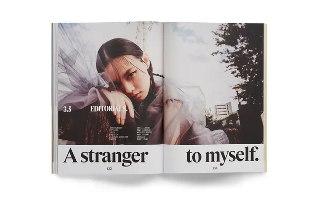
A double-page magazine spread featuring a cinematic portrait of a woman overlaid with large, bold serif typography.
Summary
A double-page magazine spread featuring a cinematic portrait of a woman overlaid with large, bold serif typography.
Visual description
A large-scale portrait of a woman in sheer fabric occupies the center, framed by trees and a building in the background. The text 'A stranger' is placed on the left page and 'to myself.' on the right page in a large, black serif typeface. Smaller text including '3.5 EDITORIALS.' and credits are positioned in the lower-left quadrant.
Key takeaway
Use oversized, split typography across a spread to create a sense of scale and direct the reader's eye through the imagery.
Reuse notes
Use this layout for high-end fashion lookbooks or artistic magazine features where the text is as much a design element as the photo.
More like this

Keep what you find
A free account saves references to boards and can send you a weekly email of picks based on what you save.
To see every result, go Pro.