Preview image. Unlock full-res
A vibrant, organic packaging design system for a children's food brand featuring illustrated icons, hand-drawn typography, and a warm color palette.

Summary
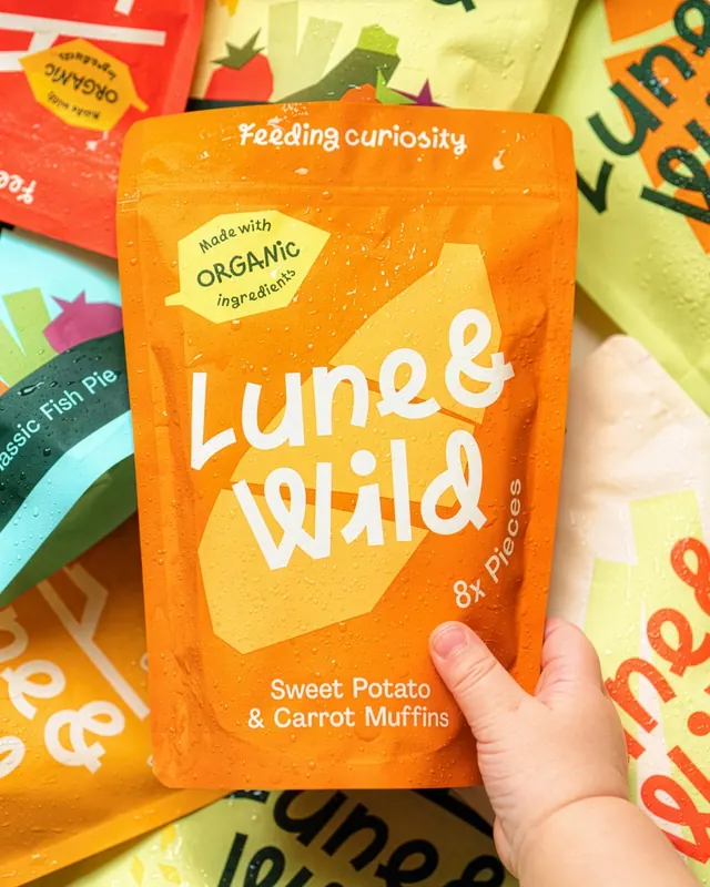
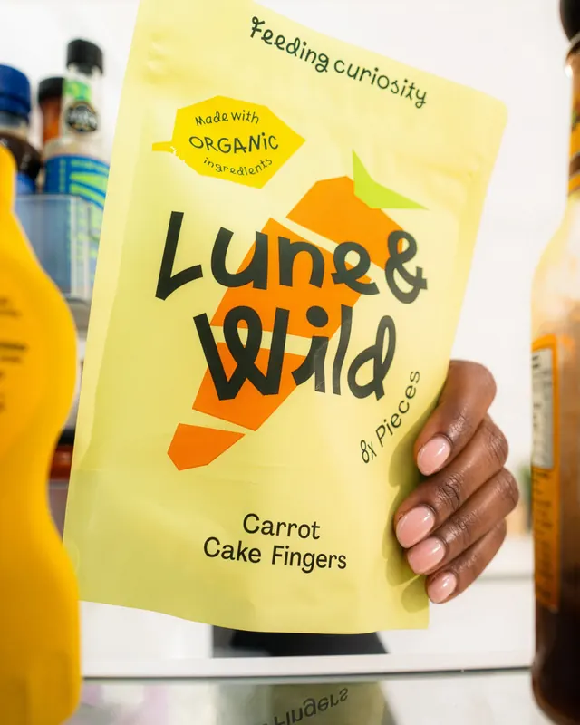
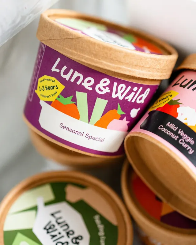
A comprehensive packaging system for Lune & Wild, a children's organic food brand, combining organic illustration, hand-drawn lettering, colorful gradients, and real product photography to create a warm, approachable identity.
Visual description
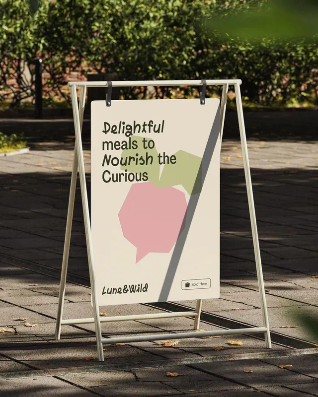
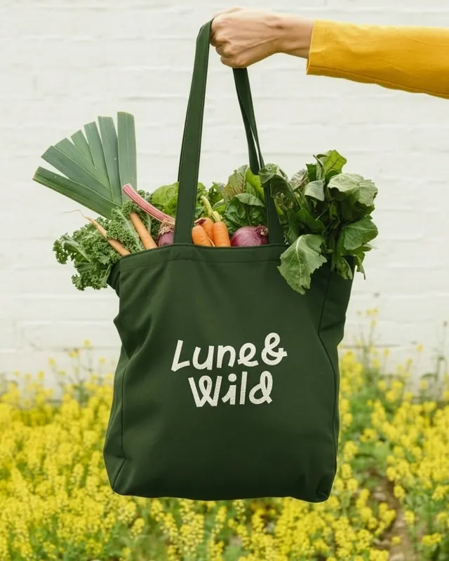
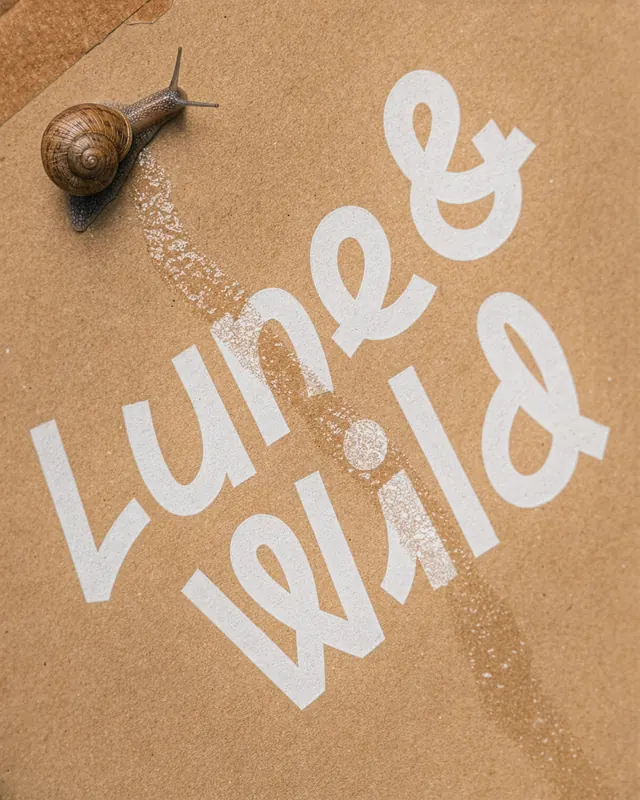
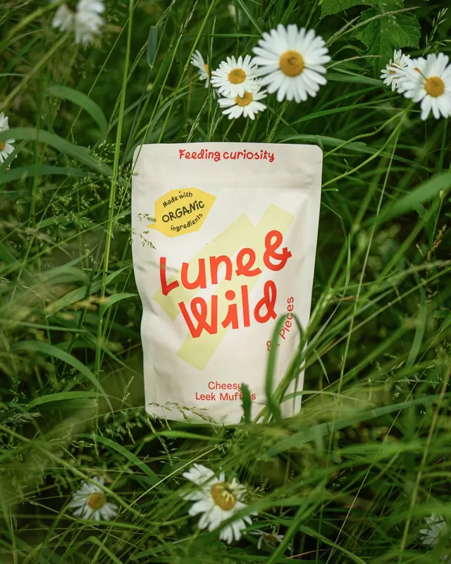
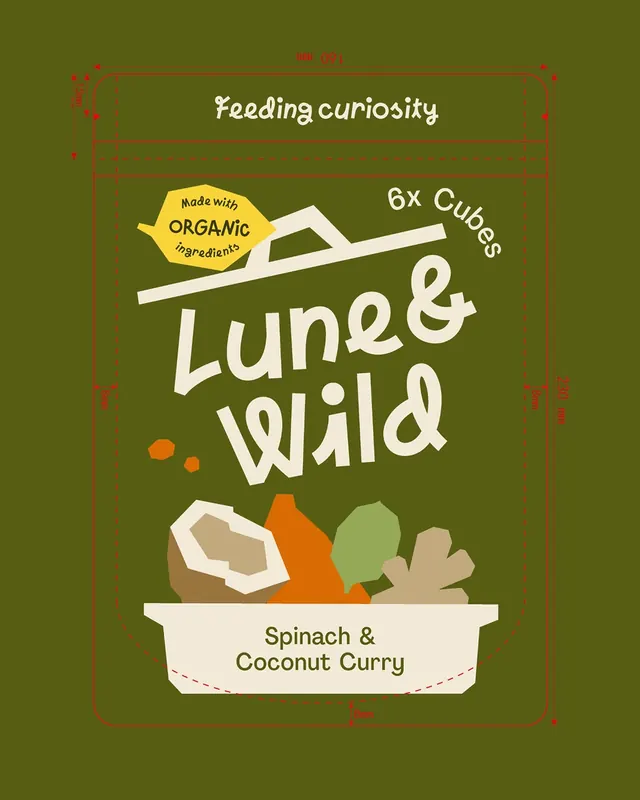
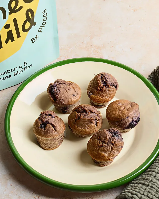
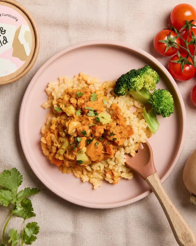
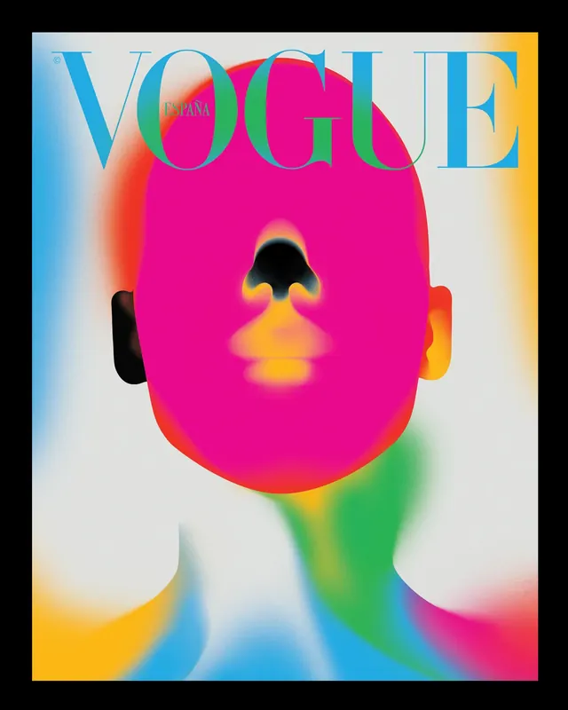
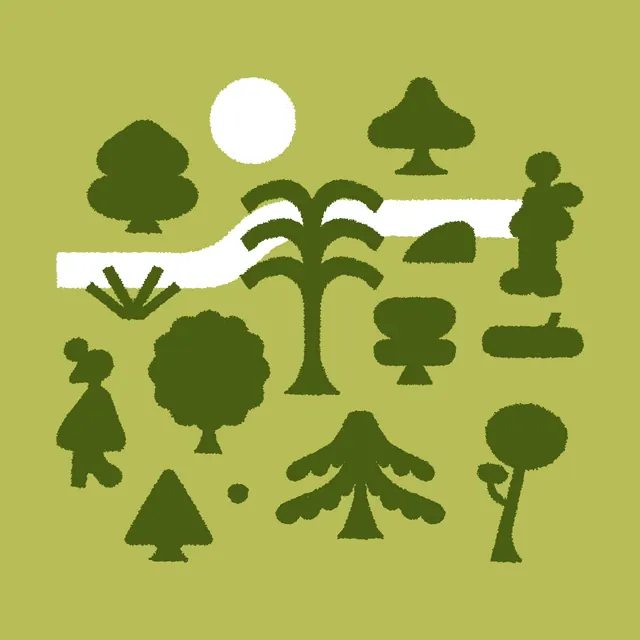
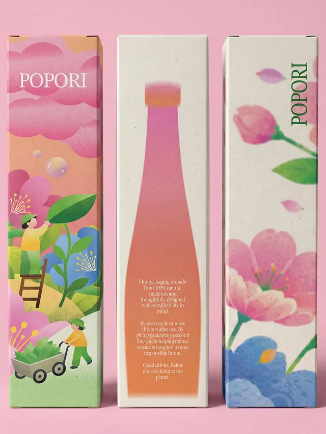
The carousel showcases the full design system: an illustrated bottle icon with vegetables on a olive-green background; product pouch photography showing bright colorful organic gradients and hand-lettered "Lune & wild" branding; detailed photos of the pouches in use and on shelf; a green canvas tote bag with the brand name; illustrated compositions of vegetables and food items; and lifestyle imagery of the products in context. Typography mixes a friendly italic handwritten script for "Feeding curiosity" with clean sans-serif for product descriptions. The color palette emphasizes warm pastels and vibrant hues-olive green, soft yellows, orange, and magentic accents. Multiple video frames show the carousel's carousel animation and transitions.
Key takeaway
The strength is in the unified visual language: hand-drawn illustration, organic color blocking, and authentic product photography work together to signal "handmade, natural, delightful" without feeling twee. The italic handwriting differentiates from typical modern sans-serif food branding and creates personality.
Reuse notes
Strong model for organic/natural food brands targeting young families. The illustrated icons and hand-drawn typography work well on pouches and flexible packaging. The real product photography grounded the illustrated system and builds trust. The gradient color treatment adds sophistication without overshadowing the simple, joyful message.