Preview image. Unlock full-res
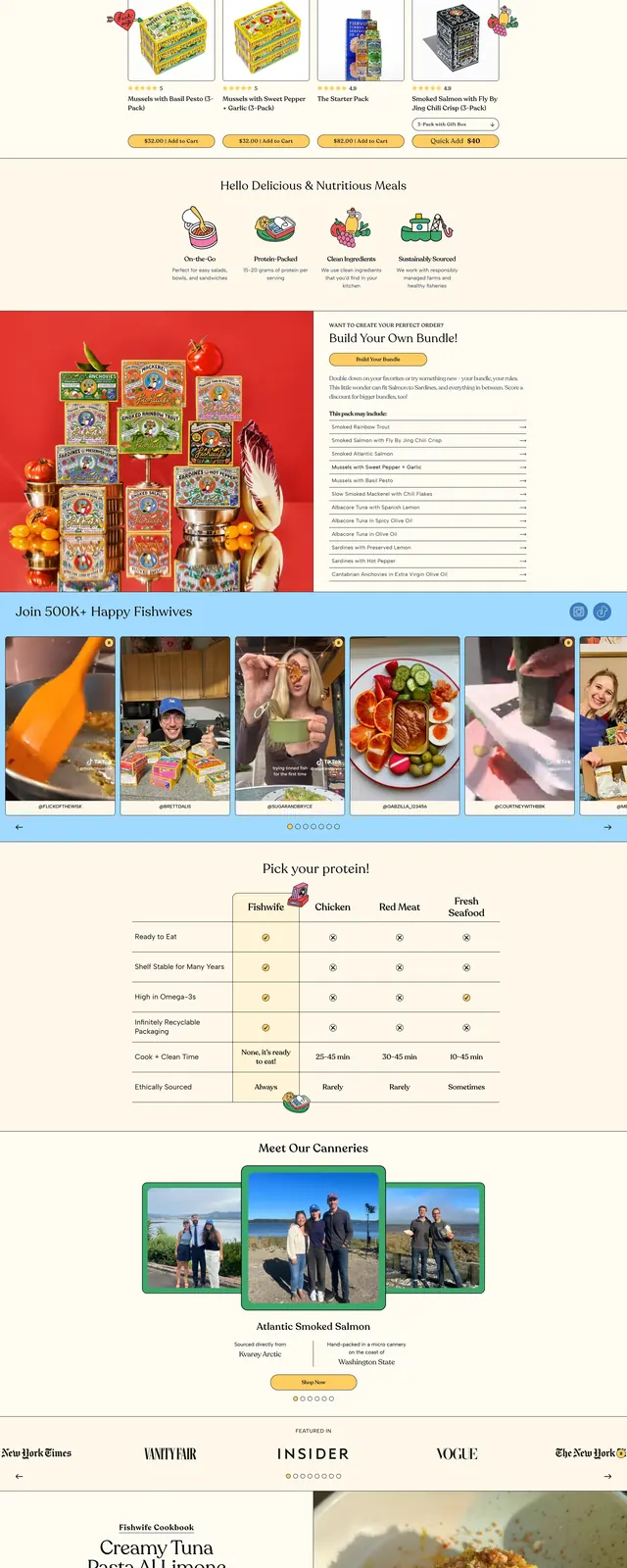
A bright, illustrated ecommerce homepage for a premium tinned seafood brand with bold product imagery, editorial sections, and playful community-driven content.
Summary
A bright, illustrated ecommerce homepage for a premium tinned seafood brand with bold product imagery, editorial sections, and playful community-driven content.
Visual description
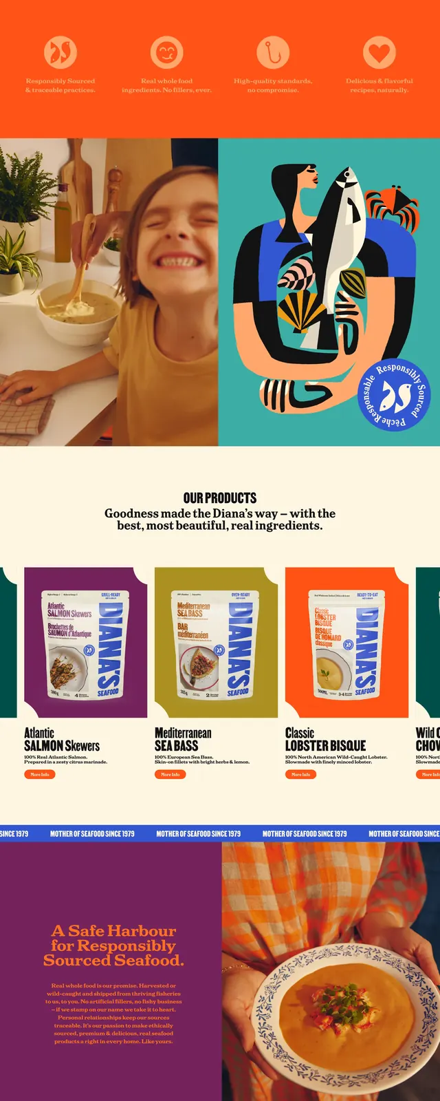
The page opens with a large hero area featuring stacked illustrated product packs, fresh ingredients, and a prominent left-aligned callout card on a warm yellow background. Below, the layout shifts into a mix of product cards, a comparison table, a social-style image carousel, and a cookbook feature split between text and a food photo. The footer area includes a newsletter signup and multi-column links, all presented on a soft cream base with light blue accent bands and vintage-inspired packaging graphics.
Key takeaway
The strongest pattern is a cheerful ecommerce homepage that balances product merchandising with editorial storytelling and community proof. It is especially reusable for food and DTC brands that want a playful, premium, content-rich landing page.
Reuse notes
Reuse the hero composition for brands that need a high-impact first screen with product imagery and a concise CTA. The comparison table and social carousel are adaptable for explaining product benefits and showing lifestyle proof without losing the upbeat tone.