Preview image. Unlock full-res
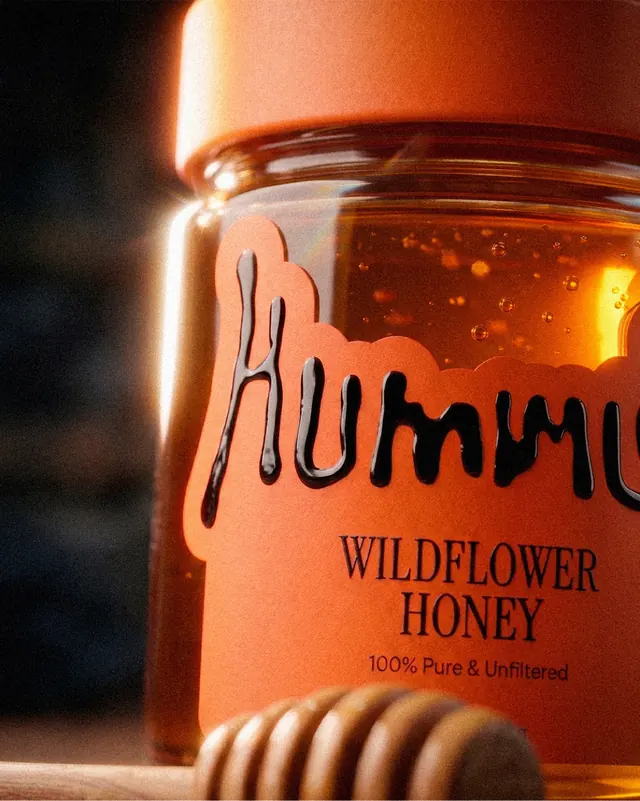
Bold packaging and product design system for Hummey honey, featuring dimensional jar labels, handwritten logomark, and warm lifestyle photography.

Summary
A vibrant honey brand design system featuring hand-lettered wordmark, color-coded jar labels for product variants, and lifestyle photography that challenges the "mild and natural" honey stereotype.
Visual description
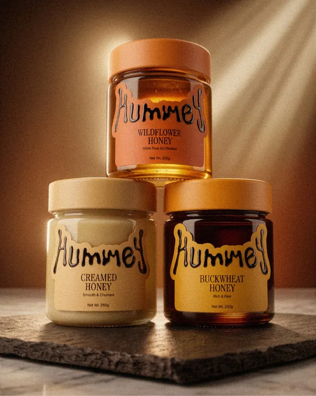
Slide 1: Three honey jars arranged in a pyramidal composition against warm studio lighting. All feature the handwritten "Hummey" mark in flowing script with organic drip-like letterforms. The Wildflower variant sits top-center with bright orange label and amber honey visible through clear glass. The Creamed Honey jar (beige label) sits bottom-left, and Buckwheat Honey (darker label) sits bottom-right. Each label clearly identifies the variant beneath the mark with product descriptors (100% Pure & Unfiltered, Smooth & Churned, Rich & Raw). Soft directional lighting emphasizes the jars' dimensional form and the honey's luminous quality.
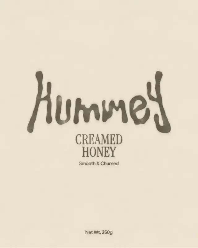
Slide 2: Clean typography-focused label design showing "Hummey / CREAMED HONEY / Smooth & Churned / Net Wt. 250g" on a beige background with the handwritten mark anchoring the composition.
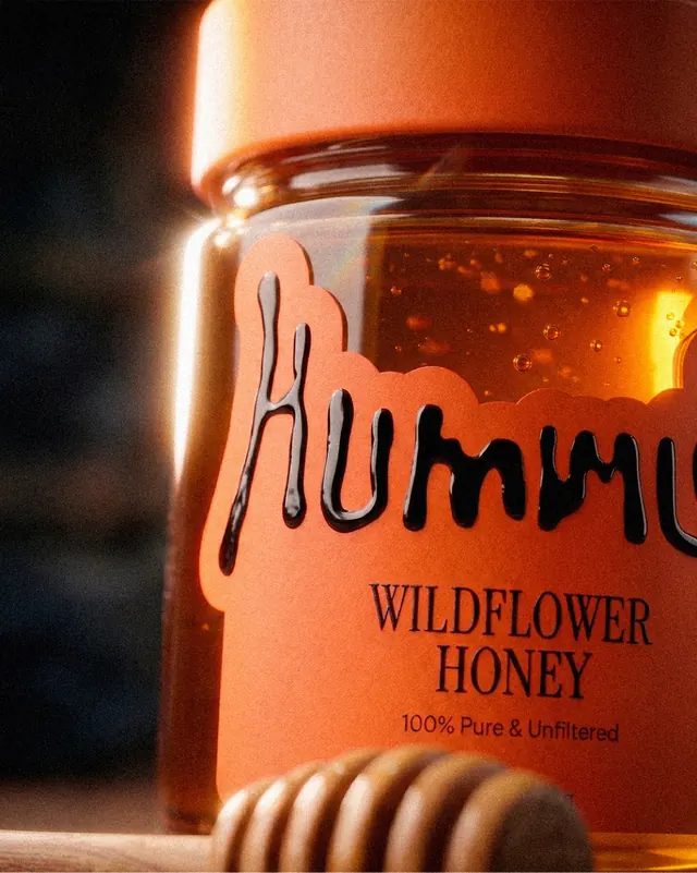
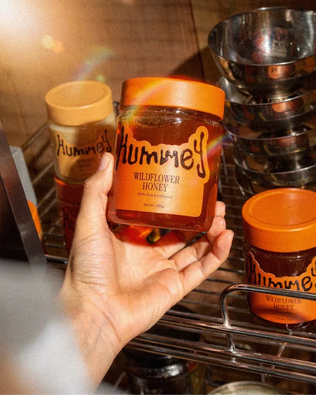
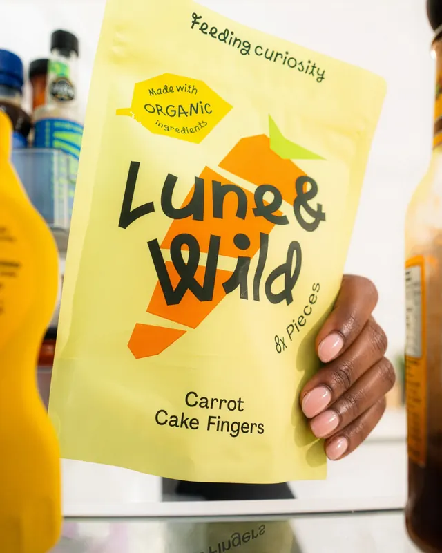
Slide 3: Close-up product shot of a single jar being held in a hand, surrounded by honey-filled containers and kitchen elements, showing the product in context.
Slide 4: Grouped product shot from above, showing all three variants with complementary styling and warm ambient lighting.
Slide 5: Overhead flat lay of honey jars with complementary elements, reinforcing the product's role in a lifestyle context.
Key takeaway
The hand-lettered mark creates personality and breaks from sterile food packaging conventions. Color-coding by variant reduces label clutter while building visual system recognition.
Reuse notes
Excellent model for artisanal food brands seeking premium positioning with approachable, playful energy. The warm color palette and organic letterforms appeal to conscious consumers without sacrificing sophistication. Works particularly well for niche or specialty food products.