Preview image. Unlock full-res
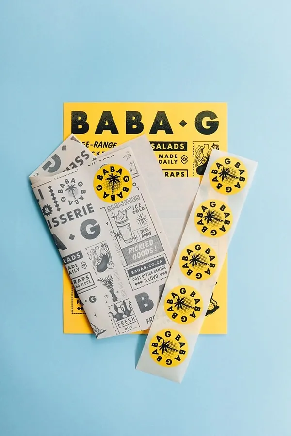
Playful food brand packaging design featuring yellow and cream-colored wrapping paper and stickers with bold "BABA.G" wordmark and geometric star pattern.
Summary
A cohesive food brand packaging system showing printed wrapping paper and repeating stickers featuring "BABA.G" wordmark with a geometric starburst pattern on warm yellow and cream background.
Visual description
A yellow card sits behind cream-colored printed wrapping paper and stickers. The wrapping features the "BABA.G" logo prominently at top, with multiple lines of small text describing product range ("SALADS", "WRAPS", "MADE DAILY", etc.) in a dense, informative layout. Below the wrapper, multiple cream stickers repeat a simple geometric starburst pattern with "BABA.G" text in black. The yellow background provides strong color contrast, suggesting these are the primary brand colors. The overall aesthetic is casual, friendly, and contemporary.
Key takeaway
The repetitive sticker pattern creates brand consistency while the simple star mark is highly memorable and scalable. The warm yellow-on-cream palette conveys approachability and warmth suitable for food service.
Reuse notes
Perfect for casual dining brands, food delivery services, or quick-service restaurants. The modular sticker approach is cost-effective for widespread application. The geometric pattern is timeless and works across digital and print contexts.
More like this

Keep what you find
A free account saves references to boards and can send you a weekly email of picks based on what you save.
To see every result, go Pro.