Preview image. Unlock full-res
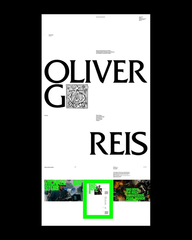
Seven-slide portfolio carousel announcing Oliver Gareis's personal rebrand, merging TypoMonday into a unified personal brand with minimal typography-driven design.

Summary
A seven-slide Instagram carousel presenting Oliver Gareis's personal rebrand, consolidating his TypoMonday design practice under his own name. The sequence moves from a bold opener with serif title and project thumbnails, through minimal ornamental letterforms, a biographical about page, and culminates in a portfolio grid of past work and a manifesto explaining the rebrand decision.
Visual description
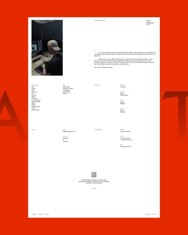
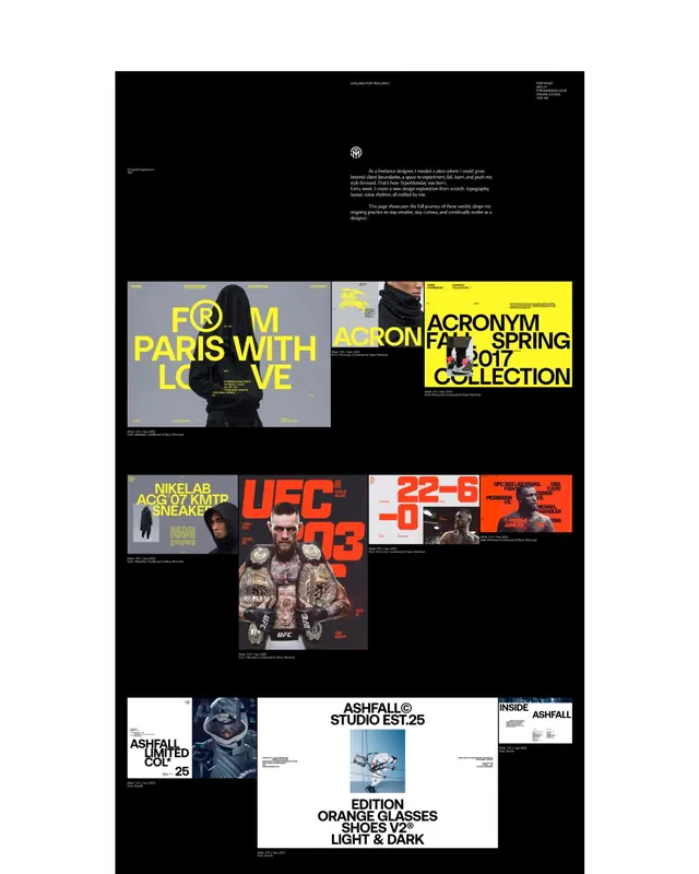
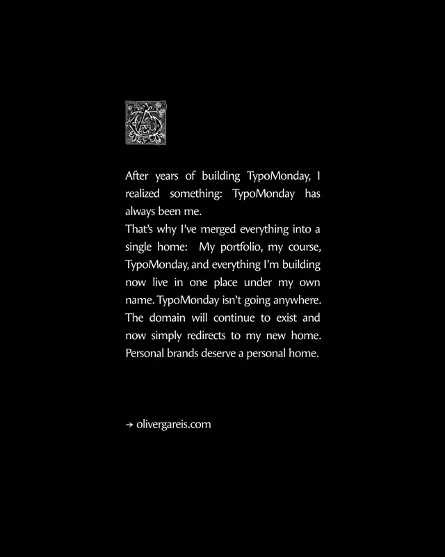
The carousel opens with a clean white background and large black serif type spelling "OLIVER GAREIS" with an ornate drop cap. Small project thumbnails with neon green borders sit at the base. Slide 2 isolates the ornamental drop cap on white. Slide 3 presents the name and subtitle "Multidisciplinary Designer" in serif and sans-serif. Slide 4 shifts to a vibrant orange/red background containing a white portfolio page with a studio photograph on the left and biographical text describing his design approach (web, interactive, visual design, product) alongside service and award listings. Slide 5 (not fully reviewed) transitions the section. Slide 6 features a black background with a white portfolio grid showcasing past projects: bold typographic work for fashion brands (Acronym, NikeLab), entertainment properties (UFC), studio identity (Ashfall), and product design. Slide 7 returns to pure black with centered white serif text - a manifesto on typography and rebrand philosophy, ending with "→ olivergareis.com". Throughout, the design alternates between high-contrast monochrome and bold accent colors (green, orange, yellow).
Key takeaway
The power of strategic use of ornamental typography (the drop cap recurs as a visual anchor) combined with assertive white space and high contrast to communicate both professional polish and artistic confidence. The manifesto slide demonstrates how to communicate a business decision (consolidation of brands) through editorial layout and serif typography. The portfolio grid efficiently showcases range across product, fashion, and entertainment while maintaining visual coherence through consistent yellow/high-contrast treatment of project titles.
Reuse notes
Ideal template for creative professionals repositioning or launching a personal brand identity, especially those in design, direction, or multidisciplinary practice. The minimal, serif-forward approach works well for audiences valuing craft and editorial sensibility. The progression from abstract ornamental elements to portfolio grid to personal manifesto creates a compelling narrative arc. Works best when the projects in the portfolio grid have strong visual contrast (color, scale, category diversity). The manifesto-on-black-background close provides a memorable ending statement that could follow any portfolio carousel announcing a business change or philosophical position.
From this post: Oliver Gareis portfolio rebrand carousel
View post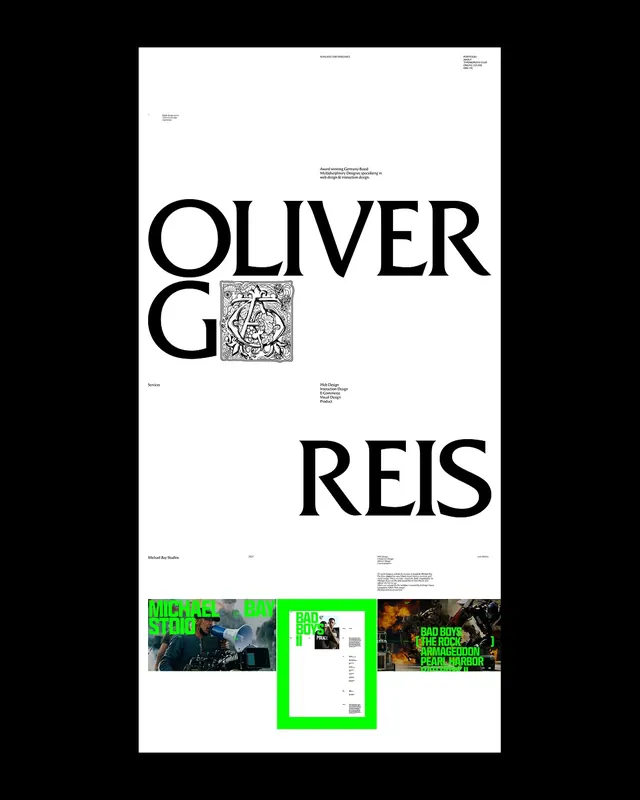
More like this
Keep what you find
A free account saves references to boards and can send you a weekly email of picks based on what you save.
To see every result, go Pro.