Preview image. Unlock full-res
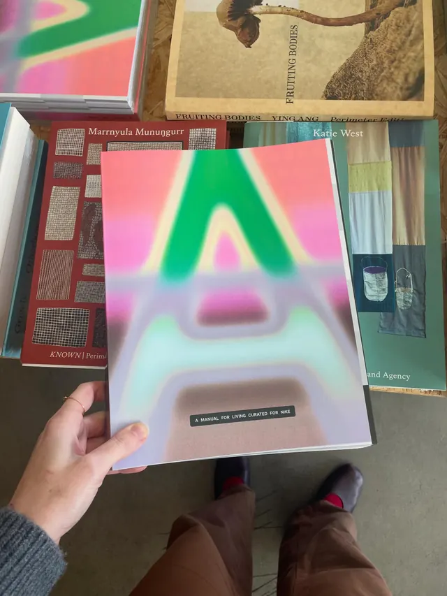
A 10-slide carousel showcasing a richly designed publication "A Manual for Living Curated for Nike" by Perimeter Books, featuring vibrant gradient covers, editorial layouts, and section-based page designs in five thematic areas.
Summary
A vibrant 10-slide publication carousel for Nike's "A Manual for Living," a curated exercise and lifestyle guide organized into five thematic sections, showcasing bold gradient covers, mixed-serif typography, and editorial layouts that balance photography with interactive page elements.
Visual description
Slide 1: Cover image held in hand shows a full-bleed vibrant gradient (pink to green to blue) with the title in bold sans-serif typography ("A MANUAL FOR LIVING CURATED FOR NIKE"); surrounding context shows stacked design books on shelves.
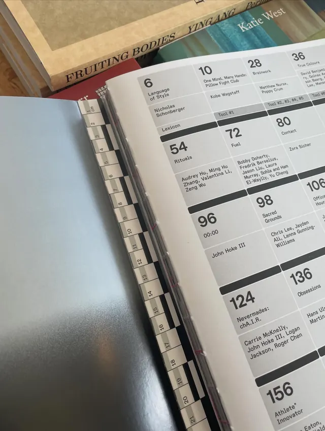
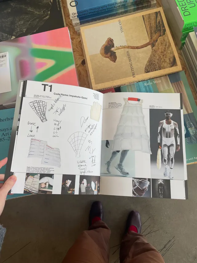
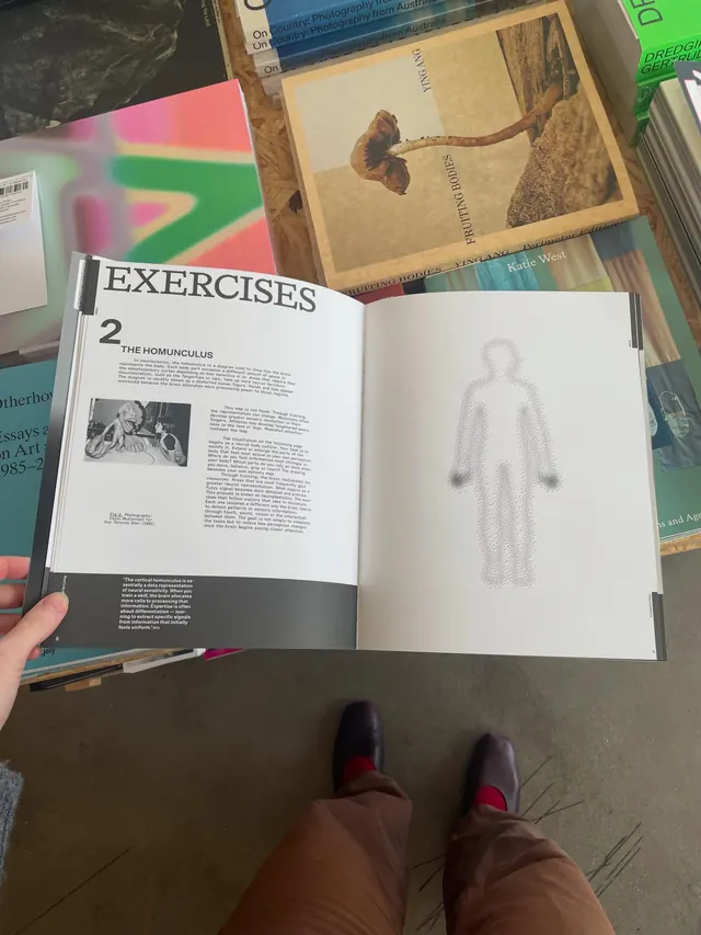
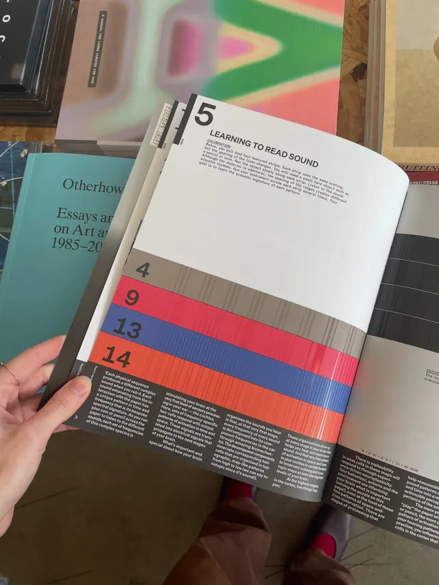
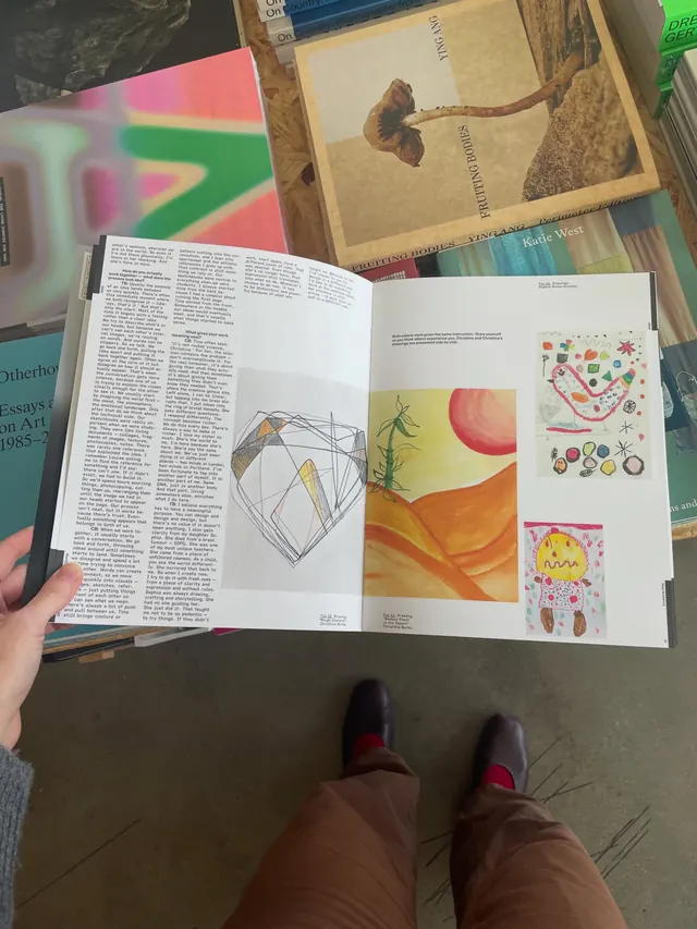
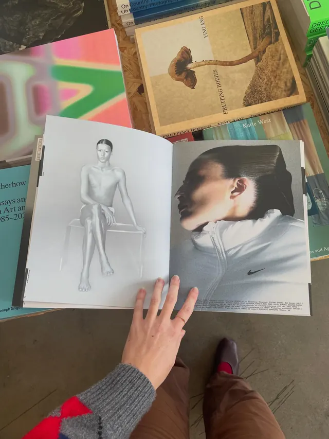
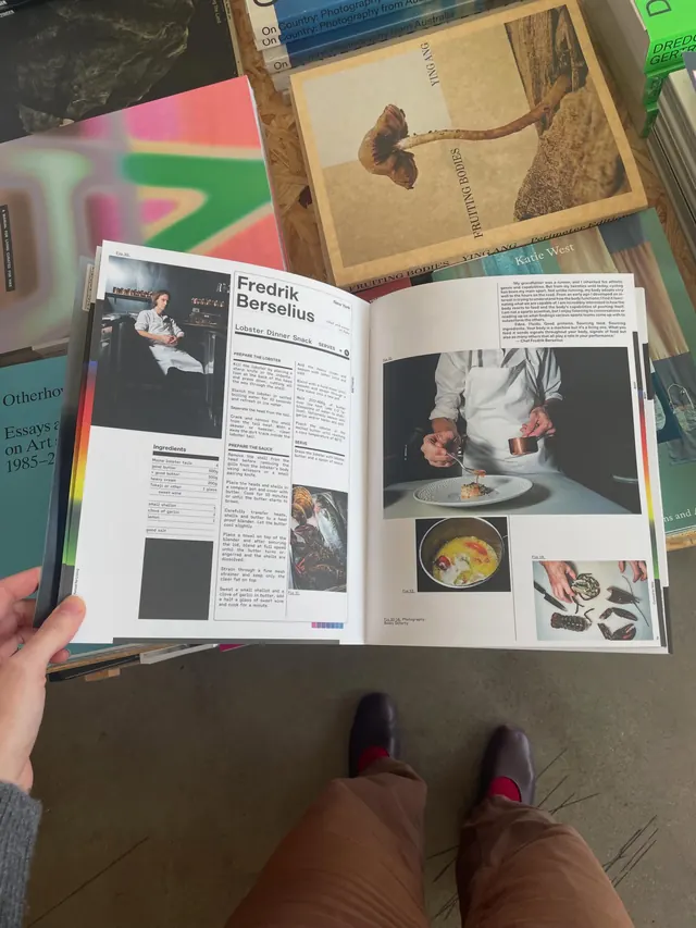
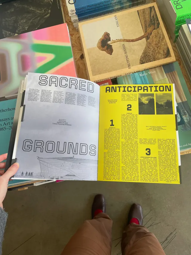
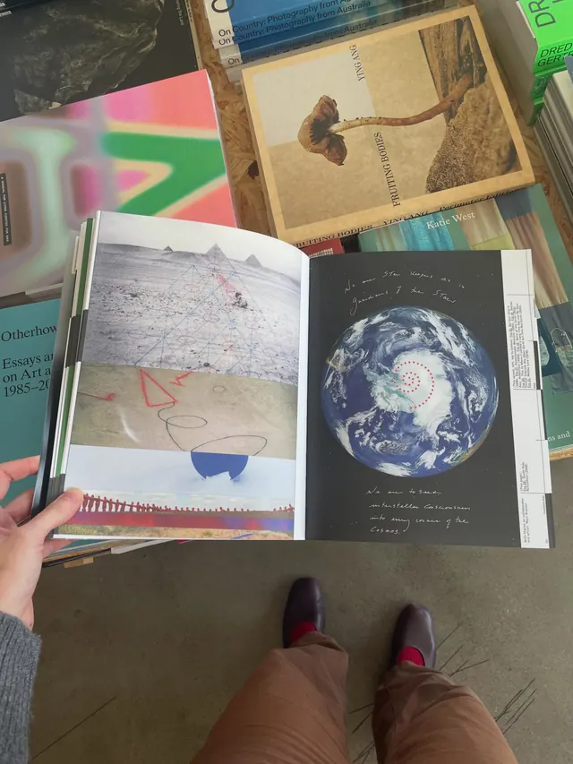
Subsequent slides: Full-page spread designs showing diverse layouts-typographic hierarchy with oversized display type; mixed serif and sans-serif pairing; color-field backgrounds (solid and gradient); editorial photography and diagrams; interactive page designs suggesting exercises or fill-in prompts; intricate grid-based layouts with labeled sections (crossword-puzzle-like elements, floor-plan-style diagrams); use of color blocking and white space to organize information hierarchically.
The publication format is landscape or square; materiality is evident in the photo (glossy cover stock, white interior pages).
Key takeaway
Gradient typography as a unifying visual strategy: rather than illustration or photography, color alone creates visual interest and premium feel. The five-section organization (Mind/Body/Soul/Desire/Imagination) mirrors Maslow-style frameworks, making the editorial structure feel purposeful. Mixed serif + sans in generous scale makes dense information feel approachable and artistic rather than corporate.
Reuse notes
Strong reference for lifestyle/wellness publications, brand-curated content, and premium editorial. Gradients work here because they're used sparingly on covers and key spreads, not throughout. The publication format (interactive, exercise-based) suits the bold visual treatment. Best for audiences expecting artistic/design-forward execution over strict information hierarchy.
From this post: A Manual for Living Curated for Nike publication
View post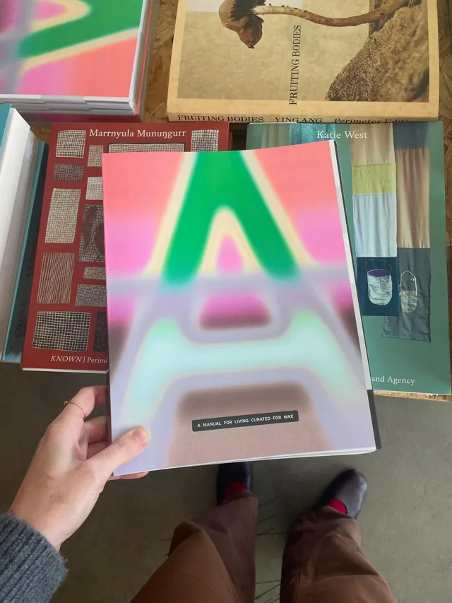
More like this
Keep what you find
A free account saves references to boards and can send you a weekly email of picks based on what you save.
To see every result, go Pro.