Preview image. Unlock full-res
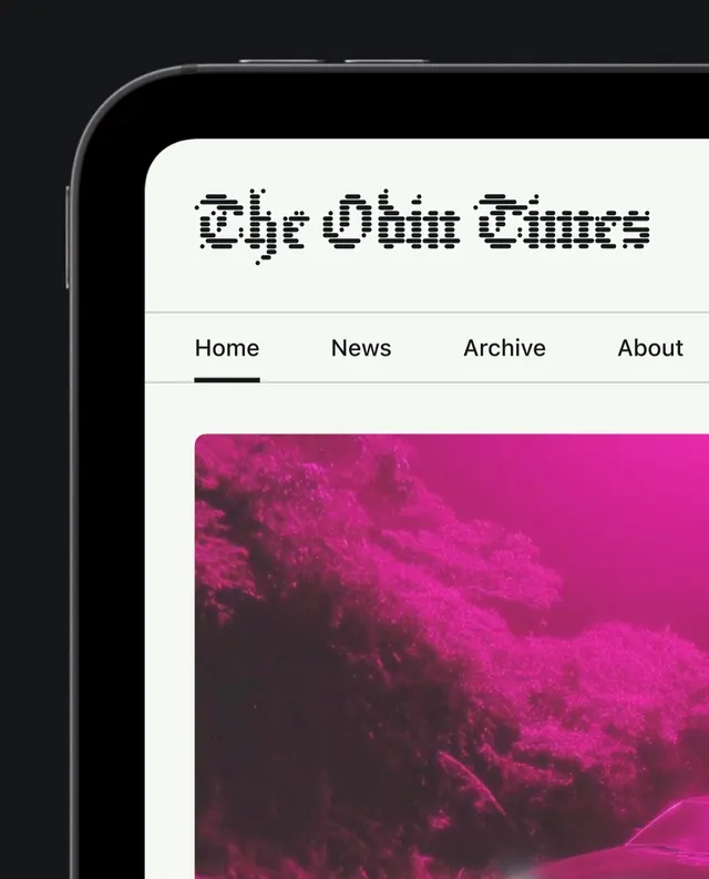
Magazine-style website design carousel with editorial layouts, atmospheric gradients, and illustrated landscapes across four slides.

Summary
A four-slide carousel showcasing a magazine website redesign for The Odin Times, featuring bright magenta gradients, editorial typography, and atmospheric illustrated landscapes that evolve across the series.
Visual description
Slide 1 (cover): A smartphone screen displaying The Odin Times website with a pixelated dot-matrix logotype, horizontal navigation (Home, News, Archive, About), and a large vibrant magenta-to-pink gradient image occupying the lower half. Slides 2-4 build out variations: a dark transition state, a cinematic landscape with a glowing house silhouetted against warm gradients, and a grid of illustrated cards with one prominently asking "What happened to the future?" set against a layered gradient background. Typography is bold and modern sans-serif throughout. All slides have accompanying video motion.
Key takeaway
The choreography between editorial hierarchy and atmospheric imagery, using gradients as a primary design element. Magazine-style card layouts paired with full-bleed gradient backdrops create visual interest without clutter. The evolution across slides demonstrates how a single color story (magenta to warm gradient) can unify diverse layouts.
Reuse notes
Strong reference for editorial or cultural publication websites. Works well for feature-heavy layouts where imagery drives the mood. Gradient-forward approach suits luxe or premium brands. Pair this with strong copywriting and full-page scroll interactions for maximum impact. Note: the pixelated logotype is a specific style choice; may not suit all brand identities.
From this post: The Odin Times magazine website carousel
View post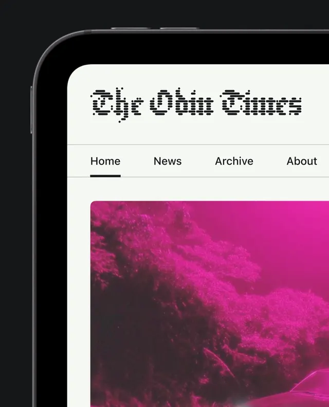
More like this
Keep what you find
A free account saves references to boards and can send you a weekly email of picks based on what you save.
To see every result, go Pro.