Preview image. Unlock full-res
A multidisciplinary design project exploring how interior spaces transform based on human perception, blending conceptual graphics, commercial proposals, and branded merchandise with philosophical messaging about spatial experience.

Summary
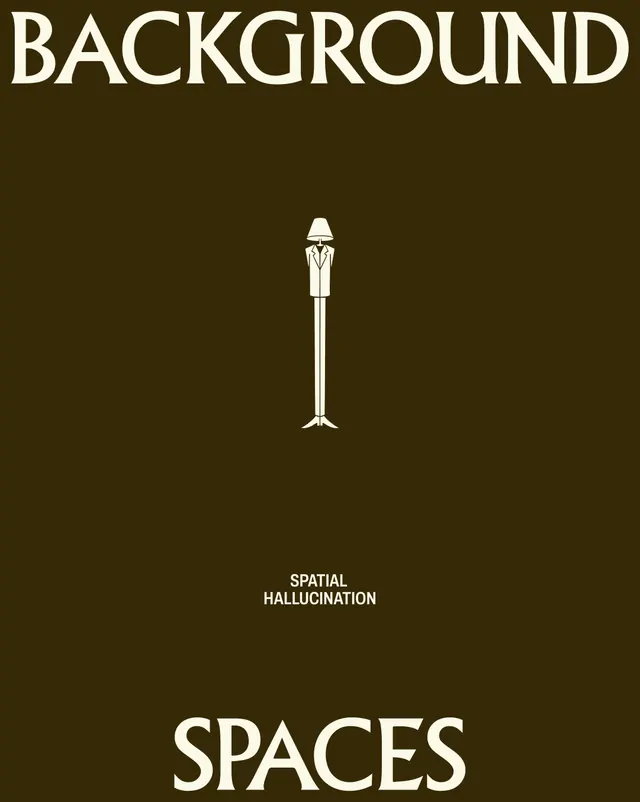
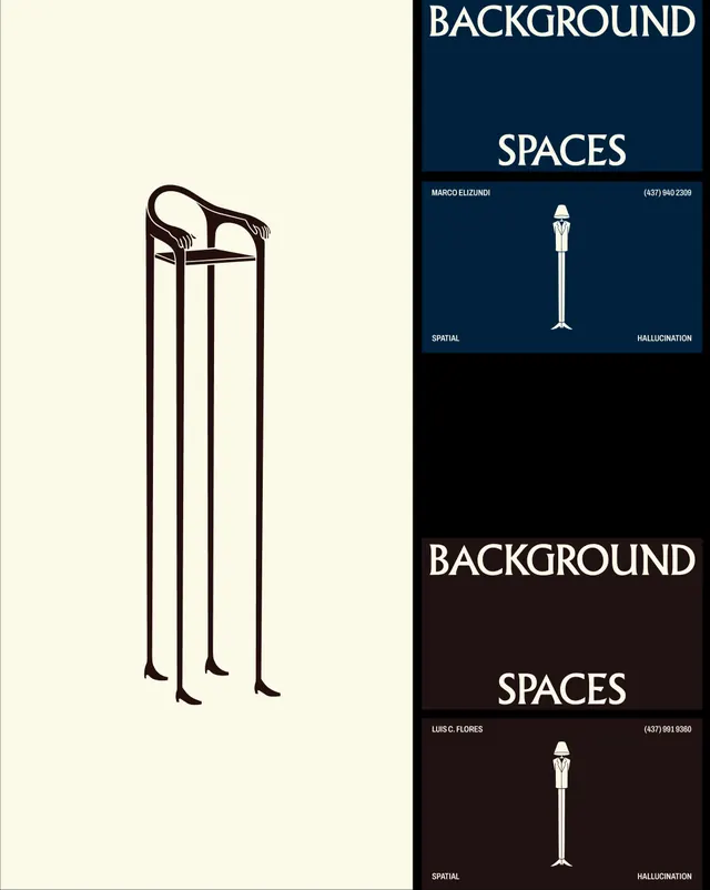
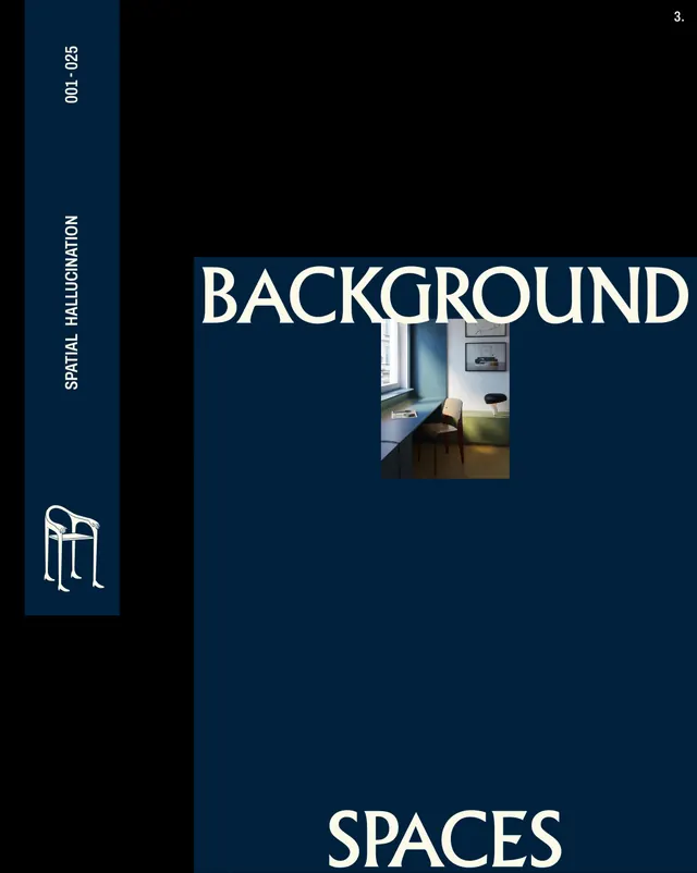
A 20-slide design system and brand presentation for Background Spaces, a spatial design consulting practice. The project positions interior spaces as living, mutable environments that shift based on human presence and perception. It combines typographic cover slides, photographic documentation of realized interiors, conceptual diagrams with recurring chair illustrations, commercial service proposals, design questionnaires, product mockups (app interface), branded merchandise (hoodie, t-shirt, tote), and closing philosophical statements.
Visual description
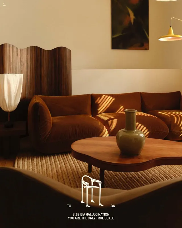
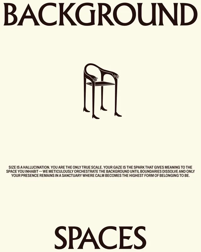
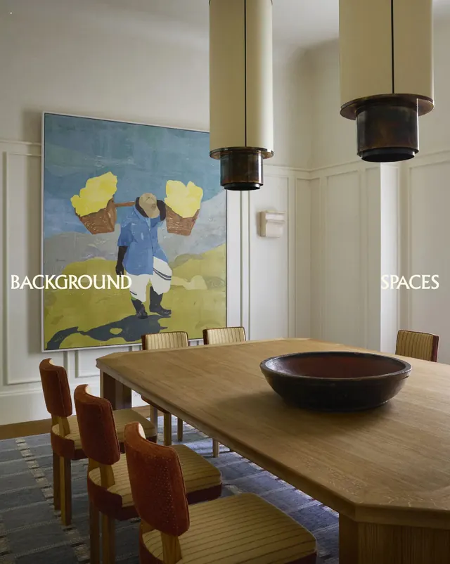
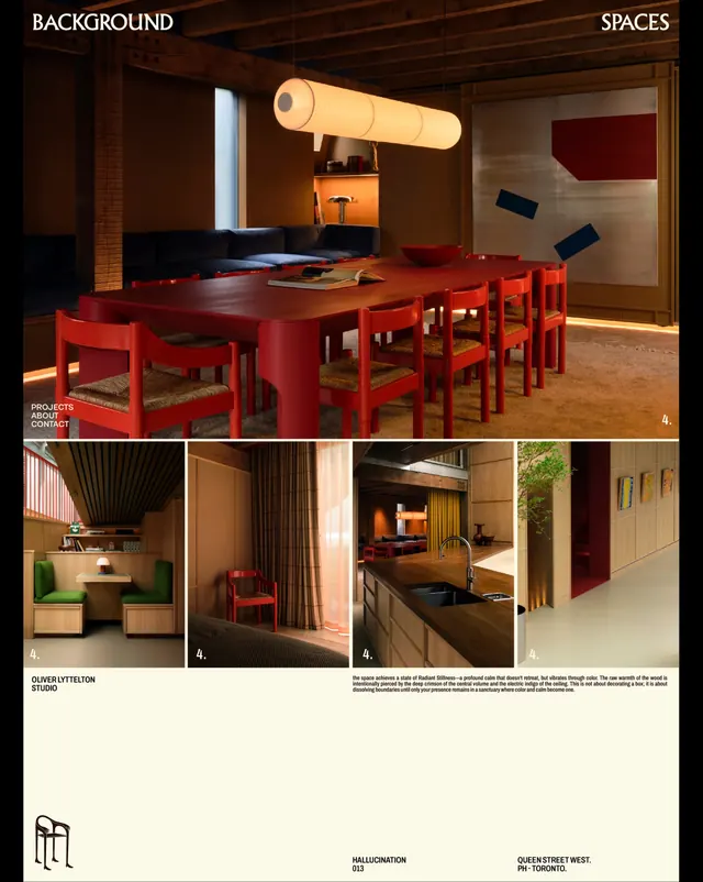
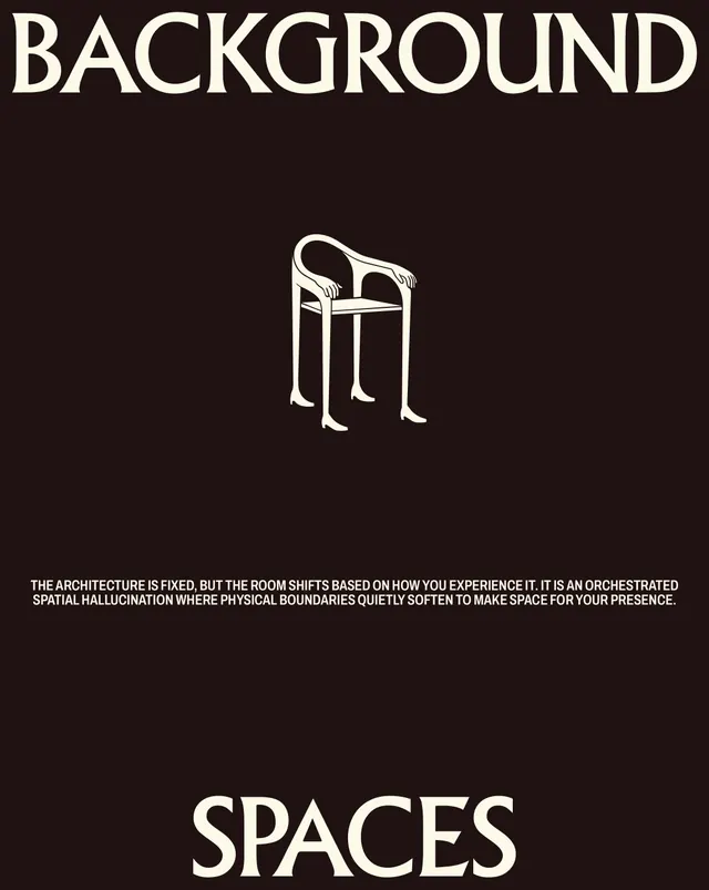
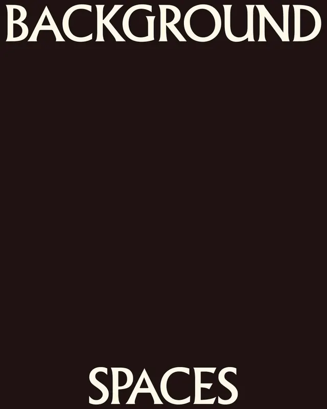
The carousel opens with dark and light title cards featuring the words "BACKGROUND SPACES" in oversized sans-serif caps. Warm-toned interior photography follows, showing realized projects with natural light, wood furnishings, and red upholstered seating, paired with the tagline "Size is a hallucination. You are the only true scale."
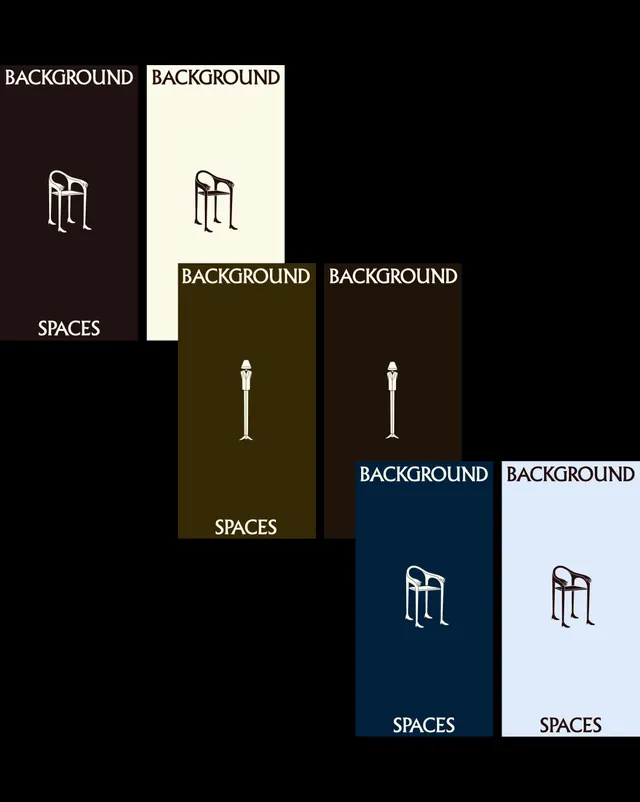
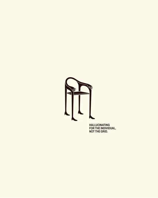
A recurring visual motif anchors the series: a minimalist line-drawn chair figure, shown in various orientations and scales across monochrome backgrounds (cream, dark brown, navy, light blue). This symbol appears on both conceptual slides and product applications, building a cohesive brand mark.
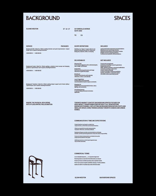
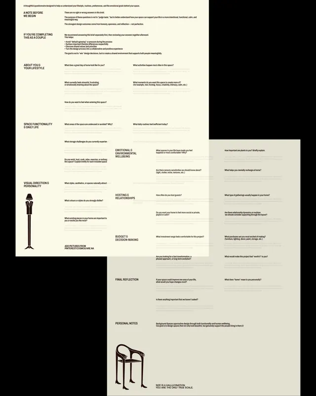
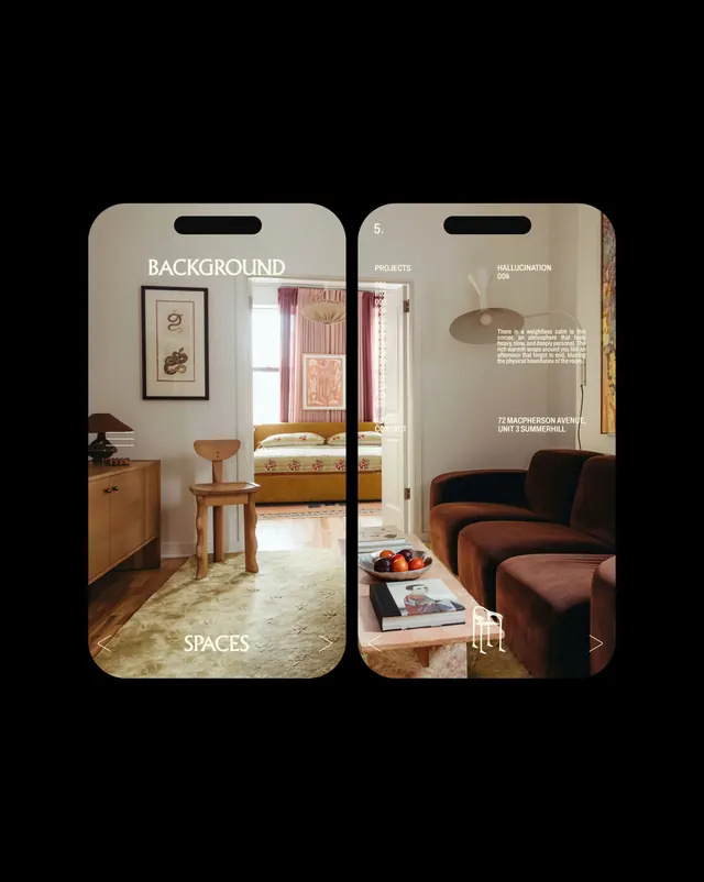
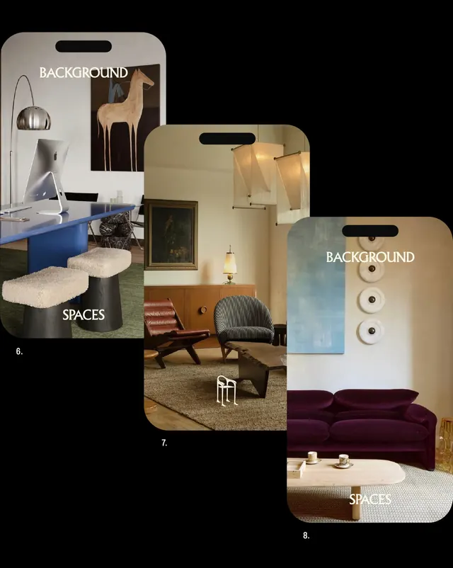
Mid-carousel sections shift to documentary content: a formal commercial proposal document on light blue, an extensive questionnaire layout exploring lifestyle and spatial wellbeing, and a detailed project mockup showing space planning concepts. A collage of photographed interiors (workspace with blue desk, residential rooms with warm wood and red accents) and iPhone app mockups in rounded frames show the digital application of the brand system.
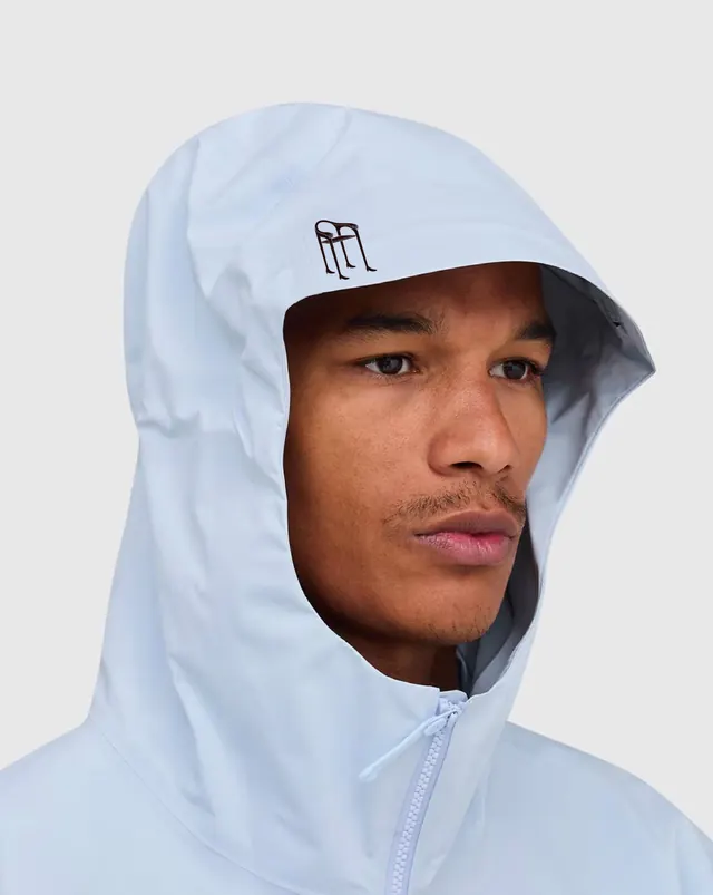
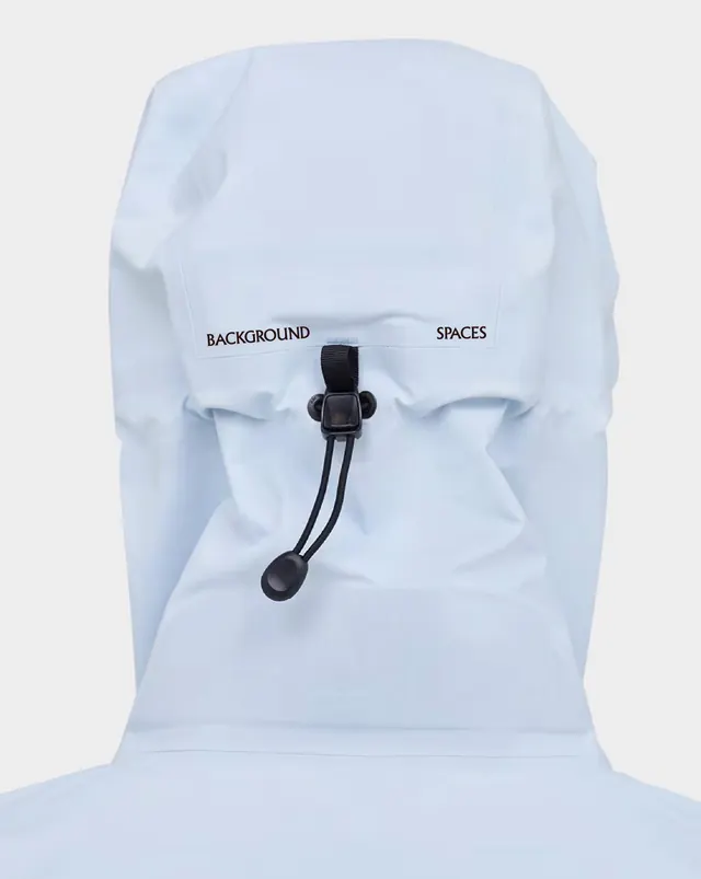
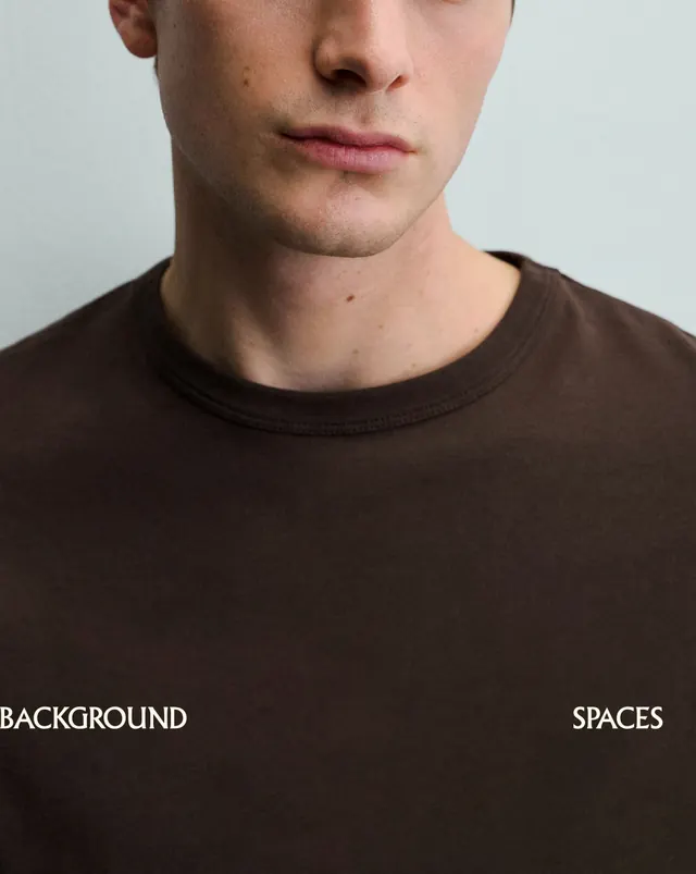
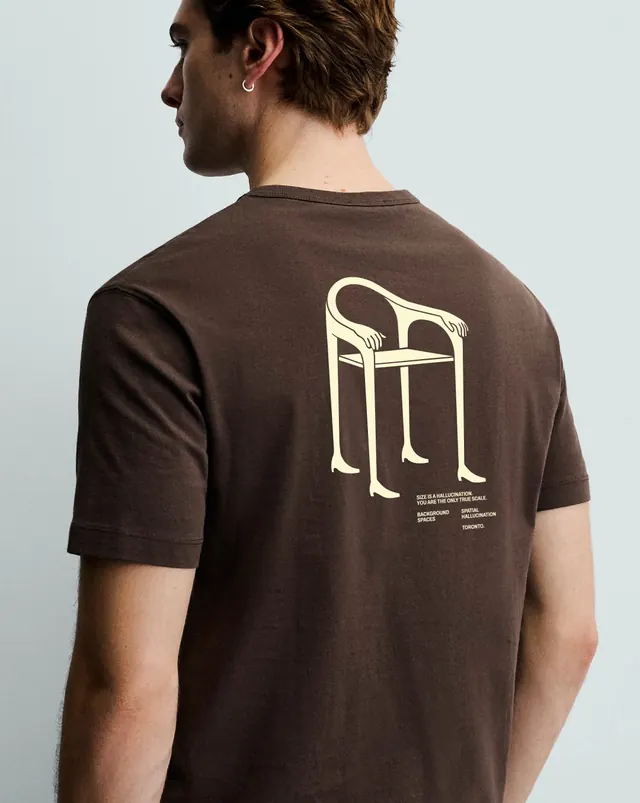
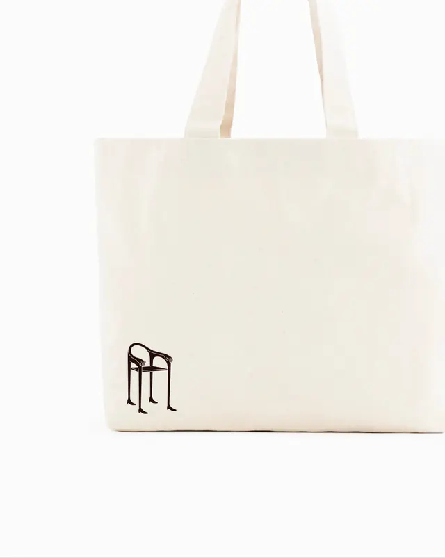
Later slides introduce merchandise: product photography of a light blue branded hoodie (front and back worn by models), a brown t-shirt featuring the chair logo and philosophy text on the back, a natural canvas tote bag, and a close-up of branded pouch packaging. The final slide returns to the chair motif with the closing statement "Hallucinating for the individual, not the grid" on cream background.
Color palette alternates between warm (terracotta, tan, rust, wood tones in photography) and cool (navy, light blue, cream). Typography is uniformly sans-serif, displayed at large scales with generous spacing and prominent all-caps headlines.
Key takeaway
The power of a single, simple illustrated mark (the chair) to unify a multifaceted brand system spanning interiors, digital products, and physical merchandise. The philosophy-forward approach and questionnaire-based discovery process position design as personal and human-centered rather than gridded or prescriptive. Mixing aspirational photography, conceptual diagrams, and tangible products creates a complete brand experience across touchpoints.
Reuse notes
Strong template for interior design or architecture consultancies wanting to emphasize personalization and lived experience. The recurring symbol is memorable and scales across formats without losing clarity. The questionnaire content model works well for service-based brands that need to educate clients before proposal. Product mockups and merchandise photography add credibility to the brand. Best suited for premium, thoughtful positioning; requires high-quality interior photography to carry the concepts. The all-caps, minimal typography pairs well with warm, natural materials and strong geometry.