Preview image. Unlock full-res
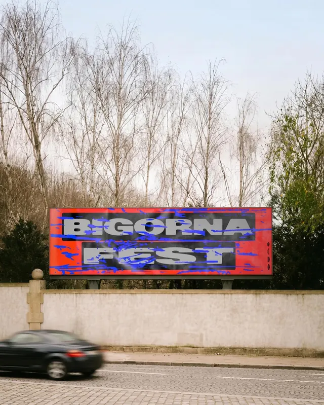
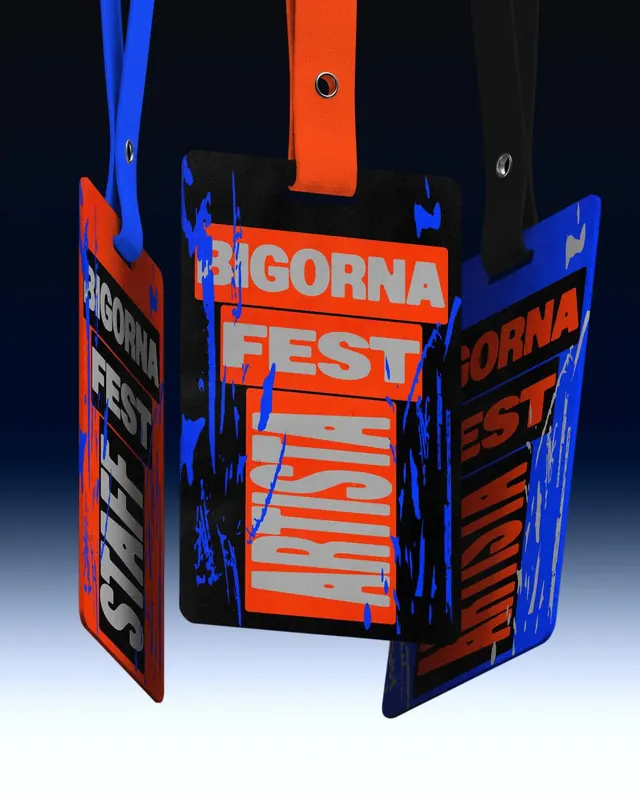
Brutalist event identity for a multi-genre music festival featuring worn textures, bold neon orange type, imperfect details, and dynamic animated treatments.

Summary
A visually aggressive event identity for Bigorna Fest balancing punk raw energy with modern sophistication, using bold neon orange type on dark backgrounds, distressed textures, and animated geometric elements to communicate an inclusive, high-energy music experience.
Visual description
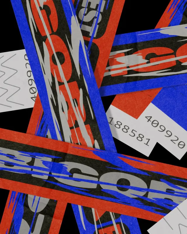
Black backgrounds throughout. Primary poster features massive orange sans-serif type reading "BIGORNA FEST 04.07 FERRO BAR" with blue drip or splatter elements suggesting paint or decay. Worn textures and imperfect lettering edges communicate rawness. Secondary posters show band lineup names in fragmented, boldly scaled type. Motion design (visible in slides) animates geometric forms and letterforms in continuous transformation, using the orange and blue palette throughout. Typography is severely oversized and all-caps, creating visual impact and accessibility from a distance.
Key takeaway
The successful merger of brutalist, imperfect design language with fluid, contemporary motion design. Oversized, distressed type makes this impossible to ignore. The inclusion of both damage-like details and smooth animation creates nuance within an otherwise aggressive aesthetic.
Reuse notes
Powerful reference for music, arts, or youth-focused events wanting to project energy and authenticity over polish. The neon-on-dark palette guarantees visibility in crowded environments and photographs well on small screens. The animated elements add dimension and can work across digital and physical contexts. Best used for brands that want to feel rebellious, inclusive, and contemporary. Works particularly well for music festivals, underground events, or brands positioned against mainstream expectations.