Preview image. Unlock full-res
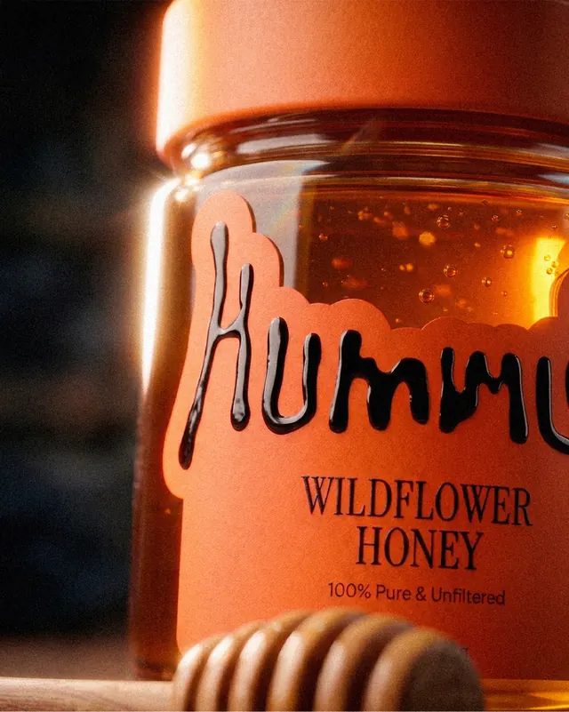
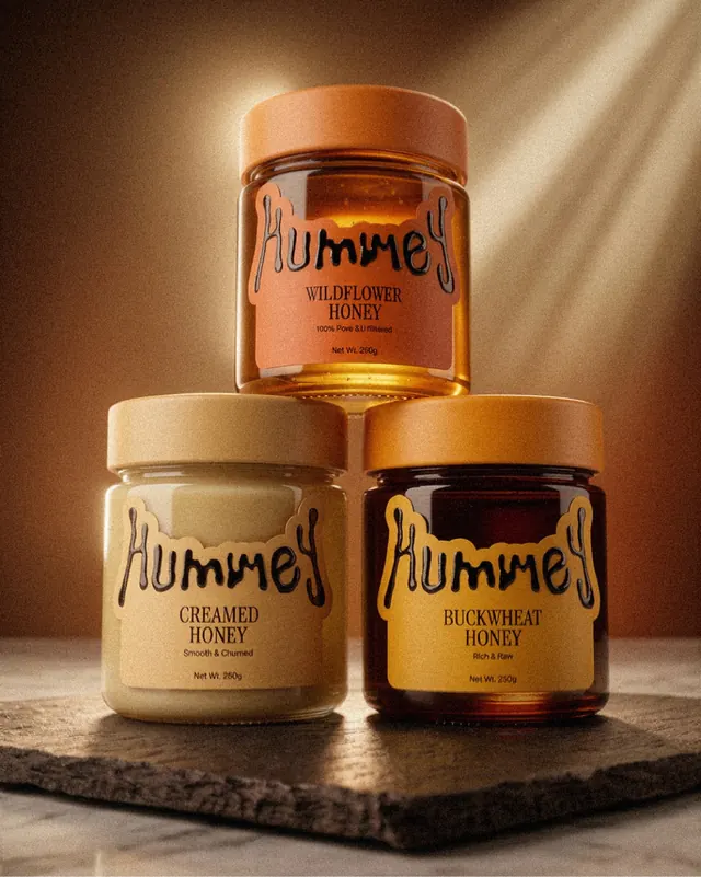
Warm, artisanal honey brand identity featuring handwritten serif wordmark, warm golden and amber color palette, and product photography with premium glass jars.

Summary
A premium honey brand identity built around warm earthy tones and handcrafted lettering. The system spans product jars (wildflower, creamed, and buckwheat varieties), lifestyle product shots, and a handwritten serif wordmark that evokes artisanal craft and natural ingredients.
Visual description
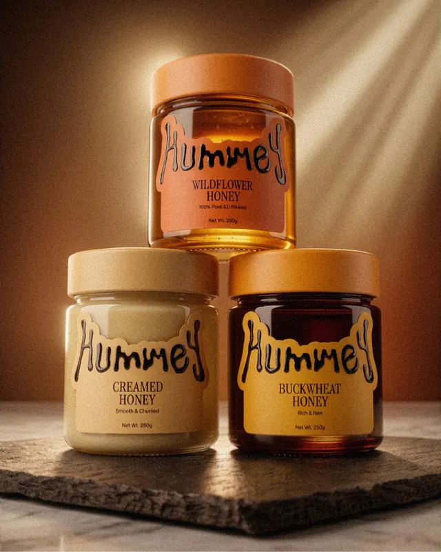
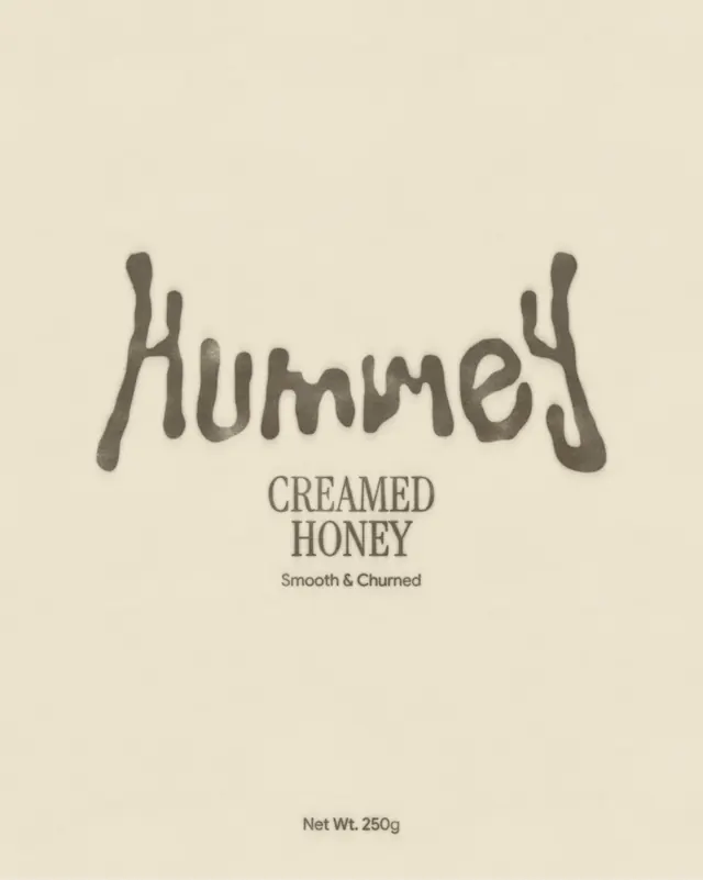
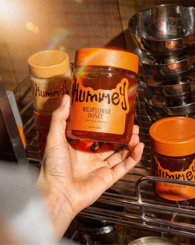
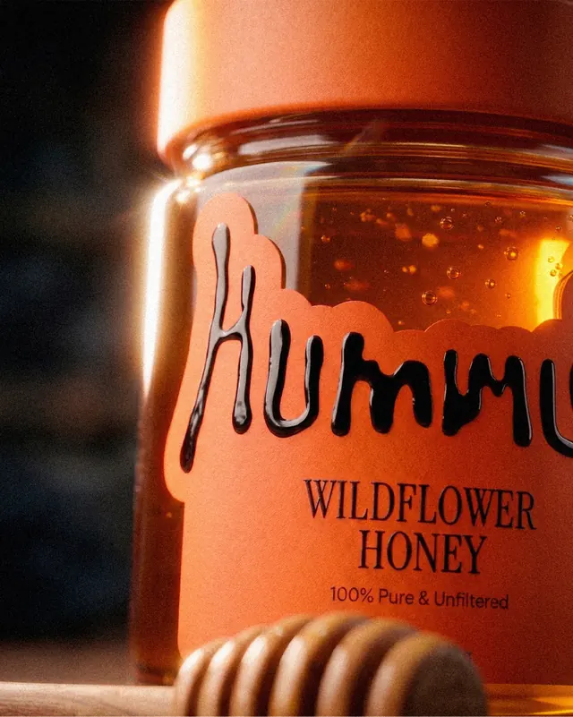
Slide 1: Three glass honey jars arranged in a triangular composition on warm stone, backlit to reveal the honey's color gradient (clear golden, pale creamed, dark buckwheat). The label features a handwritten serif wordmark in brown/olive and product descriptors in clean sans-serif. Warm directional lighting creates glow and shadow. Slide 2: Close-up of the handwritten wordmark showing organic, flowing letterforms with subtle irregularities that signal hand-lettering. Slide 3: Hand holding a wildflower honey jar in warm studio light, surrounded by other jars and neutral tableware, emphasizing texture and premium product positioning. Slide 4: Detail of the jar label showing the wordmark in context with "100% Pure & Unfiltered" and product type in refined typography. Throughout: consistent warm color palette (golden amber, warm brown, cream), soft diffused lighting, premium glass vessels, and a tactile aesthetic emphasizing natural ingredients and craft production.
Key takeaway
The handwritten wordmark is the soul of the system-warm and human against minimalist sans-serif utility type. The warm, filtered lighting photography sells the product quality; the golden glass and layered honey colors do the visual work. Label design achieves premium positioning through restraint: ample white space, clear hierarchy, and handcrafted letterforms.
Reuse notes
Strong foundation for food/beverage brands emphasizing natural, artisanal, or small-batch production. The warm color palette and handwritten type work best for honey, jam, spice, and craft beverages. The layered product photography approach (jars arranged, hand-held detail, close-up) is highly effective for e-commerce and social. The label design scales to multiple product variants while maintaining visual cohesion. Works best with glass or ceramic packaging that allows the product color to show through.