Preview image. Unlock full-res
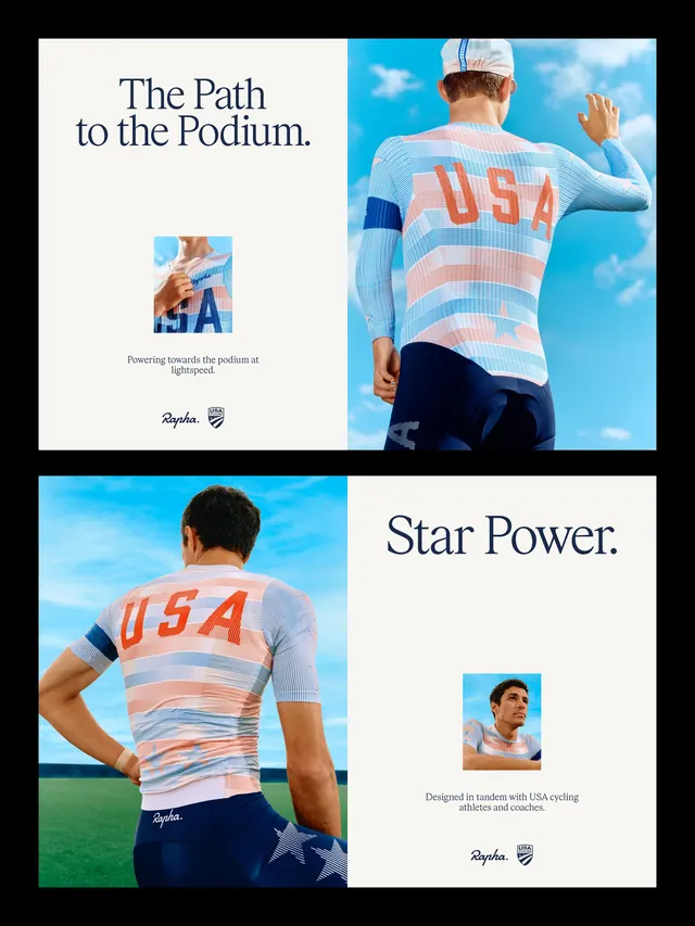
A 10-slide campaign showcasing Rapha's new brand identity applied to USA Cycling partnership, blending product photography, posters, and brand system moments.

Summary
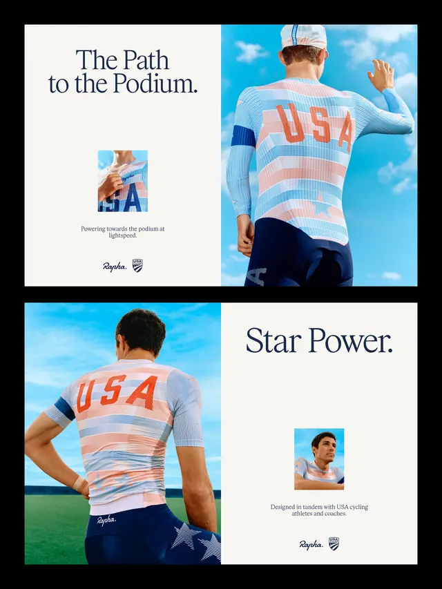
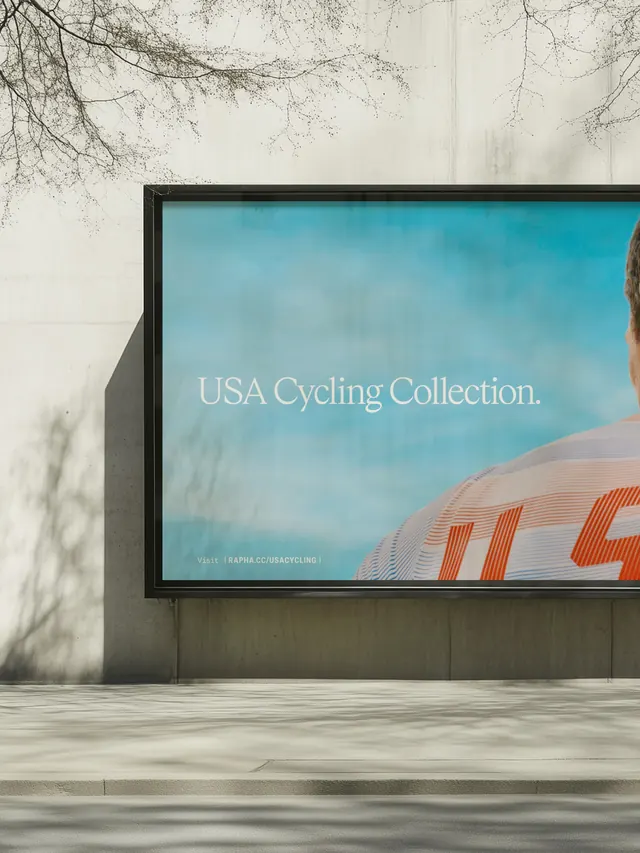
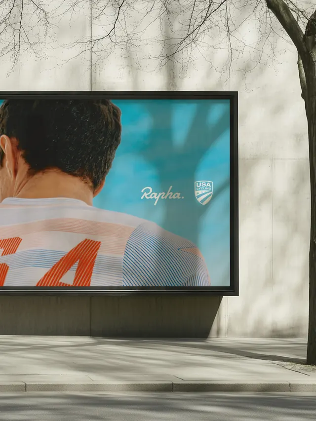
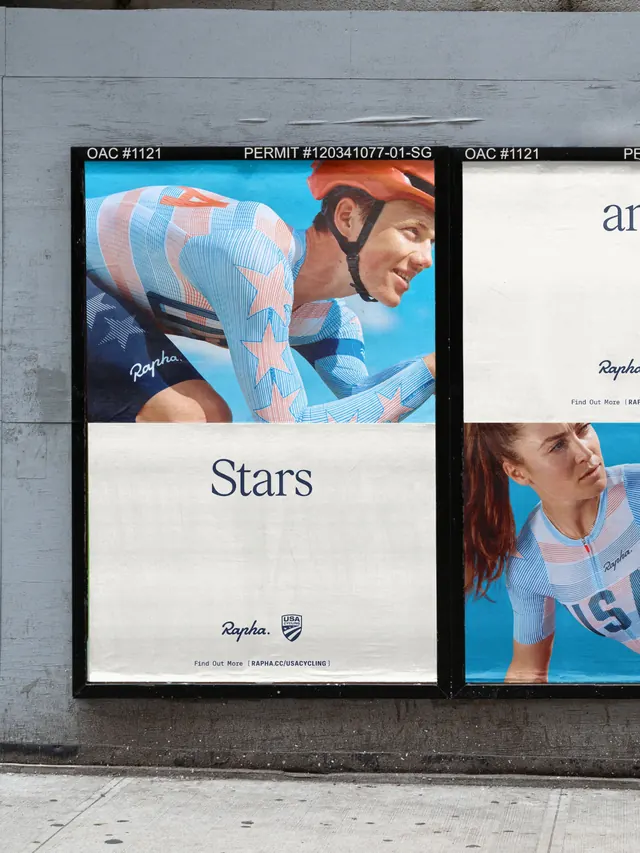
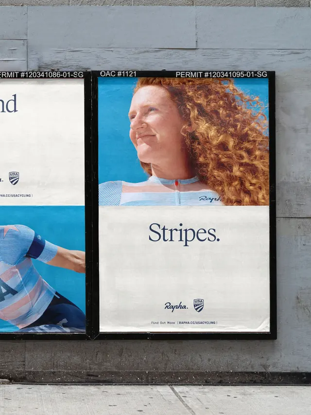
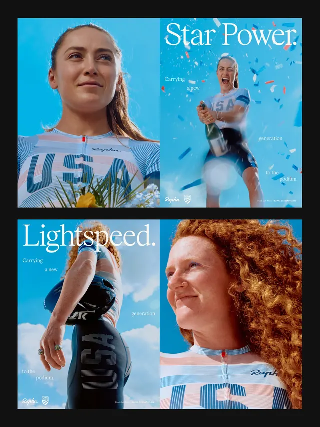
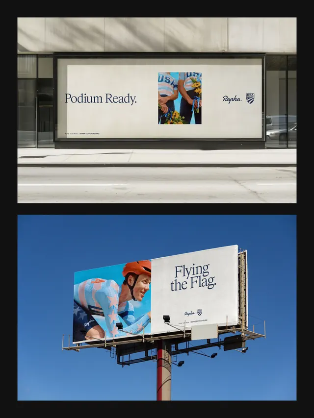
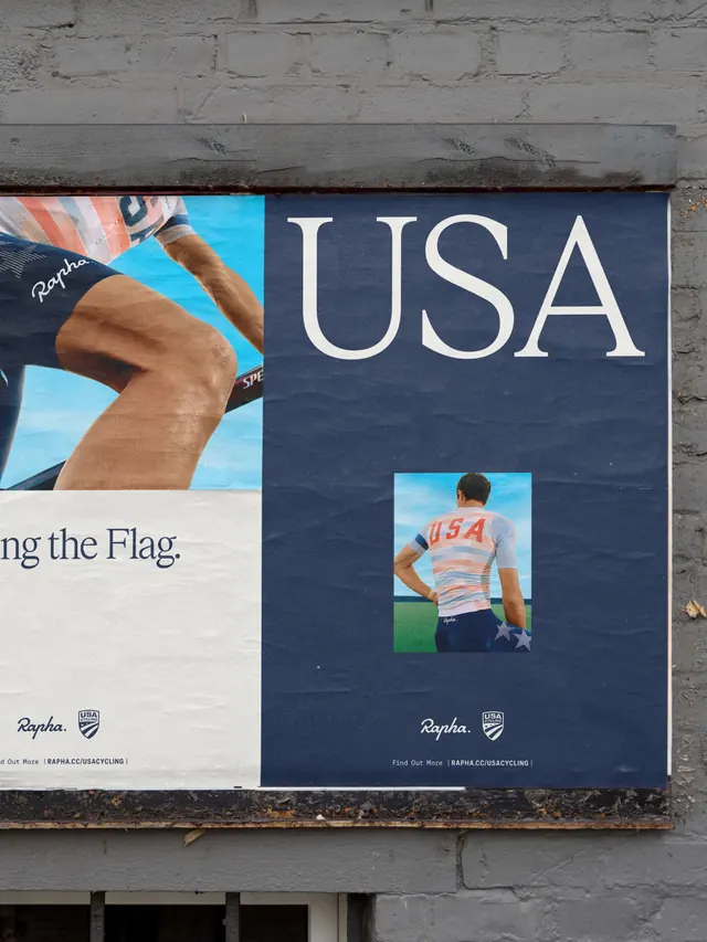
A campaign story for Rapha's rebranded partnership with USA Cycling. The carousel alternates between hero photography (athlete in new striped jersey against sky), typographic posters ("The Path to the Podium," "Star Power"), and system moments, establishing how the fresh identity behaves across print and digital surfaces.
Visual description
Predominantly light backgrounds (cream, white) paired with vibrant blue sky. The jersey features bold horizontal stripes in coral/orange and light blue. Serif headlines in navy or off-white sit centered or left-aligned, often occupying half a composition. Product shots of the cycling jersey emphasize the new color blocking and Rapha/USA shield marks. Supporting imagery includes small product detail crops, athlete portraits, and system-driven compositions with the dual-mark lockup. Typography is generous and confident, using serif faces for headlines, all-caps for emphasis.
Key takeaway
The 50/50 split between photography and typography is powerful: image builds emotional momentum, type articulates the strategic narrative. The constraint of red/blue/white + cream background maintains cohesion across a long campaign carousel. Effective use of the product itself as hero imagery alongside more conceptual hero photography.
Reuse notes
Excellent reference for sports brand campaigns, especially when bridging two organizations (brand + athlete/team/event). Works well for brands refreshing identity and needing to show it "in the real world." The balance of product detail and lifestyle context is worth replicating for apparel or performance gear launches.