Preview image. Unlock full-res
Editorial campaign carousel showcasing Ambev's institutional branding strategy with bold typography, multi-colored backgrounds, and behind-the-scenes visual storytelling.

Summary
A multi-slide carousel revealing the institutional branding ecosystem behind Ambev's major brands, mixing bold logo lockups, color palettes, poster campaigns, and candid people moments with high-contrast color blocking and oversized sans-serif typography.
Visual description
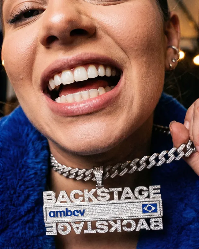
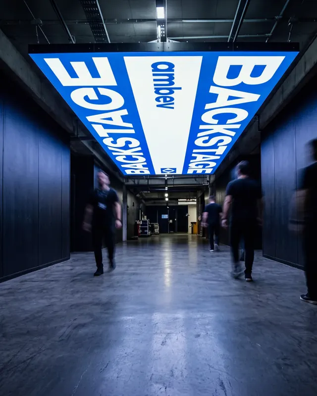
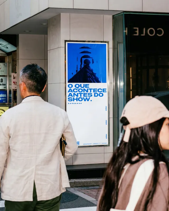
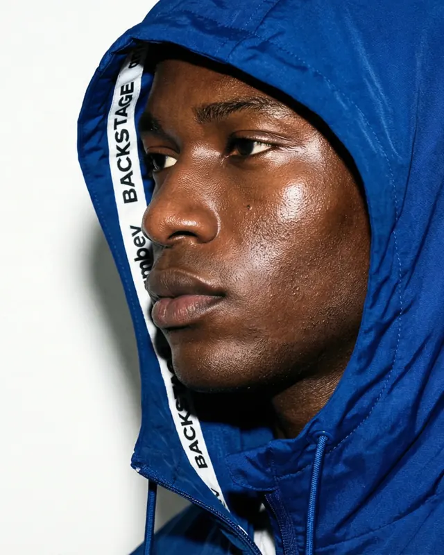
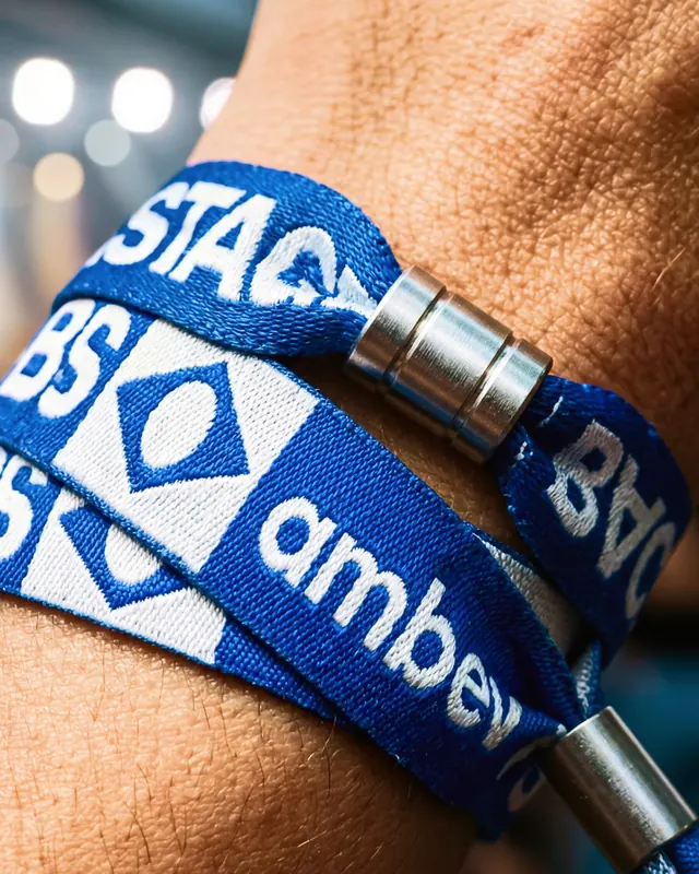
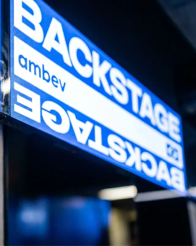
The carousel opens with the word "BACKSTAGE" in white block letters on a bright blue background, followed by a systematic showcase of brand identity materials: bold typography on colored backgrounds (blue, red, yellow, green), campaign posters featuring athletes and performers, a grid layout of carousel posts showing previous branded content, close-up lifestyle shots of people wearing branded merchandise, and minimalist brand mark variations with repeating logo lockups. Colors shift dramatically between slides-electric blue, bold red, vibrant green-creating visual rhythm and hierarchy. The "BACKSTAGE" logo marks appear as a badge element on several slides. Later slides show detailed elements: a grid of Instagram carousel thumbnails, a person in branded blue flexing with a diamond-encrusted pendant, and continued focus on brand mark variations and repeating wordmarks at different scales.
Key takeaway
The editorial power of showing design system and brand guidelines as a visual narrative-not documentation. Using bold color-blocking, scale shifts, and people-as-proof to make institutional branding feel immediate and human. The badge/logo as a recurring anchor element ties disparate visuals together.
Reuse notes
Strong for brand-behind-the-brand storytelling, especially beverages and lifestyle. Works best with 8+ slides to show the depth of a visual system. The color shifts between slides feel energetic on Instagram's infinite scroll. Only works with genuinely strong imagery and products to support the bravura presentation.
From this post: Backstage Ambev brand campaign carousel
View post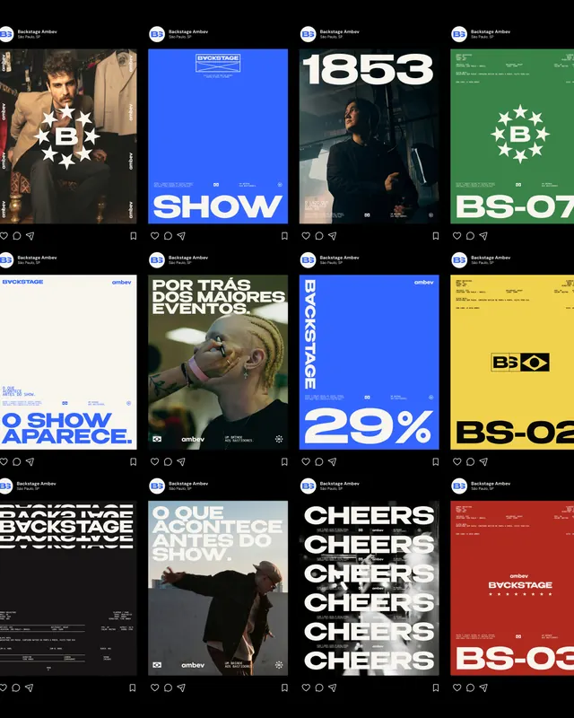
More like this

Keep what you find
A free account saves references to boards and can send you a weekly email of picks based on what you save.
To see every result, go Pro.