Preview image. Unlock full-res
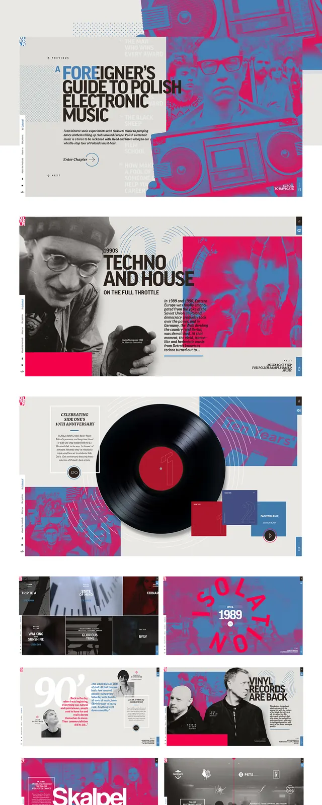
Complex editorial layout featuring interviews, vinyl record imagery, portraits, and a high-contrast red/magenta and blue duotone color palette throughout.
Summary
A comprehensive editorial spread from an electronic music publication. Multiple pages visible showing articles on electronic music, Polish electronic music, techno and house, with duotone photography and dense typography.
Visual description
Multi-page spread from a professional electronic music publication. The layout comprises approximately 8-10 individual pages stacked or arranged to show the full design system. Consistent design language throughout: headlines in bold sans-serif type (navy/black on white and on duotone), body text in smaller serif or mixed font. Dominant visual treatment is a high-contrast duotone effect using fuchsia/hot-magenta and deep navy blue applied to all photography—portraits of musicians, vinyl records, event imagery, and supporting graphics. Geometric line-work (circles, rectangles, decorative elements) in the same duotone palette. Key articles visible: "Electronic Music", "A Foreigner's Guide to Polish Electronic Music", "Techno and House on the Full Throttle", references to "1989", and artist/musician names. White backgrounds alternate with duotone sections. The overall effect is energetic, sophisticated, and visually cohesive. Page structure shows a balanced mix of large photography, substantial headline type, and dense body text.
Key takeaway
A duotone color palette (fuchsia and navy) consistently applied across diverse photographic content creates a strong, recognizable visual identity that works across genres and subjects. The combination of warm and cool tones creates visual tension and energy. Dense typography and generous white space balance high-contrast imagery. This approach demonstrates how a single technical treatment (duotone) can unify disparate content.
Reuse notes
Excellent reference for music, culture, and entertainment publications. The duotone approach works particularly well for photography-heavy layouts and gives dated or low-quality photographs a cohesive treatment. The fuchsia/navy combination is energetic without being juvenile; it works for serious editorial content. Best at magazine or printed format where the detail can be appreciated. The dense text layout requires careful readability testing and sufficient font size. Avoid for content requiring warmth or approachability; better for specialized, design-literate audiences. The geometric line-work adds visual interest without adding photography.
More like this
Keep what you find
A free account saves references to boards and can send you a weekly email of picks based on what you save.
To see every result, go Pro.