Preview image. Unlock full-res
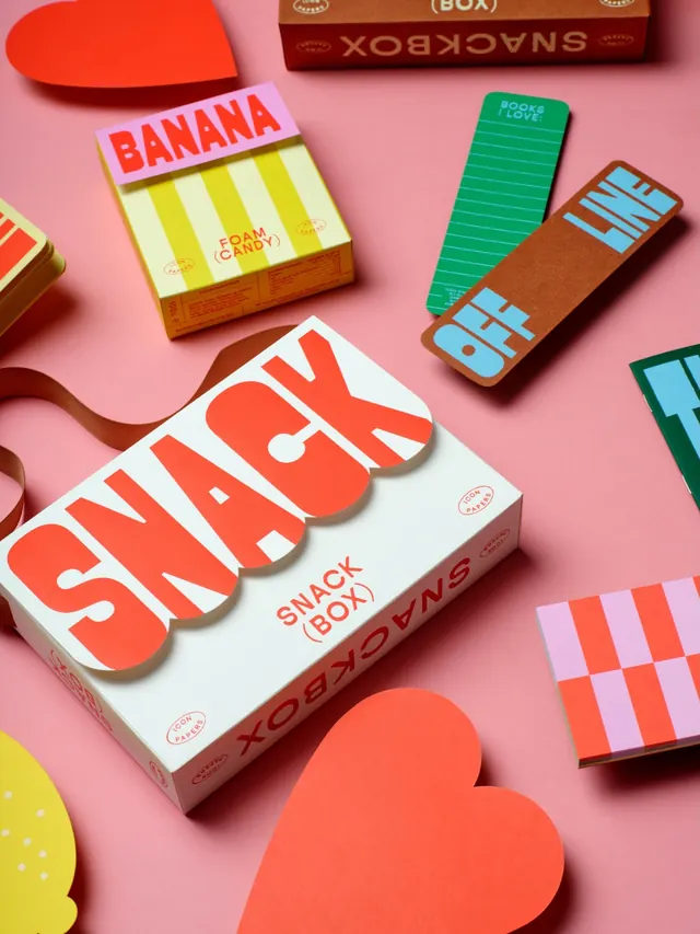
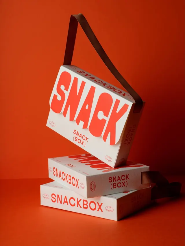
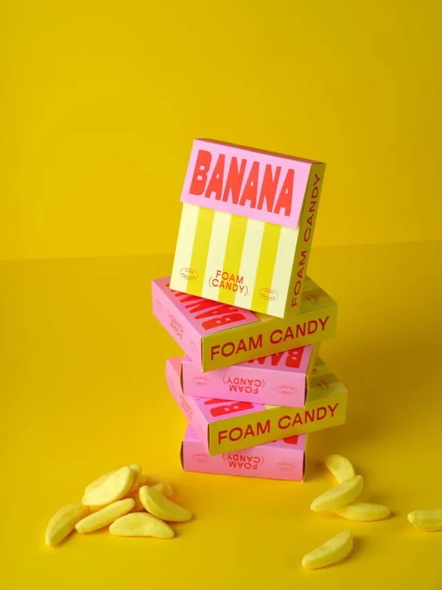
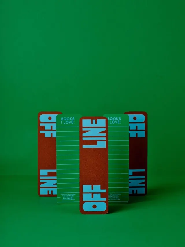
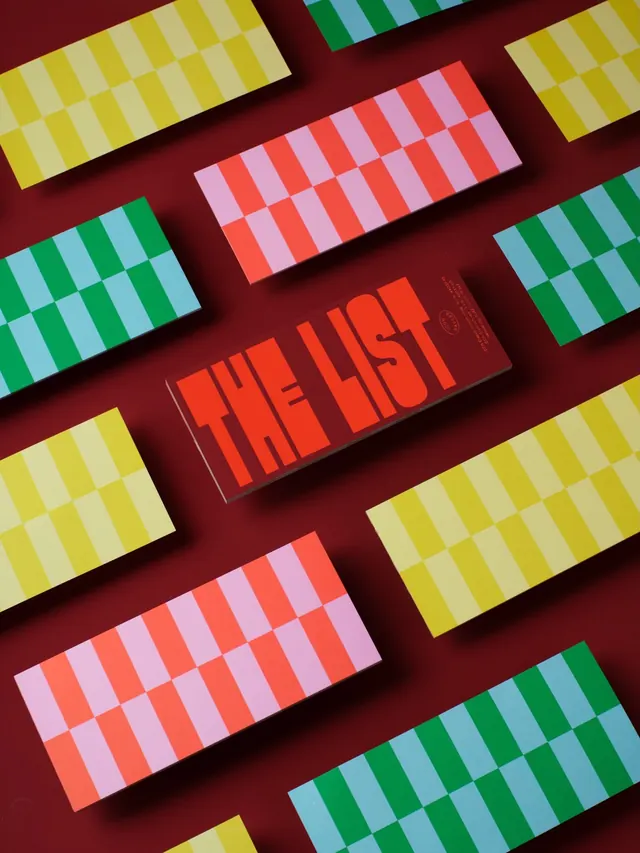
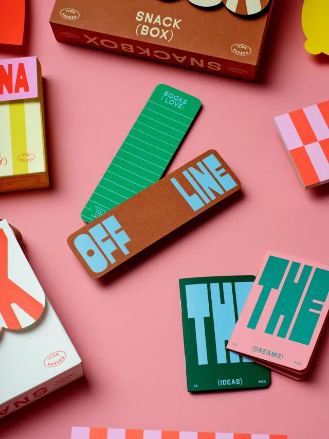
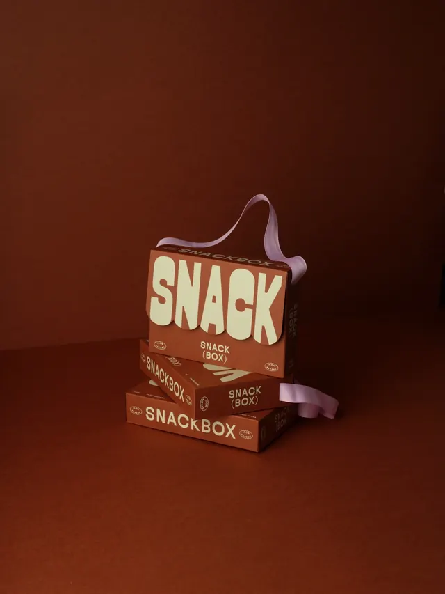
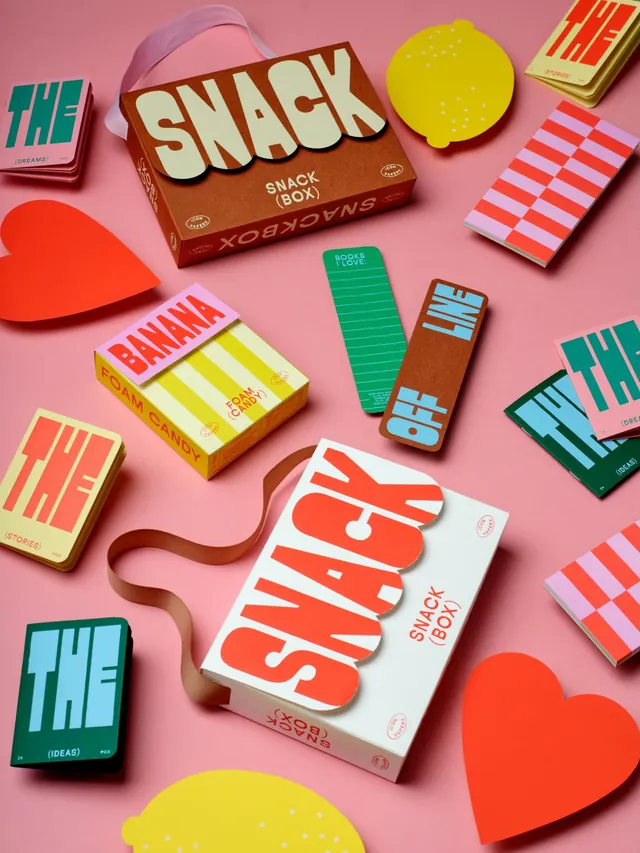
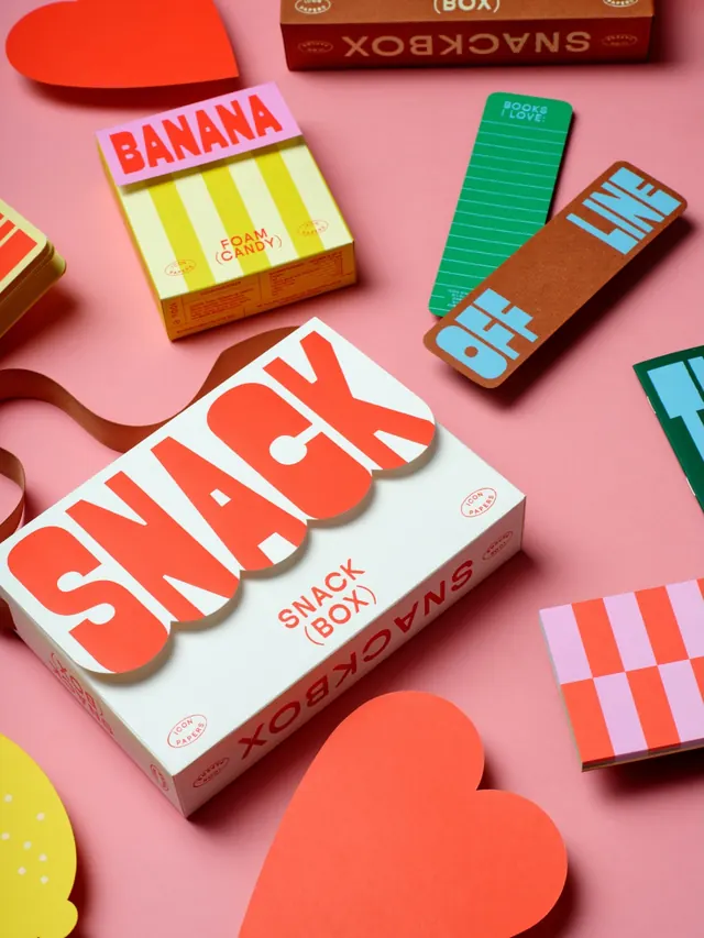
Colorful paper packaging design system for Snackbox showing coordinated 3D-rendered matchboxes, candy boxes, and branded stationery across a vibrant, playful palette.
Summary
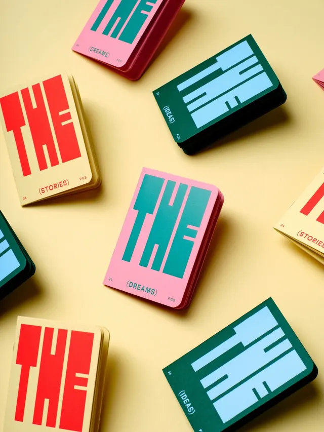
A multislide branding exploration showcasing diverse paper packaging formats including matchboxes, playing-card sleeves, and cardboard containers. Each package features hand-painted lettering, geometric cutout windows, and a harmonious color system that reads as one cohesive visual identity.
Visual description
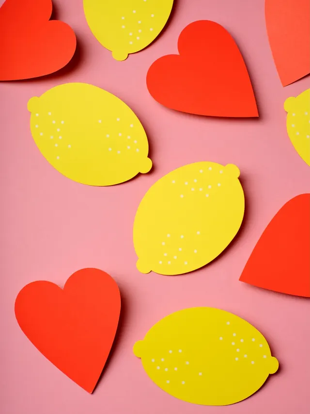
The carousel displays various 3D-rendered and photographed paper products arranged on a soft yellow background. Designs include vibrant red and white boxes labeled "SNACK" with striped interiors, pink and teal matchbook-style cards with geometric patterns reading "DREAMS" and "STORIES", cream-colored boxes with oversized red lettering, and coordinating paper sleeves in complementary colors. Each package features playful typography, cutout windows revealing interior patterns, and foil or embossed accents. The overall palette is highly saturated with reds, pinks, teals, yellows, and greens, unified by consistent line weights and geometric composition.
Key takeaway
The strength here is systematic cohesion without monotony. Despite wildly different product formats and colors, the unified approach to typography, geometric cutouts, and pattern style makes everything feel like one brand. The 3D product visualization also elevates what could be flat design into an aspirational, premium feel.
Reuse notes
Excellent reference for food/retail branding that needs playful energy without being childish. The technique of using colored interior reveals through cutout windows is particularly reusable. Works well for gift boxes, stationery sets, and product launches. Scale the approach: one core type treatment, 3-4 signature colors, and consistent geometric accent patterns applied across diverse substrates.