
Preview image. Unlock full-res
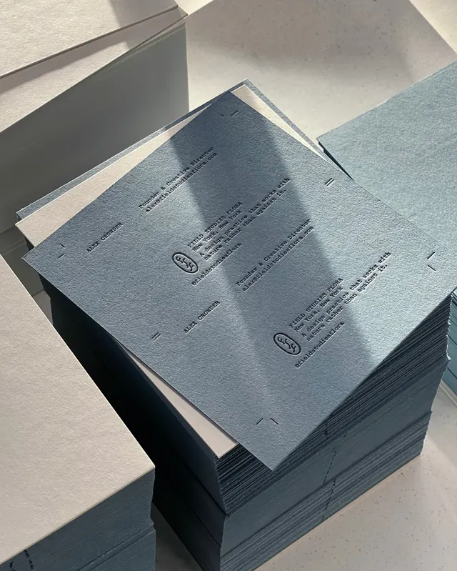
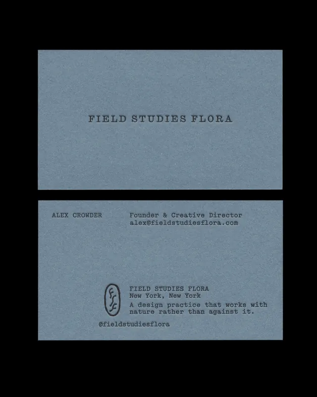
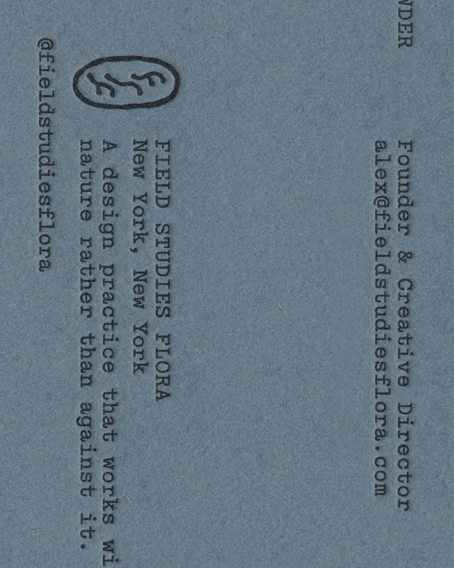
An 8-slide carousel documenting printed matter and tactile collateral for Field Studies Flora, a botanical brand identity by 1 of 1 Studio.

Summary
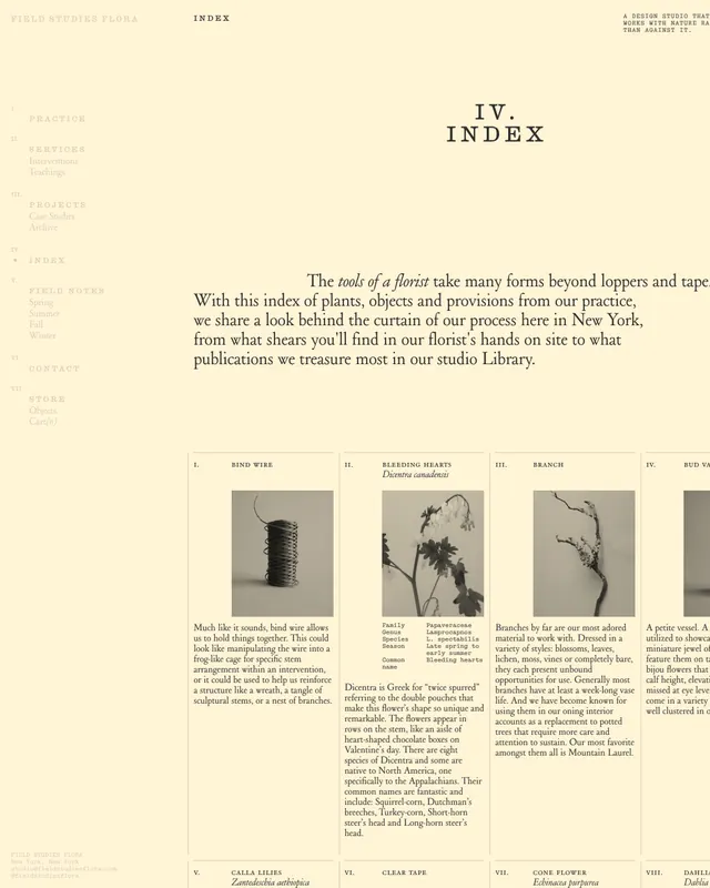
A comprehensive exhibition of brand collateral for Field Studies Flora, demonstrating a unified approach across print media. The deck showcases letterpress cards, library index documentation, botanical illustration plates, and typography applications, all grounded in minimalist design and natural materials.
Visual description
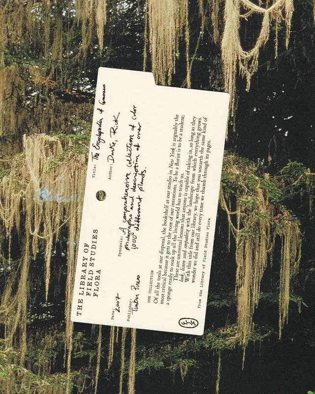
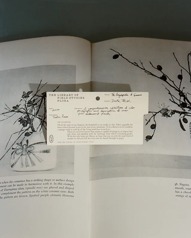
The carousel begins with a close-up of embossed letterpress business cards featuring the Field Studies Flora identity and contact information. Slide 2 shows a handwritten library index card in a soft blue-gray tone, evoking vintage botanical archives. Slides 3-6 present organized systems: the brand guidelines spread with botanical imagery, an index of plant references, and pages featuring typography and organizational frameworks in soft cream and blue-gray tones. The final slides show full product applications and supplementary printed materials. Throughout, the aesthetic emphasizes craft (letterpress embossing), natural materials (textured papers), and structured information design (grids, typography hierarchy).
Key takeaway
The powerful integration of print and digital - demonstrating that the brand operates as a unified system across media. The use of tactile elements (embossing, quality paper, handwritten details) communicates care and craftsmanship. The botanical/scientific organizational systems (index cards, notation) create narrative authority and depth.
Reuse notes
Excellent for branding portfolios, agency case studies, and projects emphasizing craft and sustainability. The minimalist palette and editorial approach work well for cultural, environmental, or luxury brands. Particularly strong for demonstrating print collateral systems and the value of tactile materials in brand experience. Pairs well with detailed process documentation or client interviews.
From this post: Field Studies Flora printed matter identity
View post

More like this



Keep what you find
A free account saves references to boards and can send you a weekly email of picks based on what you save.
To see every result, go Pro.