Preview image. Unlock full-res
A bold event identity system using rotated modular pattern elements and a striking neon-yellow accent bar to promote a design conference.
Summary
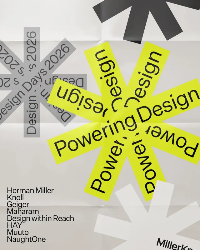
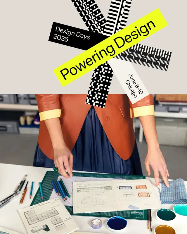
A modular event identity system for MillerKnoll's Design Days 2026 featuring rotated geometric pattern elements inspired by engine mechanics, a bold neon-yellow bar carrying the main message, and a cohesive applied-design showcase across promotional materials.
Visual description
Slide 1: An isometric composition with five rotated black-and-white geometric pattern tiles (grid, line, and dot variations), a black bar labeled "Design Days 2026", and a bright neon-yellow band reading "Powering Design" at a steep diagonal. A white label reads "June 8-10 Chicago". Slide 2: The same pattern modules arranged in a grid display across what appears to be a storefront or gallery window, showing modular band color iterations (blue, pink, green, photographic, yellow) with the "playground" text repeated, demonstrating pattern application at scale. Slide 3: A portrait-mode lifestyle shot showing the identity applied in practice-a designer at a work desk with the event materials visible above, holding sketches and surrounded by colored pencils and textile swatches. The stacked materials anchor the identity in a real professional context.
Key takeaway
The modular, rotated-pattern approach creates visual rhythm and mechanical energy while staying grid-aligned and systematic. The neon-yellow bar reading "Powering Design" becomes the primary eye-catch, allowing the patterns to recede and support. The real-world application shot grounds an abstract identity in tangible design practice.
Reuse notes
A strong reference for event branding that aims to feel energetic and cutting-edge while maintaining professional credibility. The pattern library approach scales well across collateral (posters, programs, window dressing, merchandise). Works best for design, tech, and creative industry events. The geometric patterns pair well with sans-serif typography and benefit from bold color accents to break the rhythm.