Preview image. Unlock full-res
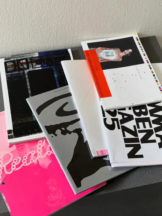
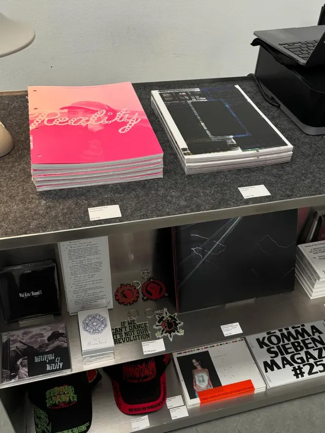
A ten-slide carousel showcasing a curated collection of independent design and art publications, magazines, and artist books stacked and fanned across a neutral surface.

Summary
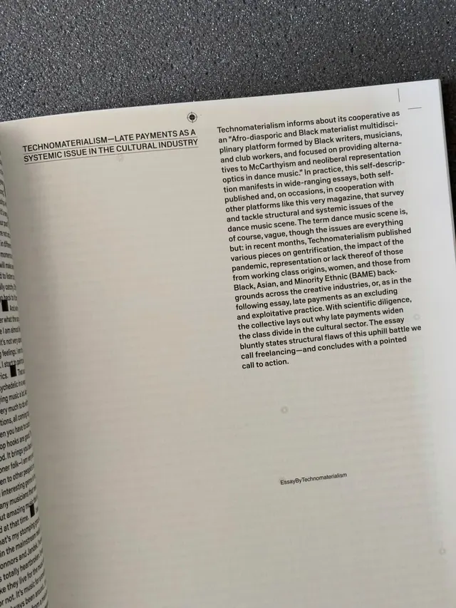
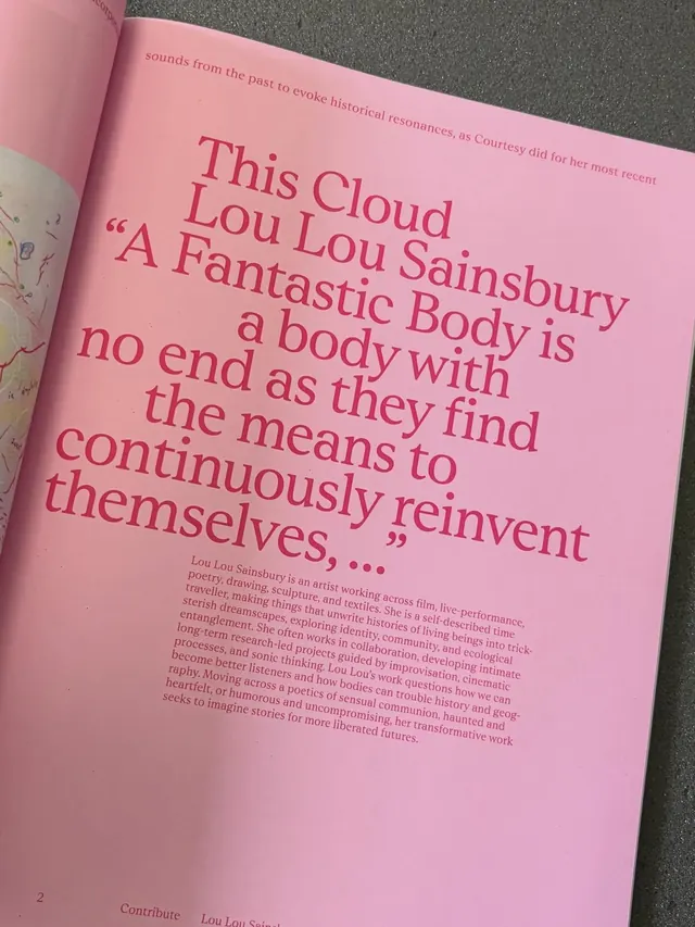
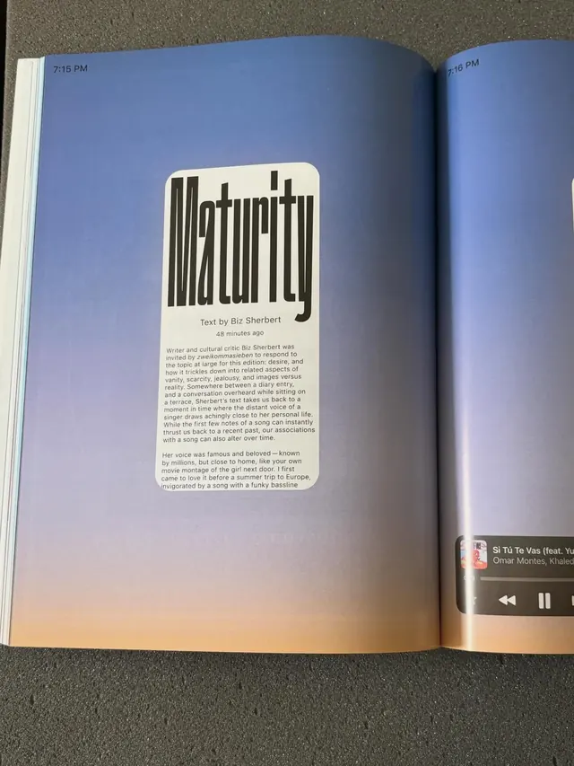
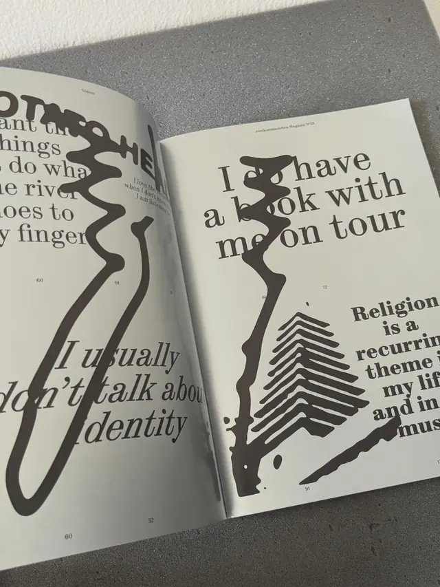
A flat-lay carousel documenting independent publications and design magazines, featuring community-run projects from Switzerland and Vienna, with spreads emphasizing editorial typography, experimental layouts, and thoughtful image+text pairings.
Visual description
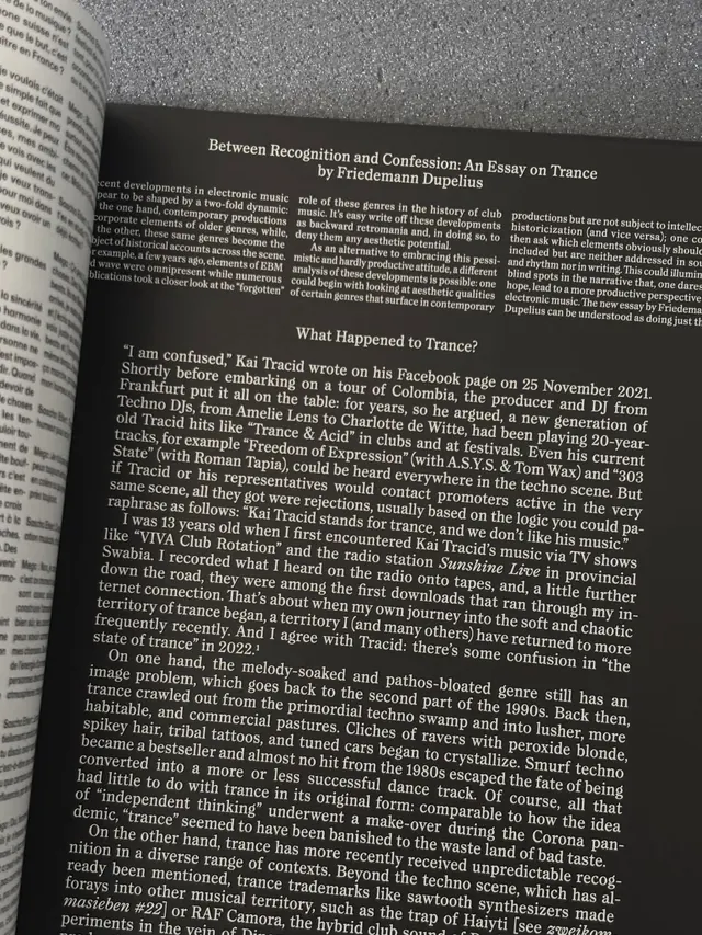
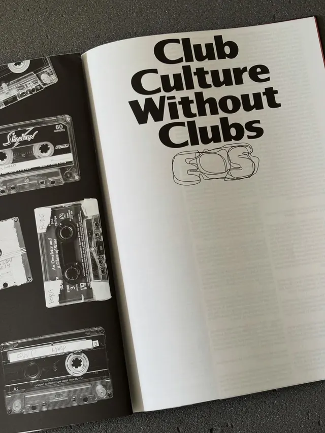
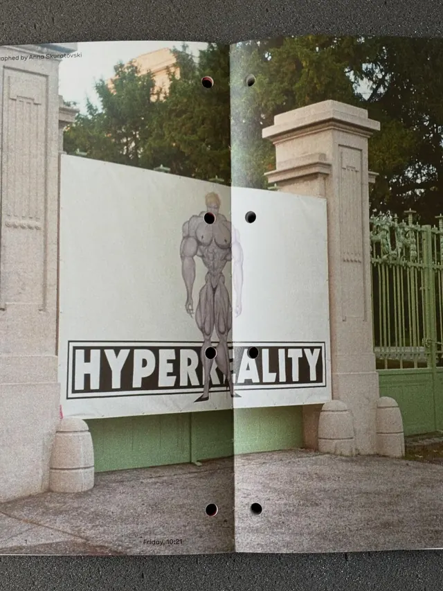
Slide 1 (the hero) shows stacked magazines and books at an angle, color-coded with striped spines and wrapped in bright orange/coral bands. Books lie overlapped on a pale paper background with soft shadows. Subsequent slides reveal interior spreads: dense columns of serif type discussing artists' practice and print culture, photographs of objects and faces, abstract graphics in black and white, and intricate layouts mixing body copy with callouts. Notable spreads include a full-page interview layout with hand-marked annotations, a magazine cover with bold wordmark ("BAZEN"), and a multi-image collage of studio objects (ceramics, sketches, business cards) arranged salon-style. Color accents are restrained: the occasional red or colored paper, but mostly black, white, and cream. Typography ranges from classical serif body copy to chunky display sans-serif headlines.
Key takeaway
The stacked, overlapped presentation of publications as itself a design statement-the colored spines and wraps add visual interest while the pale background stays calm. Magazine spreads that balance dense typography with breathing room via whitespace and single-image focal points. Experimental layouts that still serve readability through clear hierarchy (headers, body, captions at predictable positions). The bright orange band as a unifying branding device across disparate publications.
Reuse notes
Ideal reference for editorial systems and publication design. The layout strategies (mixing dense text columns with full-bleed image, using colored accent bands, organizing studio shots in grids) transfer well to design magazines, artist books, and research publications. The monochromatic palette with occasional color pops is sophisticated and forgiving when photo quality varies. Works especially well for documenting/promoting a curatorial practice or design studio.
From this post: Bookshop Library Publication Collection Flat-Lay
View post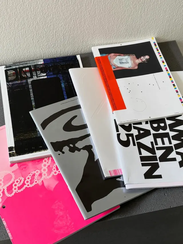
More like this
Keep what you find
A free account saves references to boards and can send you a weekly email of picks based on what you save.
To see every result, go Pro.